This repository was archived by the owner on Sep 9, 2020. It is now read-only.
Broken layout #18
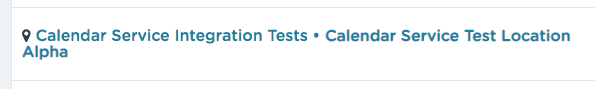
Description
I found a minor issue in the list. When the Fulfiller & Location name are longer then a single row, it overflows to the second row. But it's aligned right below the icon which looks weird, see:
I can imagine a fix which would improve it's readability, see:

- maybe an adjusted line-height for the names)
What do you think?