Advice please for my website #485
Replies: 6 comments 6 replies
-
|
Looks good. Maybe rounded corners, or that might just be my preference 😂 |
Beta Was this translation helpful? Give feedback.
-
|
Thanks for the advice! |
Beta Was this translation helpful? Give feedback.
-
|
Just a few things that I noticed...
|

Beta Was this translation helpful? Give feedback.
-
|
Thanks for the advice! I will try to modify based on your advice 👍 :) |
Beta Was this translation helpful? Give feedback.
-
|
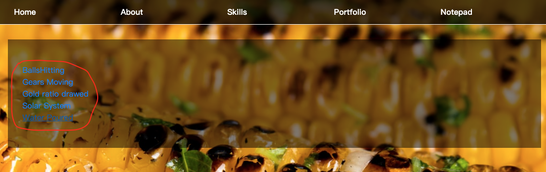
The site seems not mobile friendly... the icons are clustered into a group in mobile version. |

Beta Was this translation helpful? Give feedback.
-
|
Thanks for the advice! This advice helps alot! |
Beta Was this translation helpful? Give feedback.
-
|
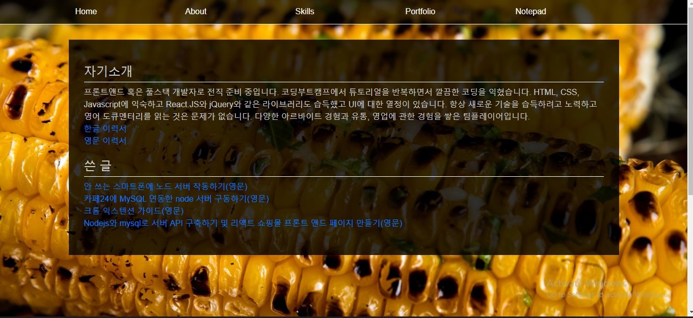
Hi, I would like to suggest you change all of the hyperlinks’ font color and hover color to make them stand out more from the background, so they are easier to read.
|
Beta Was this translation helpful? Give feedback.
-
|
It would look better then. Thanks for the advice! |
Beta Was this translation helpful? Give feedback.
-
Firstly;
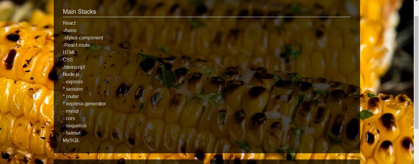
The skills are not orderly arranged. I suggest you should have done it like this;
Secondly;
I feel there should be a kind of translation here, when I saw this I could not pick something from it or maybe translating it to a general acceptable language(English) can go a long way! |
Beta Was this translation helpful? Give feedback.
-
|
@chryzcodez Thanks for the advice! I appreciate your passion for Javascript. The advice is very helpful! |
Beta Was this translation helpful? Give feedback.
-
Yeah, You are welcome! |
Beta Was this translation helpful? Give feedback.
-
|
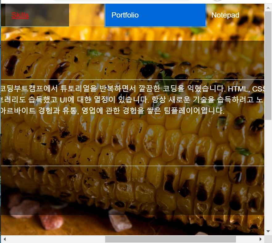
It looks like your page should be a single page without scrolling or only scrolling inline the boxes.
May you can remove the little scrolling |
Beta Was this translation helpful? Give feedback.
Uh oh!
There was an error while loading. Please reload this page.
-
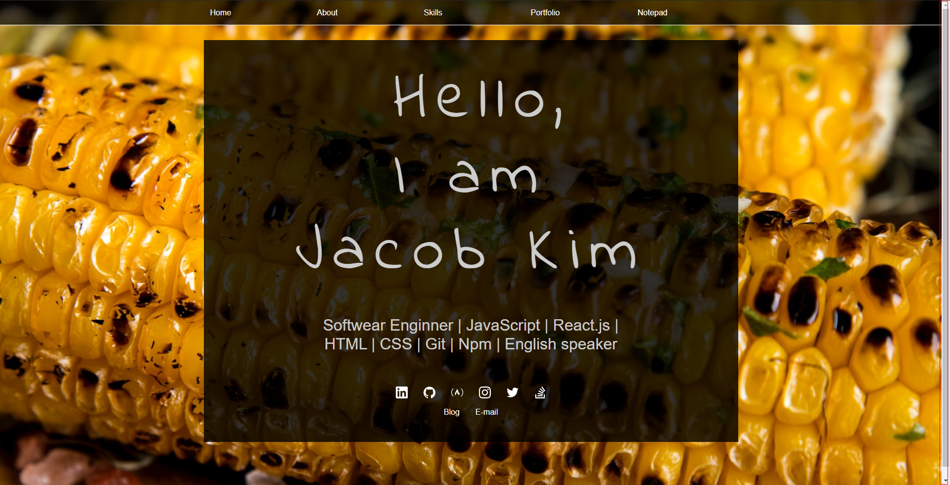
Hello people. I just wanted to get some advice of my website. Your advice will be appreciated! Thanks!
https://lucid-clarke-3ee16f.netlify.app
Beta Was this translation helpful? Give feedback.
All reactions