show region names on plotmarkers #1590
Answered
by
rcorces
yamihn
asked this question in
Questions / Documentation
-
|
hi, is it possible to show the names of some regions on the maplot using plotmarkers? |
Beta Was this translation helpful? Give feedback.
Answered by
rcorces
Aug 27, 2022
Replies: 2 comments
-
|
no this is not available. you are welcome to make your own plots manually from the data stored in the SummarizedExperiment. |
Beta Was this translation helpful? Give feedback.
0 replies
Answer selected by
yamihn
-
|
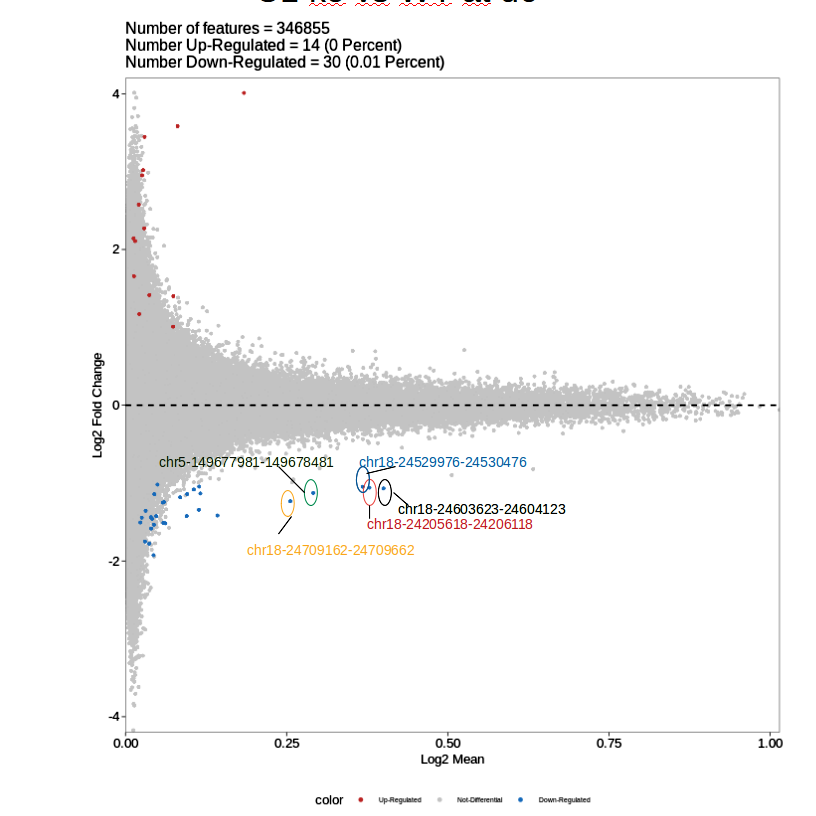
Hello @mitchTwoTimes, I used ggplot.
meta_data= [email protected])
list_data= markertest@***.***@list@lista.data)
new_df= cbind(meta_data, list_data)
View(new_df)
new_df$x <- "Log2FC"
colnames(new_df)[5] <- "Log2FC"
colnames(new_df)[6] <- "Mean"
colnames(new_df)[7] <- "FDR"
colnames(new_df)[8] <- "Pval"
colnames(new_df)[9]<- "MeanDiff"
colnames(new_df)[10] <- "AUC"
colnames(new_df)[11] <- "MeanBGD"
df_filter= dplyr::filter(new_df, FDR < 0.1, abs(Log2FC) > 1)
df_filter_mean = dplyr::filter(df_filter, Mean > 0.40000000)
new_df$region <- paste(new_df$seqnames, new_df$start, new_df$end, sep = "-")
df_filter$region <- paste(df_filter$seqnames, df_filter$start,
df_filter$end, sep = "-")
df_filter_mean$region <- paste(df_filter_mean$seqnames,
df_filter_mean$start, df_filter_mean$end, sep = "-")
new_df$color <- "NA"
new_df$color <- ifelse((new_df$FDR < 0.1 & abs(new_df$Log2FC) > 1), "red",
"grey50")
new_df$DE <- ifelse((new_df$FDR < 0.1 & abs(new_df$Log2FC) > 1), "DE",
"NOTDE")
ggplot(new_df,
aes(x=Mean, y=Log2FC)) +
geom_point(colour=new_df$color, aes(shape= DE)) +
geom_hline(yintercept = 0) +
geom_hline(yintercept = 1, linetype = "dotted", size = 1) +
geom_hline(yintercept = -1, linetype = "dotted", size = 1) +
ggtitle("MA Plot") + ggrepel::geom_label_repel(aes(label = region), data
= df_filter_mean, col= "Blue", alpha= 0.6)
|
Beta Was this translation helpful? Give feedback.
0 replies
Sign up for free
to join this conversation on GitHub.
Already have an account?
Sign in to comment
no this is not available. you are welcome to make your own plots manually from the data stored in the SummarizedExperiment.