Attach a X-axis/bar of Pseudo-time value/cell cluster color bar on the top of the plotTrajectoryHeatmap #580
Replies: 4 comments 3 replies
-
|
I dont think this is currently possible but seems reasonable. Feature requests have piled up so I wouldnt expect this to be addressed soon though. |
Beta Was this translation helpful? Give feedback.
-
|
Thank you!! Totally understand! Thanks again for this great package! |
Beta Was this translation helpful? Give feedback.
-
|
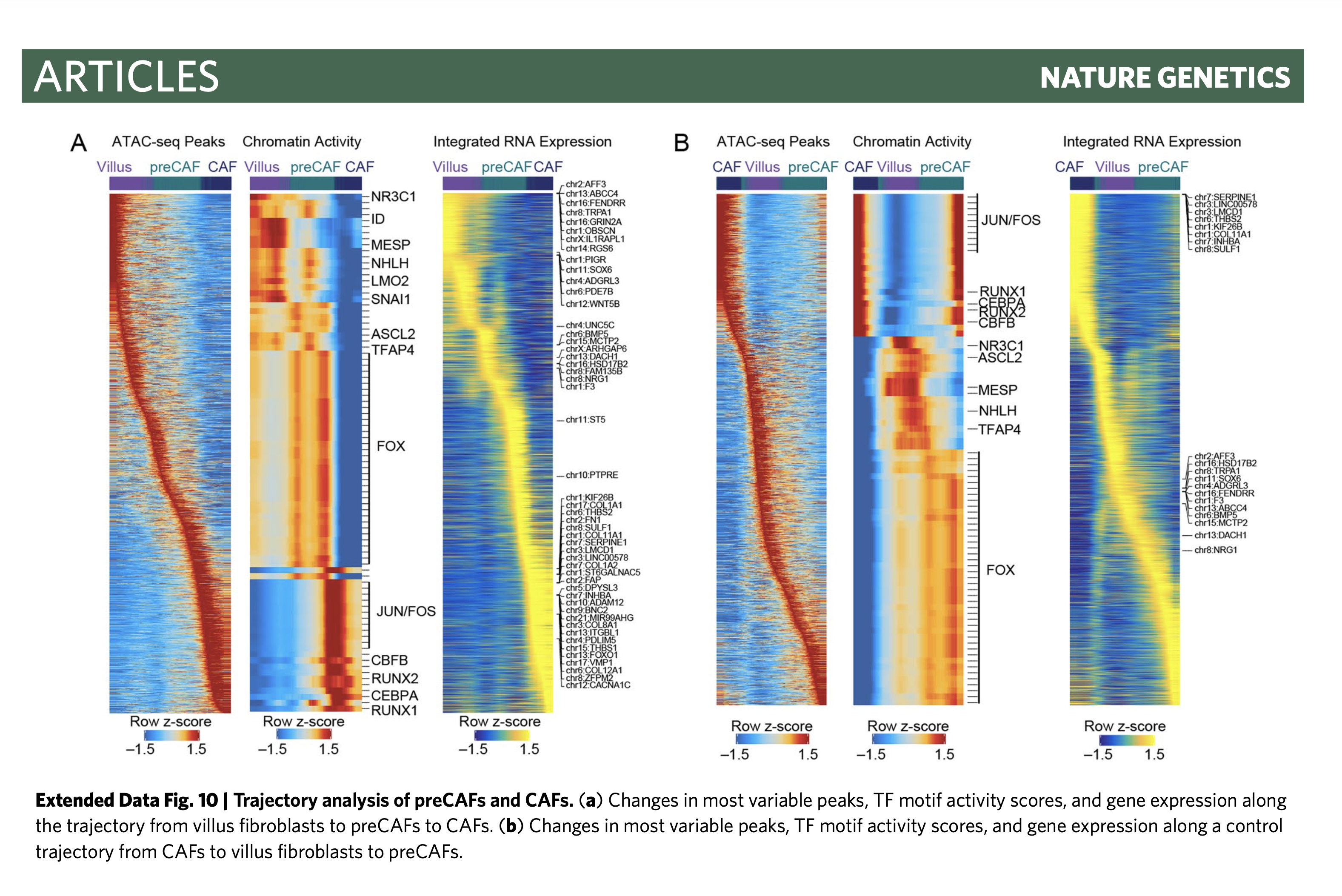
Hi there, I am using the package and found that this feature is important. While I found some code in their Nature Genetic paper can do this. Please see below https://github.com/winstonbecker/scCRC_continuum/blob/main/scATAC_stromal.R line 1028 - 1039
Hope it helps, and I hope someone can incorporate this code into the plotTrajectoryHeatmap function, since right now its just giving out a heatmap without any label on top. Will be very frustrating for non-hardcore users. Sincerely Han. |
Beta Was this translation helpful? Give feedback.
-
|
@hjc0818 - thanks for the reminder. I had half-way coded this and lost track of it. After installing, you will need to re-run Lines 290 to 292 in 586c8a9 Then you will run Lines 470 to 475 in 586c8a9 Please let me know if this works for you. If so, I will merge these changes into Example below:
|
Beta Was this translation helpful? Give feedback.
-
|
@hjc0818 - could you test this out please? |
Beta Was this translation helpful? Give feedback.
-
|
Hi, first of all thanks for the great tool. I really enjoy working with ArchR. I am currently doing a lot of Pseudotime Trajectory analysis. For this, I would like to add a X-axis/bar of cell cluster on the top of the plotTrajectoryHeatmap. While searching for this possibility, I came across this issue. However, unfortunately I am not able to install the
Is this branch not present anymore? I would highly appreciate your help! Thanks a lot! |
Beta Was this translation helpful? Give feedback.
-
|
this was merged into the |
Beta Was this translation helpful? Give feedback.
Uh oh!
There was an error while loading. Please reload this page.
-
Hello! Thanks again for this great package!
Describe the problem that your feature request would address.
The plotTrajectoryHeatmap function is very cool.
The y axis of the current plots(TF motif,Gene score, RNA) is very clear. However, it is better to get an accurate sense about which time point, a feature(motif,gene,RNA) is showing up/down, maybe through a more detailed x-axis or color bar, for example, the pseudo-time x axis or the pesudotime/cell cluster color bars, on the top of the trajectory heatmap.
Describe the solution you'd like
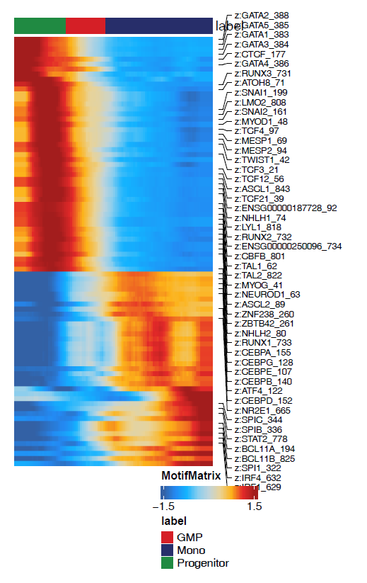
Is there any way to attach a x-axis that shows pesudotime value according to the heatmap,like below or on the top of the heatmap? Then, we can get a sense of exactly when a TF/RNA/gene score is upregulated/downregulated.
Describe alternatives you've considered
If there is another way, that shows the matched color the pesudotime value (dark blue, purple to yellow, showed in manual 16.1.1) in a horizontal color bar plot, and matching the trajectory heatmap x-axis, then it will be much more clear.
Or if there is a way to shows the cell cluster color bar together matching the x-axis, it will be great!
For these two alternative solutions, I attached two reference plots, examples from single-cell RNA-seq study. Just for examples only. For the second example, their cell type/stage colors showing on the top of the heatmap are a similar analogy to cell cluster color.
Additional context
After searching in the issues, not sure if a similar feature request was posted before.
Thank you so much and again this is a great and amazing package!
Beta Was this translation helpful? Give feedback.
All reactions