v0.10.0 (the one that added downloads)
Summary
This release was made possible by the following contributors:
- @cathysiller
- @CITguy
- @shaleen76
You can view documentation at https://rackerlabs.github.io/helix-ui/.
Breaking Changes
- The
@webcomponents/webcomponentsjsNPM package was changed to a peer dependency to allow consumers to upgrade the polyfills at their own pace. (#245)- This will require you to install an explicit version range of the package to satisfy the peer dependency.
- HelixUI should work with any version of the polyfills.
Deprecated
The following items are considered deprecated and will be removed in the next major version of HelixUI.
- The
.disabledCSS class for links is deprecated in favor of thedisabledattribute (#256)a[href].disabled-->a[href][disabled]
- The
.hxLinkCSS class for buttons is deprecated in favor of the.hxTertiaryCSS class. (#256)- This is to better align with nomenclature from Helix design standards.
Fixed
- Fixed broken "ESC to close" functionality of Modals (#256)
- Corrected bug with template caching in polyfilled browsers. (#247)
- Custom elements added to the DOM after the initial upgrade process were not receiving ShadyDOM CSS classes.
- Same fix as in v0.9.1
Added
- Added button styling support to button-like input elements (#256)
- e.g.,
input[type="button"],input[type="submit"], andinput[type="reset"]
- e.g.,
- Added button style support for anchor (
<a>) elements (#256) - Added
:focusstyles for tertiary buttons (#256) - Added styles for ordered lists (
<ol>) (#233) - Added styles for unordered lists (
<ul>) (#233)
New Pre-Built Assets
Pre-built packages available to download for HelixUI browser assets and SVG Icons. (#254)
Downloading Browser Assets*
These assets allow HelixUI to be consumable in products other than those based on NPM/Yarn.
* 3rd party dependencies not included in browser assets
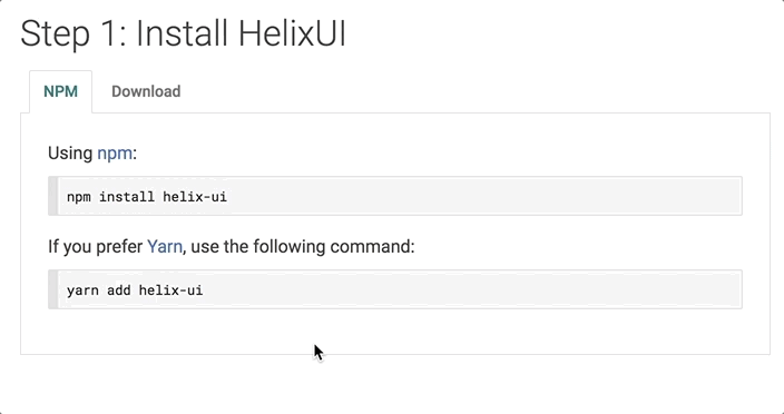
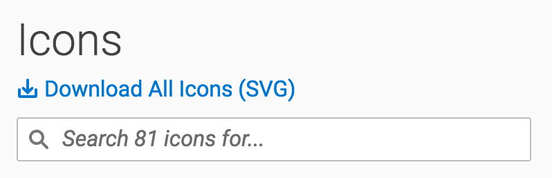
Downloading SVG Icons
New Badge Component
- Added the Badge component (#243)
| Type | Example |
|---|---|
| Link Badge | 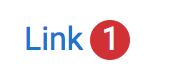 |
| Tab Badge | 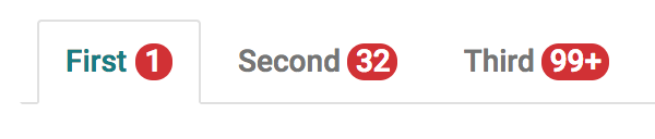 |
| Icon Badge | 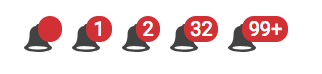 |
Updated
- Button nomenclature updated to match Helix design nomenclature. (#256)
- Getting Started documentation revised to better guide consumers toward a boilerplate application. (#254)
Merged
- #256 - Fix Bugs / Update Buttons / Update Links
- #254 - docs(downloads): modify getting started guide
- #247 - fix(HXElement): fix template caching (v0.10.0)
- #244 - test(Modal): add visual regression tests
- #243 - feat(Badge): add badge component
- #245 - chore(npm): make @webcomponentsjs/webcomponents a peer dependency
- #233 - feat(lists): styles for ordered and unordered lists