v0.12.0 (the one with better documentation)
Summary
This release was made possible by the following contributors:
- @cathysiller
- @CITguy
- @shaleen76
You can view documentation at https://rackerlabs.github.io/helix-ui/.
Breaking Changes
- Caption styles are now opt-in, to avoid conflicts with pre-existing application CSS. (#292)
- This has the potential to change the appearance of the
<caption>and<figcaption>elements in consuming projects. <caption>will only be styled if it's placed within a Helix Table (caption->.hxTable caption)<figcaption>will only be styled if it's placed within a<figure class="hxFigure">
- This has the potential to change the appearance of the
Deprecated
The following items have been marked for deprecation, and will be removed in the next major release.
- <hx-dl> - use
<dl class="hxList">instead (#280) - <hx-def> - use
<div>instead (#280) - <hx-dt> - use
<dt>instead (#280) - <hx-dd> - use
<dd>instead (#280) - <hx-menuitem-group> - use
<section>instead (#286) - <hx-tile-title> - use
<header>instead (#282) - <hx-tile-description> - use
<p>instead (#282) HelixUI.elements.HXIconElement.icons- useHelixUI.ICONSinstead (#295)
Fixed
- Fixed flexbox issue preventing grid columns from wrapping in IE (#281)
.hxCaptionstyles updated with correct font-size and font-weight (#292)<hx-alert>updated for better JSX compatibility (#289)
Updates
If you haven't already noticed, there's been a lot of work done on the documentation. (#281)
Updated Component Docs
All Component demos have been updated with a consistent look and feel to make consumption more consistent and predictable.
- State tables for all Components have been moved into separate test pages.
- Components with tests will have links in their "See Also" section.
- The "Busy" and "Progress" components have been moved into the "Loaders" component
- "Status Pills" has been moved into the "Pills" component
- "Text Inputs" updated with new interactive demos
Updated Guides
In addition to updated Component documentation, the guides received some updates as well.
- "Getting Started"
- Added polyfill installation instructions
- "FAQ"
- Added to document common questions and answers
- "React Compatibility"
- Added to document quirks around consuming HelixUI within React applications
- "Polyfills"
- Added to provide information about included polyfills and resources to search for additional polyfills.
New Icons
Added the undo and redo icons to the list of available icons. (#285)
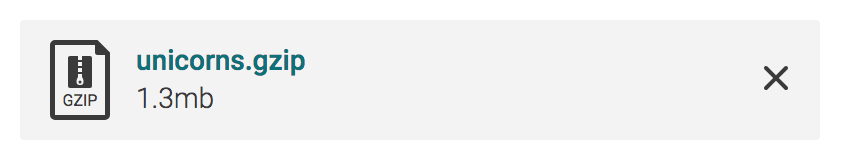
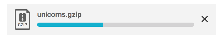
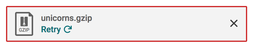
New "Files" Component
The new "Files" component has been created with <hx-file-tile> as its first element. (#273)
Merged
- #297 - docs(TextInputs): correct snippet output
- #292 - fix(CSS): correct caption resets
- #291 - docs(Buttons): do not promote non-interactive anchor buttons
- #289 - fix(*): Updates for JSX compatibility
- #286 - refactor(hx-menuitem-group): deprecate custom element
- #285 - feat(icons): add undo and redo icons
- #282 - chore(ChoiceTiles): deprecate custom elements
- #281 - docs(components): overhaul for consistency and functionality
- #280 - surf-1056-refactor-lists-custom-elements
- #273 - feat(FileTile): add File Tile component
- #267 - Remove all visreg tests
- #257 - feat(file-upload-tile): styles added for new component