v0.13.0 (the one without default exports)
Summary
This release was made possible by the following contributors:
- @cathysiller
- @CITguy
You can view documentation at https://rackerlabs.github.io/helix-ui/.
🚨 Breaking Changes 🚨
helix-uino longer exports a default object (#309)- Better conforms to
import/exportbest practices.
- Better conforms to
HelixUI.VERSIONis now a plain string (#309)- Previous value was an unnecessarily complex object.
HelixUI.elementsrenamed toHelixUI.Elements(#309)- Clarifies it as a namespace rather than an export/property.
Before
/* import default object */
import HelixUI from 'helix-ui';

/* log raw value */
console.log(HelixUI.VERSION); // { major: 0, minor: 12, ..., toString: function() { ... } }

/* log as string */
console.log(`${HelixUI.VERSION}`); // "0.12.1"

/* capture list of icons */
const ICON_NAMES = Object.keys(HelixUI.ICONS); // [ 'account', 'angle-down', ... ]

/* define custom element */
class ExampleElement extends HelixUI.Elements.HXElement { ... }

// Initialize HelixUI
HelixUI.initialize();
After
Option 1: import module as namespace
/* import as namespace */
import * as HelixUI from 'helix-ui';

/* log raw value */
console.log(HelixUI.VERSION); // "0.13.0"

/* log as string */
console.log(`${HelixUI.VERSION}`); // "0.13.0"

/* capture list of icons */
const ICON_NAMES = Object.keys(HelixUI.ICONS); // [ 'account', 'angle-down', ... ]

/* define custom element */
class ExampleElement extends HelixUI.Elements.HXElement { ... }

/* Initialize HelixUI */
HelixUI.initialize();
Option 2: import individual items
/* import individual exports */
import { VERSION, ICONS, Elements, initialize } from 'helix-ui';

/* log raw value */
console.log(VERSION); // "0.13.0"

/* log as string */
console.log(`${VERSION}`); // "0.13.0"

/* capture list of icons */
const ICON_NAMES = Object.keys(ICONS); // [ 'account', 'angle-down', ... ]

/* define custom element */
class ExampleElement extends Elements.HXElement { ... }

/* Initialize HelixUI */
initialize();
Deprecated
HelixUI.Elements.HXIconElement.iconsdeprecated in favor ofHelixUI.ICONS(#311)
Deprecated old Box spacing CSS Classes
.hxBox-*CSS classes deprecated in favor ofhx-div.hx*or.hxBox.hx*(#313)
| old | new | example |
|---|---|---|
| n/a | .hxFlush |
hx-div.hxFlush, .hxBox.hxFlush |
.hxBox-xs |
.hxXs |
hx-div.hxXs, .hxBox.hxXs |
.hxBox-sm |
.hxSm |
hx-div.hxSm, .hxBox.hxSm |
.hxBox-md* |
.hxMd |
hx-div.hxMd, .hxBox.hxMd |
.hxBox-lg* |
.hxLg |
hx-div.hxLg, .hxBox.hxLg |
.hxBox-xl* |
.hxXl |
hx-div.hxXl, .hxBox.hxXl |
| n/a | .hx2x |
hx-div.hx2x, .hxBox.hx2x |
* Padding will differ (not a 1:1 replacement).
Fixed
- Corrected broken logic for Tooltips and Popovers with unconventional (but valid) ID values (#306, #303)
- Corrected height of buttons with icons (#311)
- Corrected focus styles of "X" in
<hx-search>element (#311) - Corrected vertical alignment of
<hx-icon>elements when placed inline with text (#311)- Due to this CSS correction, some icons may not appear aligned with text. We will be auditing how SVGs within the
<hx-icon>element's ShadowDOM align with LightDOM text in various scenarios, and will make corrections where necessary.
- Due to this CSS correction, some icons may not appear aligned with text. We will be auditing how SVGs within the
- Corrected icon alignment in
<hx-alert>(#311) - Corrected inconsistencies with applying
ShadyCSSpolyfill to elements with<hx-icon>in their ShadowDOM. (#311)
Added Utils Namespace
HelixUI.Utils defined to provide access to low-level JavaScript functionality. (#309)
Added New Container Spacing CSS Classes
New CSS classes added to conform with Helix design specifications. (#313)
These new spacing classes must be combined with either a <hx-div> element or any block-level element with the .hxBox CSS class.
<hx-div class="..."></hx-div>
<div class="hxBox ..."></div>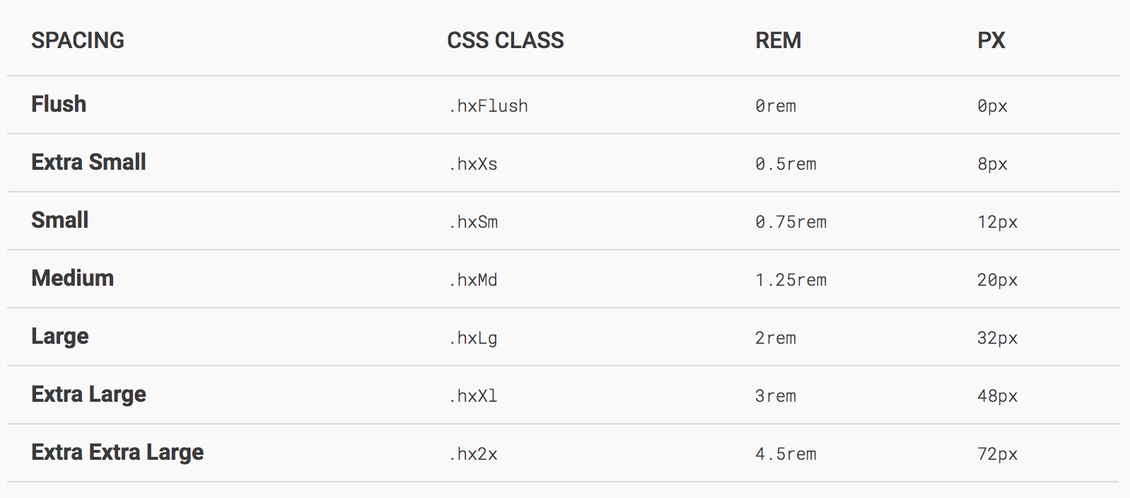
Added File Selector
Components > Files # File Selector
Added the <hx-file-input> element to wrap native <input type="file"> elements for consistent, cross-browser appearance and behavior. (#293)
| Primary | Secondary | Tertiary |
|---|---|---|
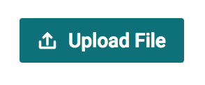 |
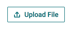 |
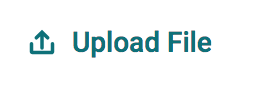 |
Added <hx-div> Utility Element
Components > Box # Scrolling Containers
The <hx-div> element is a non-visual, block-level, utility element that provides scrolling behaviors needed to properly calculate positioned elements like <hx-popover>, <hx-tooltip>, and <hx-menu> when they're nested within an element with position: relative; or position: absolute; (e.g. Modals).
- The
<hx-div>element alone won't fix the position calculation issue, but it provides the functionality needed to do so.
How To Report Scroll Events
If you need to scroll content, you will need to do one of the following:
- Use
<hx-div scroll="...">to automatically report scroll events (recommended), OR - Manually report scroll events with an explicit event listener using
HelixUI.Utils.onScroll.
<!-- automatically reports 'scroll' events -->
<hx-div scroll="..."></hx-div>

<!-- report 'scroll' events with an explicit event listener -->
<div id="scrollingDiv"> ... </div>
<script>
  (function () {
    var elDiv = document.getElementById('scrollingDiv');
    elDiv.addEventListener('scroll', HelixUI.Utils.onScroll);
  })();
</script>
Updated
<hx-search-assistance>element updated to report content scrolling.<hx-tabpanel>element updated to report content scrolling.
Merged
- #316 - chore(file-tile): add focus styles
- #313 - feat(HXDivElement): add
<hx-div>element - #311 - fix(HXIconElement): add ShadowDOM and correct issues
- #309 - refactor(*): refactor imports, exports, and jsdocs
- #307 - docs(*): limit available icons in demos
- #306 - [v0.13.0] Fix Issue 303
- #293 - feat(File Input): add File Input component