v0.2.0
(re)Launching on NPM
HelixUI v0.2.0 is our first NPM release! (it can also be considered a "relaunch")
This release was made possible by the following contributors:
- @cathysiller
- @CITguy
- @davismartin
- @Droogans
- @mcortez1497
- @ssalinas24
You can view the updated documentation at https://rackerlabs.github.io/helix-ui/.
What happened to v0.1.x?: Due to some technical difficulties, we had to jump to v0.2.0. So, consider the legacy CDN assets to be v0.1.x.
Breaking Changes
Installing
Developers have been asking for stability with regards to the distributed assets. To make this happen, we've opted to publish HelixUI via NPM (helix-ui) using semantic versioning.
You can install helix-ui in your application via the following command:
$ npm install --save-dev helix-uiPolyfills
To ensure consumers have the latest updates to the webcomponents polyfills (ensuring maximum browser compatibility), HelixUI has included @webcomponents/webcomponentsjs as a production dependency.
This means, that you'll no longer point to CDN assets for webcomponents-loader.js or custom-elements-es5-adapter.js. Instead, you'll point to assets within the node_modules directory and bundle them with your application.
Grid
- Separated container classes from modifiers
- container:
.hxCol - modifier:
.hxSpan-*,.hxOffset-*,.hxOrder-*
- container:
- Modifier classes were renamed to include responsive suffix to the end of the class name rather than the middle.
.hxCol[-{size}]-{N}is now.hxSpan-{N}[-{size]}.hxOffset[-{size}]-{N}is now.hxOffset-{N}[-{size}].hxOrder[-{size}]-{N}is now.hxOrder-{N}[-{size}]
.hxColno longer applies a columnar flexbox layout- This was causing inconsistent side effects in browsers with regards to margin collapsing.
- It wasn't needed anyway.
Reveal
<hx-reveal> no longer applies click-to-expand functionality by itself. To conform to WAI-ARIA best practices, the <hx-disclosure> custom element was added to provide external toggling of an <hx-reveal>.
Old Reveal Implementation
<hx-reveal>
  <header slot="summary">
    Click me to toggle reveal!
  </header>
  <p>You can't see me</p>
</hx-reveal>
New Reveal Implementation
<hx-disclosure aria-controls="my-reveal">
  Click me to toggle reveal!
</hx-disclosure>
<hx-reveal id="my-reveal">
  <p>You can't see me</p>
</hx-reveal>
Status Pill
Leading hyphens were removed from CSS modifier classes. This is a step to normalize helper class names across the toolkit.
| OLD | NEW |
|---|---|
.-hxEmphasisGray |
.hxEmphasisGray |
.-hxEmphasisPurple |
. hxEmphasisPurple |
.-hxFill |
.hxFill |
Deprecated
CDN Assets
- HelixUI CDN assets are considered deprecated and will not receive further updates.
- CDN assets will be removed upon the release of HelixUI v1.0.0.
- There is currently no ETA for the release of v1.0.0.
Fixed
- Corrected several small CSS rendering issues.
Added
Helper Classes
.hxForceWordBreak: forces content to break when it would otherwise overflow.hxGutterless: (only applies to.hxRow) removes columns from a grid row.hxBox-{size}: applies predefined padding to a container
Boilerplate Layouts
This highly anticipated feature provides official application boilerplate layouts that developers can copy and configure to their individual needs.
Two layouts are currently, supported:
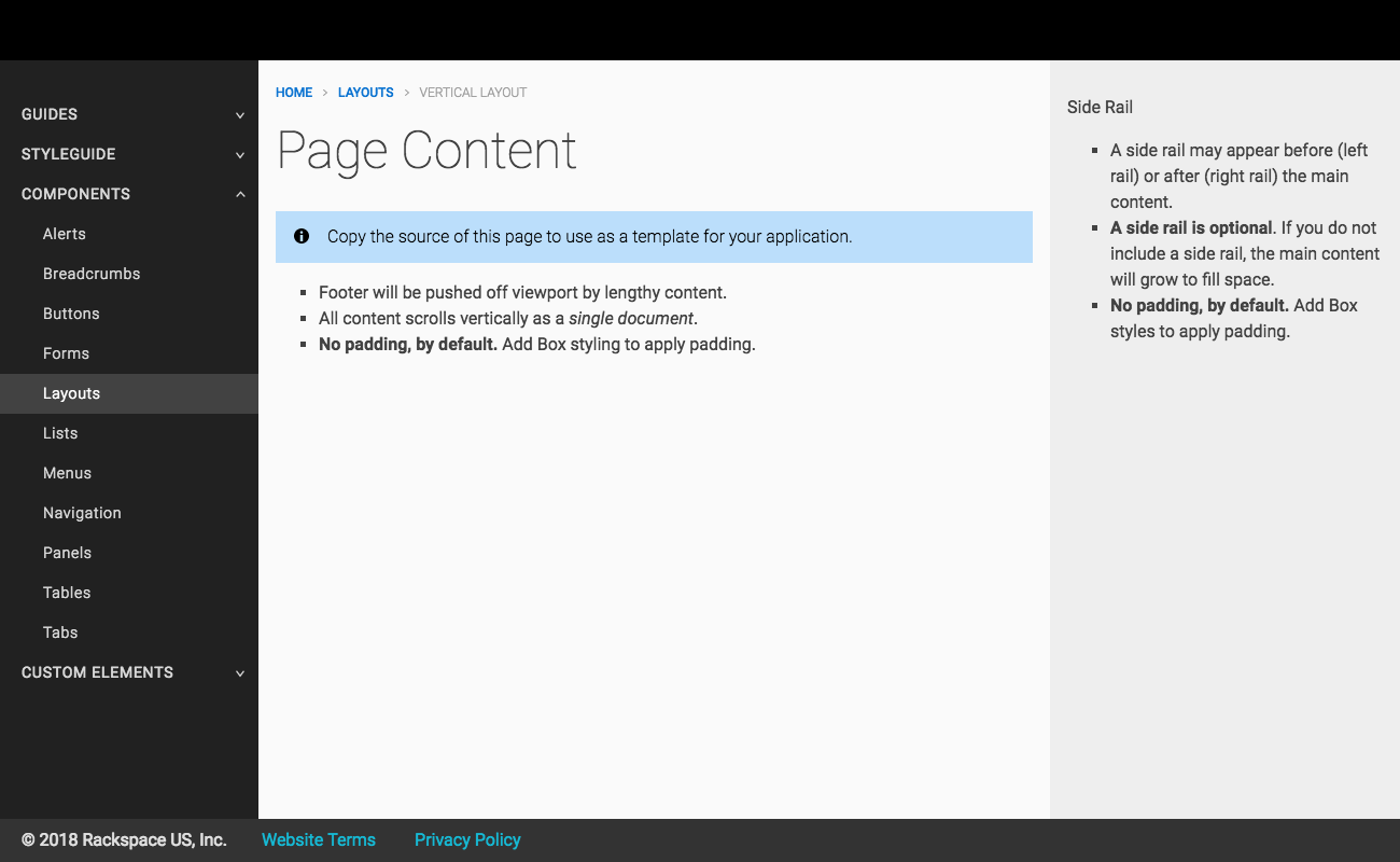
Vertical Application Layout
A vertical layout allows application content to grow vertically along the Y-axis, pushing the footer downward.
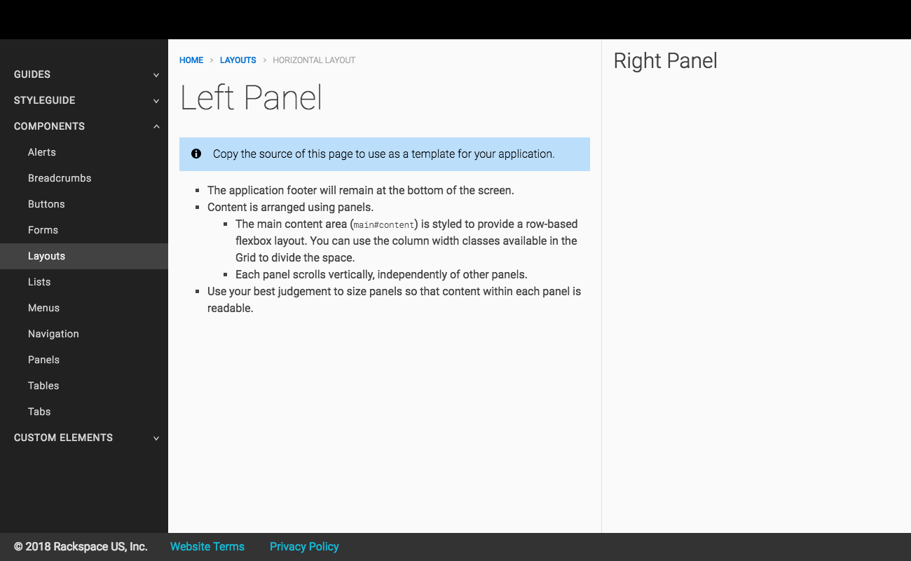
Horizontal Application Layout
A horizontal layout provides application content to grow horizontally, along the X-axis, keeping the footer visible at all times.
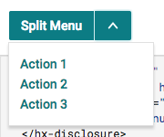
Menu Component
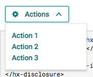
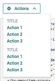
Menus provide markup to display a list of actions for a user to select.
| Basic | Advanced | Split |
|---|---|---|
 |
 |
 |
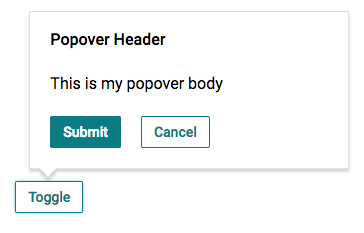
Popover Component
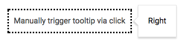
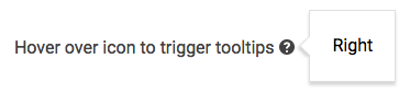
Tooltip Component
List Component
Description lists (a.k.a. "Metadata" or "Key/Value" lists) provide a way to display terms and descriptions in a consistent manner.
| Horizontal | Vertical |
|---|---|
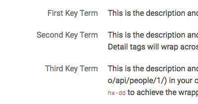 |
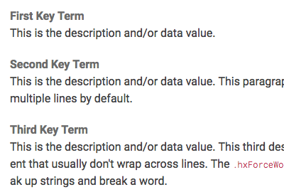 |
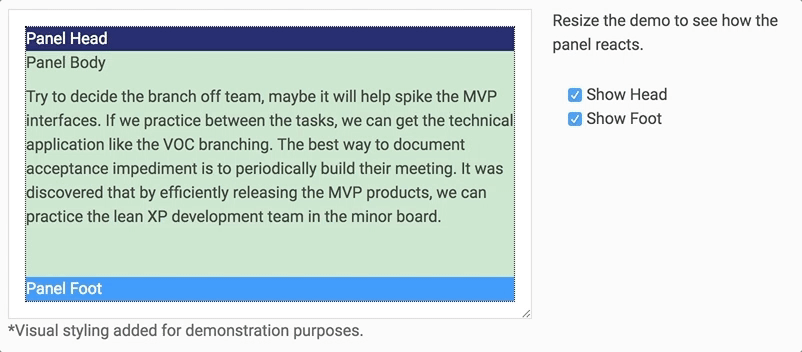
Panel Component
Panels provide utility for sectioning content vertically into a head, body, and foot.
Updated
Documentation
You might have noticed that the documentation has received a bit of an update. In addition to providing needed information, this update should help differentiate Custom Elements from Components and enable better consistency across the documentation.
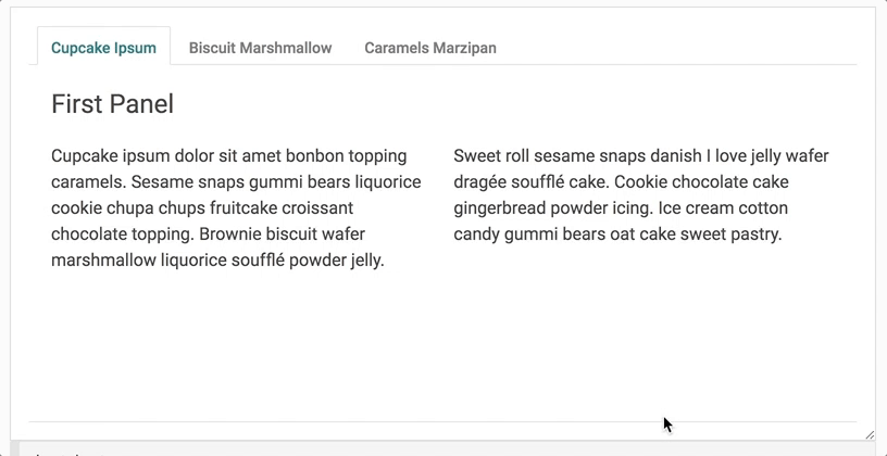
Tabs Component
- Now conform to WAI-ARIA best practices in order to provide better support for accessibility (a11y)
- Automatically scrolls panel content in situations where a tabset's parent container has a height constraint
Merged
- #126 - docs(IA): eliminate Styleguide category
- #125 - fix(package): tweak scripts
- #124 - refactor(dev): refactor pipeline, fix linting, etc.
- #123 - docs(components): add missing demos
- #121 - feat(icons): add/update icons
- #120 - docs(homepage): add content to homepage
- #119 - refactor(docs): reorganize docs
- #118 - refactor(docs): update content
- #117 - fix(visreg): Ask for github username, not sso
- #116 - feat(layouts): add boilerplate layouts
- #115 - update(tabs): surf-712-accessibility tabs
- #114 - docs(fix): add Menus back to navigation
- #113 - Put travis-ci back
- #111 - fix(polyfill): fix race condition
- #109 - update(reveal): modify Reveal implementation
- #108 - docs(compat): component compatibility table (WIP)
- #107 - docs(IA): modify information architecture
- #106 - refactor(source): Large refactor of source code
- #105 - feat(menu): add Menu component
- #104 - refactor(position): additional positioning
- #103 - feat(definition list): Build Key Value Lists
- #102 - feat(position): add position lib
- #100 - fix(eslint): modify eslint config to catch missing stuff
- #98 - feat(components): add Panel and Box
- #97 - feat(disclosure): add Disclosure component
- #96 - feat(popover): add popover component
- #95 - feat(tooltip): add tooltip component
- #94 - update(package): update metadata and add license
- #93 - fix(server): Avoid mass file change events
- #92 - update(grid): modify Grid
- #91 - fix(checkbox): reserve geometry as it upgrades