v0.4.0
Summary
This release was made possible by the following contributors:
- @cathysiller
- @CITguy
- @ssalinas24
- @thiagarajan-n
You can view the updated documentation at https://rackerlabs.github.io/helix-ui/.
Client-Side Framework Compatibility
In the near future, we'll be making updates to existing components to ensure maximum compatibility with client-side libraries. Configuration of custom elements can already be accomplished either via HTML attributes or JavaScript properties (outside-in). In order for custom elements to communicate their own internal state change, they will make use of DOM Events (inside-out).
Simply put...
- Attributes/Properties IN
- Events OUT

Note: Each library will have its own technique to listen for events. Below are some examples of how you might communicate with the updated <hx-checkbox> custom element in some of the popular client-side libraries.
If you are aware of better methods, please let us know so we can help others integrate HelixUI with their own applications.
Angular 1.x
<hx-checkbox my-ng-checkbox ng-model="isChecked"></hx-checkbox>- Create a custom directive (e.g.,
my-ng-checkbox) that works in tandem with theng-modeldirective in order to listen for thechangeevent and update the model value.
React 15+
<hx-checkbox ref={ el => this._element = el }></hx-checkbox>- Add a
changeevent listener tothis._elementin order to keep state in sync with your React application.
VueJS 2.x
<hx-checkbox :checked="isChecked" @change="onChange"></hx-checkbox>- Create a
changeevent listener (e.g.,onChange) to keep state in sync with your Vue application.
Updated Checkboxes
Checkboxes were updated to provide better compatibility with client-side libraries.
- Listen for the
changeevent to keep state in sync with your application.
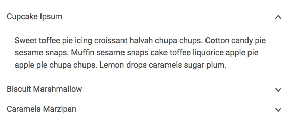
Added Accordions
Added Busy Component
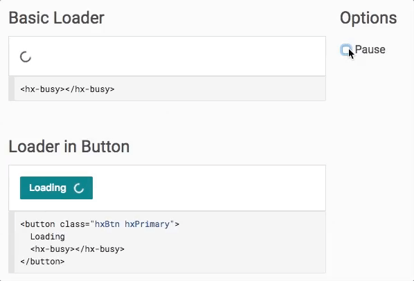
NOTE: IE11 is known to have rendering bugs that are outside of our ability to correct. Under certain conditions, the component may be rendered with a squigglevision-like appearance.

Busy in a button on IE11 - transform calculations result in squigglevision-like rendering.
Added Choice Tiles
Choice Tiles are a stylized variation of a Radio group. In combination with the Grid system, you can build a grid of choices for user selection.
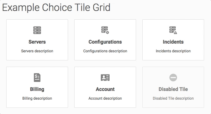
Example Choice Tile Grid - Note that keyboard functionality still works.
Added Search Component
The Search component provides consistent interaction and appearance for a search input.
- Listen for the
inputandchangeevents to keep state in sync with your application.