v0.6.0
Summary
This release was made possible by the following contributors:
- @CITguy
- @cathysiller
- @mcortez1497
You can view the updated documentation at https://rackerlabs.github.io/helix-ui/.
Deprecated
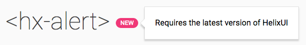
The Alert CSS classes are considered deprecated and will be removed in the HelixUI v1.0.0 release. The new <hx-alert> element should be used instead. (#143)
.hxAlerts.hxAlert.hxAlert__icon.hxAlert__text.hxAlert__action
Fixed
- Corrected a bug with IE11 automatically adding
<svg>elements to the tab order. (#191) - Corrected issue with non-bubbling events not being properly retargeted in polyfilled browsers. (#191)
- Corrected when events emitted in the lifecycle of the following elements: (#191)
<hx-modal><hx-menu>
- Corrected value of
aria-hiddenwhen the following elements connect to the DOM: (#191)<hx-tooltip><hx-popover><hx-modal>
- Corrected value of
aria-expandedwhen<hx-tabpanel>connects to the DOM (#191)
Added
Events
Several custom elements now emit new events to make it easier to compose reactive UIs.
| Element | New Events |
|---|---|
<hx-accordion> |
panelchange |
<hx-accordion-panel> |
close |
<hx-alert> |
submit, dismiss |
<hx-menu> |
open, close |
<hx-popover> |
open, close |
<hx-reveal> |
open, close |
<hx-search> |
focus, blur |
<hx-search-assistance> |
open, close |
<hx-tabpanel> |
open, close |
<hx-tabset> |
tabchange |
<hx-tooltip> |
open, close |
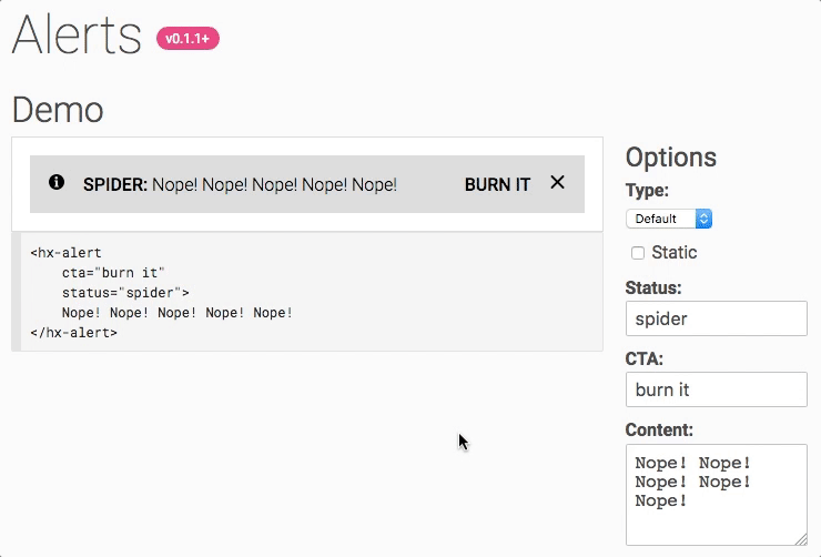
<hx-alert>
Components > Alerts
Elements > <hx-alert>
The Alert component was updated to make use of the brand new <hx-alert> element. This new element makes it easy to add meaningful alert bars in your applications.
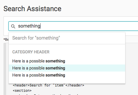
Search Assistance
Note: Consumers will be responsible for wiring up behavior around when to show/hide the search assistance. The <hx-search-assitance> element only knows how to open, not when to open.
Updated
Minimum Version Documentation
Documentation now includes information about the minimum version required to consume a component or element. Please note that elements for a component may not have been added in the same version, please be weary of additional versions in the docs.
new element (minimum version unknown)
minimum version known
sub-component added in different version
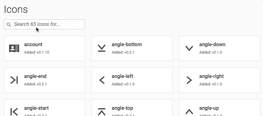
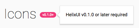
Filterable Icons
In addition to adding information about minimum version for each icon, the Icons documentation has been updated to provide filtering capabilities by the icon name.