Releases: HelixDesignSystem/helix-ui
v0.9.2
v0.9.1
v0.9.0
Summary
This release was made possible by the following contributors:
- @cathysiller
- @CITguy
- @jpangelle
You can view documentation at https://rackerlabs.github.io/helix-ui/.
Breaking Changes
- HelixUI has updated the
@webcomponents/webcomponentsjsdependency to 2.0 to take advantage of its improvements in order to minimize required polyfills.- Please review their documentation to get familiar with the changes needed to consume their assets.
Fixed
- Corrected Flexbox implementation of Key/Value lists to work in IE (#230)
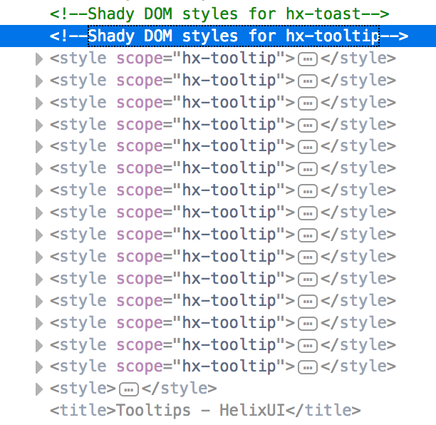
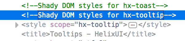
- Reduced the likelihood of ShadyDOM elements getting accidentally styled by LightDOM CSS. (We cannot completely eliminate collisions, due to the fundamental behavior of CSS) (#232)
- Corrected CSS to ensure that elements with the
.hxBtnclass are defined as inline-block elements. (#236)
Added
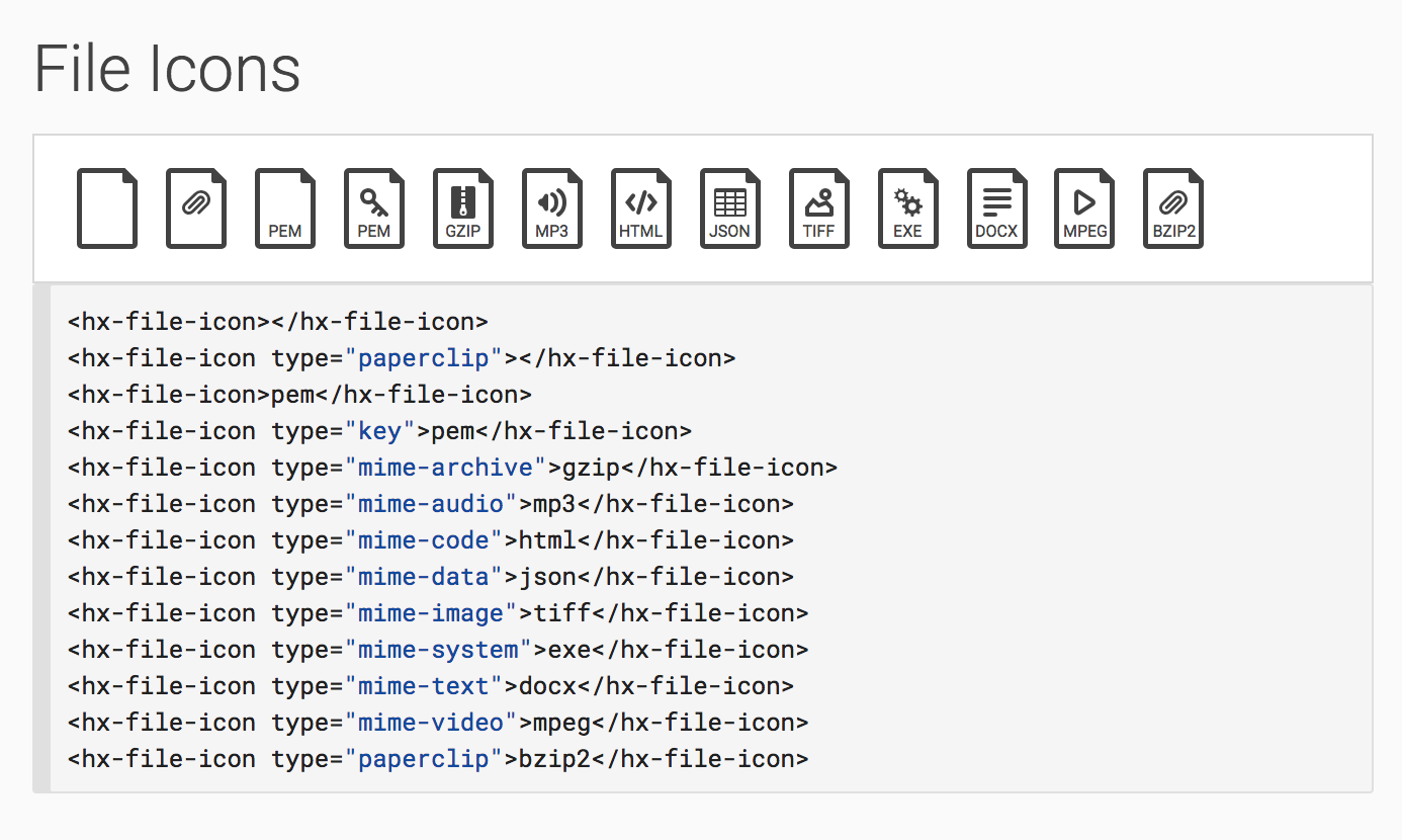
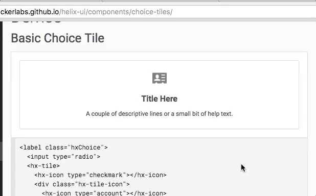
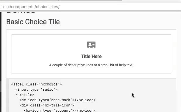
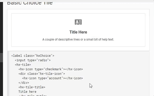
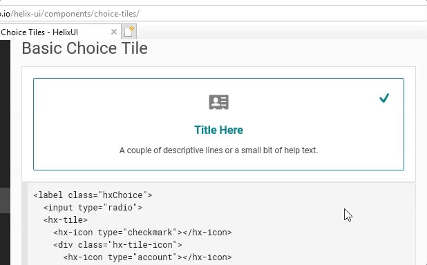
Components > Icons : File Icons
Added the <hx-file-icon> element to aid in building icons useful for describing attached files. (#229)
Updated
- Navigation has been split from the Layouts component to Components > Navigation. (#235)
- The way that HelixUI consumes the webcomponents polyfills (specifically ShadyCSS) has been optimized to reduce unnecessary setup logic when instantiating custom elements on the page. This results in quicker instantiation which improves performance for polyfilled browsers (Firefox, Edge, IE). (#231)
| before | after |
|---|---|
 |
 |
Merged
- #236 - fix(Buttons): correct button display CSS
- #235 - Refactoring
- #232 - fix(styles): update shadowdom prefix styles with hx
- #231 - perf(HXElement): prevent unnecessary ShadyCSS behavior
- #230 - fix(CSS) Change flex values for IE11 support
- #229 - feat(hx-file-icon): new element styles added for hx-file-icon
v0.8.0
Summary
This release was made possible by the following contributors:
- @cathysiller
- @CITguy
You can view documentation at https://rackerlabs.github.io/helix-ui/.
Deprecated
- The "export" icon has been deprecated in favor of the "upload" icon. (#220)
Fixed
Corrected a styling issue with the magnifying glass in <hx-search> (#220)
| before | after |
|---|---|
 |
 |
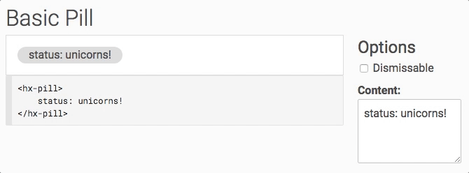
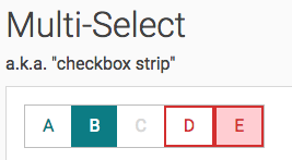
Added Pill Component
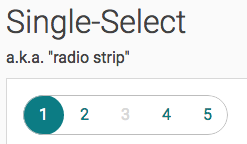
Added Selector Strip Component
Components > Selector Strips (#222)
Updated
- All element documentation has been updated to include metadata about emitted events (#224)
Merged
v0.7.0
Summary
This release was made possible by the following contributors:
- @cathysiller
- @CITguy
You can view documentation at https://rackerlabs.github.io/helix-ui/.
Deprecated
input-urlicon deprecated, useglobeinstead (#213)technical-changeicon deprecated, useserver-configinstead (#213)technical-incidenticon deprecated, useserver-incidentinstead (#213)
Fixed
- Replaced non-compliant icons with newly designed images (#213)
- Corrected geometry of several icons to better align with pixel boundaries (#213)
- Applied
min-width: 0;to grid columns to fix text wrapping issues. (#199) - Corrected vertical alignment of
<hx-icon>when used inline with text. (#209) - Corrected color of placeholder text to adhere to redline specs (#217)
Added
- Added
.hxTruncatehelper to provide ellipsis truncation of a block element (#199) - Added the following icons: (#213)
fileflagglobekeymime-archivemime-audiomime-codemime-datamime-imagemime-systemmime-textmime-videopaperclipserver-configserver-incident
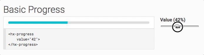
New Progress Component
A simple, no-nonsense way to visually indicate progress of a process. (#215)
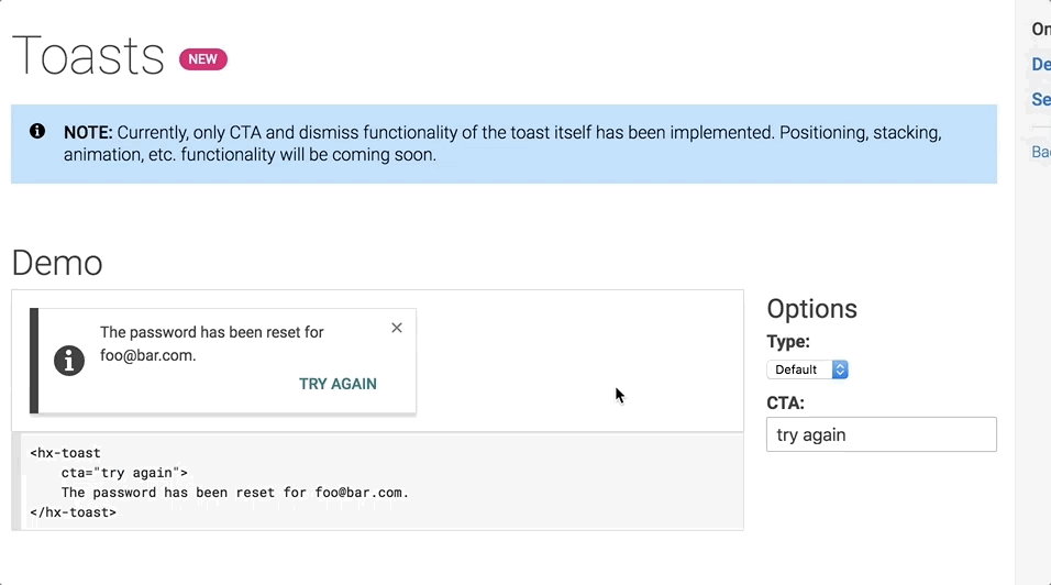
New Toasts Component
NOTE: this only provides basic appearance and behavior of Toast notifications. Advanced configuration and behavior is coming soon. (#210)
New Low-Level APIs
HXElement has been updated to make it easier than ever to define custom elements.
static get is-- Now required by all subclasses (not a problem, given that every subclass already defines it).static get template-- a shadow root will be created if this is defined in the subclassstatic get $observedAttributes-- used by$onAttributeChange()to react to attribute changes$onCreate()-- called at the end of construction$onConnect()-- called at the end ofconnectedCallback()$onDisconnect()-- called at the end ofdisconnectedCallback()$onAttributeChange()-- called when attributes defined instatic get $observedAttributeschange values.
Updated
- Updated
HXElementmethods to provide HelixUI syntactic sugar on top of the native custom elements APIs to help with contributions. A developer's guide is coming soon.
Updated CSS
- Updated CSS source file load order to provide a better progression of CSS specificity in the generated output. (#198)
- Removed unused CSS styles (#198)
Updated Docs
- Updated Icons docs to allow filtering of icons based on keyword. (#213)
- Update minimum version for
<hx-search-assistance>element (#206) - Improved
hx-tab*element documentation with attribute/property types and default values (#198) - Improved normalization of documentation formatting (#214)
- Current version number in footer updated to link to GitHub release notes (#204)
- Added link to GitHub repo on home page (#204)
Merged
- #218 - fix(ShadowDOM): fix broken elements
- #217 - fix(CSS): correct placeholder color
- #216 - Begin adding JSDoc comments
- #215 - feat(Progress): Add Progress component
- #214 - refactor(element-docs): make elements documentations in sync
- #213 - feat(Icons): Update Icons
- #210 - feat(toasts): add styles for toasts
- #209 - fix(hx-icon): correct alignment of
- #206 - docs(minver): update minver for hx-search-assistance
- #204 - docs(layout): Add GitHub links
- #199 - refactor(*): updates based on feedback
- #198 - refactor(*): free friday
v0.6.1
Summary
This release was made possible by the following contributors:
You can view documentation at https://rackerlabs.github.io/helix-ui/.
New Polyfills
The usage of polyfill.io is being deprecated in favor of an internally-maintained list of polyfills to reduce the risk of external points of failure. These new polyfills can be loaded in addition to polyfill.io or not at all. If they are not included, polyfill.io will pick up the slack, but keep in mind that you will eventually need to switch to the included polyfills.
The polyfills are available in two versions:
dist/scripts/helix-ui.polyfills.jsdist/scripts/helix-ui.polyfills.min.js
Layout templates have been updated to include these new polyfills.
Polyfill.io
Do not remove polyfill.io from your layout. Doing so will likely break your application.
The new polyfills do not meet minimum requirements to drop support for polyfill.io just yet. We'll be adding functionality to the new polyfills in upcoming releases of HelixUI.
Fixed
- ShadyDOM (polyfilled browsers)
- Prevent rewritten markup from accidentally submitting forms (#193)
- CSS
- HXElement
Merged
v0.6.0
Summary
This release was made possible by the following contributors:
- @CITguy
- @cathysiller
- @mcortez1497
You can view the updated documentation at https://rackerlabs.github.io/helix-ui/.
Deprecated
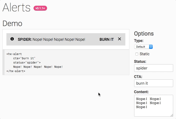
The Alert CSS classes are considered deprecated and will be removed in the HelixUI v1.0.0 release. The new <hx-alert> element should be used instead. (#143)
.hxAlerts.hxAlert.hxAlert__icon.hxAlert__text.hxAlert__action
Fixed
- Corrected a bug with IE11 automatically adding
<svg>elements to the tab order. (#191) - Corrected issue with non-bubbling events not being properly retargeted in polyfilled browsers. (#191)
- Corrected when events emitted in the lifecycle of the following elements: (#191)
<hx-modal><hx-menu>
- Corrected value of
aria-hiddenwhen the following elements connect to the DOM: (#191)<hx-tooltip><hx-popover><hx-modal>
- Corrected value of
aria-expandedwhen<hx-tabpanel>connects to the DOM (#191)
Added
Events
Several custom elements now emit new events to make it easier to compose reactive UIs.
| Element | New Events |
|---|---|
<hx-accordion> |
panelchange |
<hx-accordion-panel> |
close |
<hx-alert> |
submit, dismiss |
<hx-menu> |
open, close |
<hx-popover> |
open, close |
<hx-reveal> |
open, close |
<hx-search> |
focus, blur |
<hx-search-assistance> |
open, close |
<hx-tabpanel> |
open, close |
<hx-tabset> |
tabchange |
<hx-tooltip> |
open, close |
<hx-alert>
Components > Alerts
Elements > <hx-alert>
The Alert component was updated to make use of the brand new <hx-alert> element. This new element makes it easy to add meaningful alert bars in your applications.
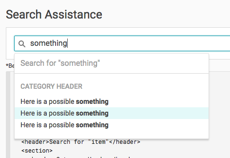
Search Assistance
Note: Consumers will be responsible for wiring up behavior around when to show/hide the search assistance. The <hx-search-assitance> element only knows how to open, not when to open.
Updated
Minimum Version Documentation
Documentation now includes information about the minimum version required to consume a component or element. Please note that elements for a component may not have been added in the same version, please be weary of additional versions in the docs.
new element (minimum version unknown)
minimum version known
sub-component added in different version
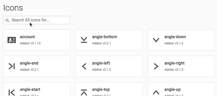
Filterable Icons
In addition to adding information about minimum version for each icon, the Icons documentation has been updated to provide filtering capabilities by the icon name.
Merged
v0.5.2
v0.5.1

v0.5.0
Summary
This release was made possible by the following contributors:
- @CITguy
- @cathysiller
You can view the updated documentation at https://rackerlabs.github.io/helix-ui/.
Breaking Changes
- The
<hx-search>element now emits a "clear" event instead of a "change" event when the value is cleared by the user via the "X". This prevents issues with the "change" event being emitted twice in polyfilled browsers by emitting a different event. (#177)
Fixed
- Corrected CSS for Accordions in polyfilled browsers (#176)
- Corrected emitted events from Checkbox and Search components (#177)
- Corrected CSS for the "X" in the Alert component (#178)
Added
Pagination