Releases: HelixDesignSystem/helix-ui
v0.4.2
Summary
This release was made possible by the following contributors:
You can view the updated documentation at https://rackerlabs.github.io/helix-ui/.
Fixed
In addition to the below corrections, the NPM assets were also corrected to include missing CSS. We're not sure what happened with those assets in the previous release, but we'll be keeping a close eye on them from now on.
- Corrected greedy CSS selector for headers in the Stepper - BETA (#172)
- Corrected vertical padding for Textareas (#171)
- Corrected alignment of "X" icon in the Search component (#170)
Merged
v0.4.1
Summary
This release was made possible by the following contributors:
You can view the updated documentation at https://rackerlabs.github.io/helix-ui/.
Fixed
- Updated Layouts to support single-page applications (SPAs) (BREAKING CHANGE - #162)
- Corrected extra space appearing below headings that are the only child (#162)
- Corrected CSS styling of "arrows" for Tooltips and Popovers (#162)
- Corrected Button fonts (#162)
- Correct double "X" on Windows (#162)
- Correct null value reference with Tabs component (#158)
Added
Skip Links
Added support for "skip links" behavior for accessibility. (#162)
- Add
<a href="#content">Skip to main content</a>as the first child of<body>
...
<body>
  <a href="#content">Skip to main content</a>
  ...
</body>
HTML5 Resets
CSS resets have been added to support HTML5 elements in legacy browsers. (#162)
Breaking Changes
This release introduces breaking changes as a result of various changes to correct issues.
Changed Layouts
!!! BREAKING CHANGE !!!
The markup required to implement supported layouts has been changed slightly to support SPAs and provide better support for accessible user agents. (#162)
- Wrap
<div id="stage">in a<div id="app">- mount your SPA on
<div id="app"> - use
<div id="stage">as the root element for your application template
- mount your SPA on
- Add
role="main"to<main id="content">to ensure maximum compatibility with accessible user agents.
before
...
<body>
  <header id="head">...</header>

  <div id="stage">
    <nav id="nav">...</nav>
    <main id="content">...</main>
    <aside class="hxSiderail">...</aside>
  </div>

  <footer id="foot">...</footer>

  ...
</body>
after
...
<body>
<header id="head">...</header>
<div id="app"><!-- Mount SPA here -->
<div id="stage">
<nav id="nav">...</nav>
<main role="main" id="content">
<!-- ^ Don't forget the "role" attribute! -->
</main>
<aside class="hxSiderail">...</aside>
</div>
</div>
<footer id="foot">...</footer>
...
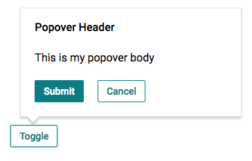
</body>Changed Popovers
!!! BREAKING CHANGE !!!
Popovers have been updated to ensure that its contents will scroll if they get too long. This update requires a change in the markup to apply the fix. (#162)
before
<hx-popover>
  <header slot="header">
    <h3 class="hxHeading-4">Popover Heading</h3>
  </header>

  <p>I'm in the body.</p>

  <footer slot="footer">...</footer>
</hx-popover>
after
<hx-popover>
  <hx-popover-head>Popover Heading</hx-popover-head>

  <hx-popover-body>
    <p>I'm in the body.</p>
  </hx-popover-body>

  <hx-popover-foot>...</hx-popover-foot>
</hx-popover>
Merged
v0.4.0
Summary
This release was made possible by the following contributors:
- @cathysiller
- @CITguy
- @ssalinas24
- @thiagarajan-n
You can view the updated documentation at https://rackerlabs.github.io/helix-ui/.
Client-Side Framework Compatibility
In the near future, we'll be making updates to existing components to ensure maximum compatibility with client-side libraries. Configuration of custom elements can already be accomplished either via HTML attributes or JavaScript properties (outside-in). In order for custom elements to communicate their own internal state change, they will make use of DOM Events (inside-out).
Simply put...
- Attributes/Properties IN
- Events OUT

Note: Each library will have its own technique to listen for events. Below are some examples of how you might communicate with the updated <hx-checkbox> custom element in some of the popular client-side libraries.
If you are aware of better methods, please let us know so we can help others integrate HelixUI with their own applications.
Angular 1.x
<hx-checkbox my-ng-checkbox ng-model="isChecked"></hx-checkbox>- Create a custom directive (e.g.,
my-ng-checkbox) that works in tandem with theng-modeldirective in order to listen for thechangeevent and update the model value.
React 15+
<hx-checkbox ref={ el => this._element = el }></hx-checkbox>- Add a
changeevent listener tothis._elementin order to keep state in sync with your React application.
VueJS 2.x
<hx-checkbox :checked="isChecked" @change="onChange"></hx-checkbox>- Create a
changeevent listener (e.g.,onChange) to keep state in sync with your Vue application.
Updated Checkboxes
Checkboxes were updated to provide better compatibility with client-side libraries.
- Listen for the
changeevent to keep state in sync with your application.
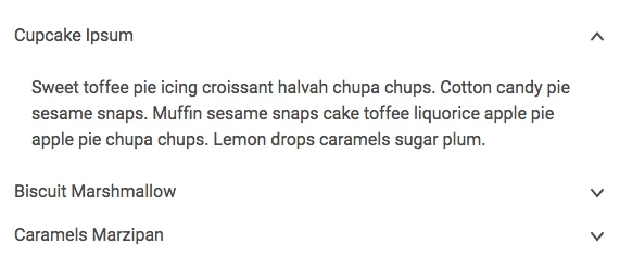
Added Accordions
Added Busy Component
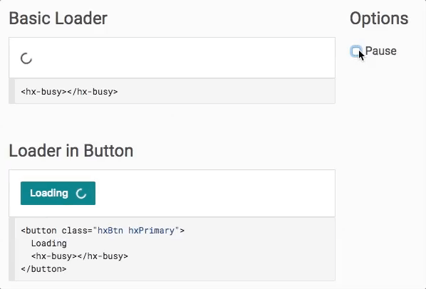
NOTE: IE11 is known to have rendering bugs that are outside of our ability to correct. Under certain conditions, the component may be rendered with a squigglevision-like appearance.
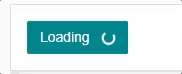
Busy in a button on IE11 - transform calculations result in squigglevision-like rendering.
Added Choice Tiles
Choice Tiles are a stylized variation of a Radio group. In combination with the Grid system, you can build a grid of choices for user selection.
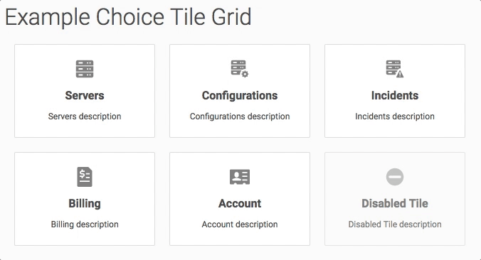
Example Choice Tile Grid - Note that keyboard functionality still works.
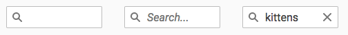
Added Search Component
The Search component provides consistent interaction and appearance for a search input.
- Listen for the
inputandchangeevents to keep state in sync with your application.
Merged
v0.3.0
Summary
This release was made possible by the following contributors:
You can view the updated documentation at https://rackerlabs.github.io/helix-ui/.
Fixed
- Corrected inverted
aria-expandedvalue on<hx-menu>(#135) - Corrected
[disabled]behavior for<hx-disclosure>(#131) - Corrected CSS bug in the layout that was allowing long, unbreakable content to force the stage to be wider than the viewport. (#131)
- Corrected external element lookup for several custom elements to support composition within more complex components (#142)
document.lookupFn()-->this.getRootNode().lookupFn()
Deprecated
Several CSS styles have been marked as deprecated for removal in the v1.0.0 release of HelixUI.
- BEM-style CSS classes (#131)
- non-"hx"-prefixed classes (#131)
- CSS classes used to apply default styling (#136, #131)
Please use the reference table below to update your markup.
| Old Selector | New Selector | Notes |
|---|---|---|
.hxBtn--lg |
.hxBtn.hxLg |
n/a |
.hxBtn--link |
.hxBtn.hxLink |
n/a |
.hxBtn--primary |
.hxBtn.hxPrimary |
n/a |
.hxBtn--sm |
.hxBtn.hxSm |
n/a |
.hxBtnGroup > .hxPrimary |
.hxBtnGroup.hxPrimary |
n/a |
.hxPageTitle |
h1 or .hxHeading-1 |
<h1> should work for most cases |
.hxSectionTitle |
h2 or .hxHeading-2 |
<h2> should work for most cases |
.hxSubSectionTitle |
h3 or .hxHeading-3 |
<h3> should work for most cases |
.hxContainerTitle |
h4 or .hxHeading-4 |
<h4> should work for most cases |
.hxLabel |
h5 or .hxHeading-5 |
<h5> should work for most cases |
.hxTable tbody tr.selected |
.hxTable tbody tr.hxSelected |
n/a |
.hxTable--bordered |
.hxTable.hxBound |
n/a |
.hxTable__control-col |
th.hxControl, td.hxControl |
n/a |
.hxTable--hover |
.hxTable.hxHoverable |
n/a |
.text-center |
.hxCenter |
n/a |
.text-justify |
no replacement | n/a |
.text-left |
.hxLeft |
n/a |
.text-nowrap |
.hxNoWrap |
n/a |
.text-right |
.hxRight |
n/a |
hx-disclosure > .menu-icon |
hx-disclosure > hx-icon.hxPrimary |
indicates which icons get flipped on toggle |
hx-menu.hxBox-sm |
hx-menu |
no need for extra CSS classes to apply default styles |
hx-menuitem.hxBtn.hxBtn--link |
hx-menuitem |
no need for extra CSS classes to apply default styles |
Updated
In addition to components listed below, the documentation itself was updated to provide better cross-linking, more consistent styling, and more robust demos. (#131)
Buttons
Four new modifier CSS classes are available to change the appearance of your buttons. These classes are meant to replace the old BEM-style classes in order to provide standardization around modification of button styles. (#131)
- Variants:
.hxPrimary,.hxLink - Sizing:
.hxLg,.hxSm
Button Groups
Button groups were previously undocumented (it was technically documented with split Menu), so we've added official documentation for button group implementation. (#131)
Button group styling has been made more robust and simpler to implement. Because button groups are usually the same button style, it makes sense to apply that style once across all buttons. The same modifiers added for Buttons can also be used on Button Groups. (#131)
Before
<div class="hxBtnGroup">
  <button class="hxBtn hxBtn--primary">Button 1</button>
  <button class="hxBtn hxBtn--primary">Button 2</button>
  <button class="hxBtn hxBtn--primary">Button 3</button>
</div>
After
<div class="hxBtnGroup hxPrimary">
  <button class="hxBtn">Button 1</button>
  <button class="hxBtn">Button 2</button>
  <button class="hxBtn">Button 3</button>
</div>
Menus
The Menu component has been updated to provide better accessibility for users with screen readers.
role="menu"automatically applied to<hx-menu>(#135)role="menuitem"automatically applied to<hx-menuitem>(#135)
Cog Menu
Cog menu styles have been added. You can apply the styles by adding the .hxCog class in addition to .hxBtn. (#138)
Popovers
- Corrected CSS inheritance issue pertaining to ShadowDOM markup. (#139)
Typography
Heading styles have been simplified. The old CSS classes are no longer needed to apply default heading styles. Semantic HTML heading tags (h1-h6) should handle most use cases, but the CSS classes listed below have been added if you need to override default heading styles. (#136)
.hxHeading-1.hxHeading-2.hxHeading-3.hxHeading-4.hxHeading-5
Merged
- #142 - fix(getRootNode): correct root node element lookup
- #139 - fix(popover): correct ShadowDOM CSS
- #138 - feat(button): Cog Menu
- #136 - feat(typography): Modify Heading styles
- #135 - fix(menus): correct ARIA attributes
- #132 - Tabs tests
- #131 - fix(papercuts): update lots of small annoyances and bugs
v0.2.1
Summary
This release was made possible by the following contributors:
You can view the updated documentation at https://rackerlabs.github.io/helix-ui/.
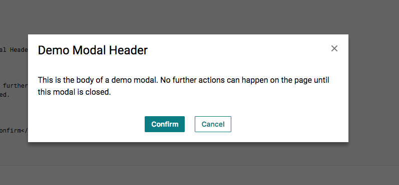
New Modal Component
Updated Icons
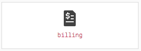
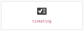
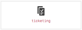
| Before | After |
|---|---|
| n/a | 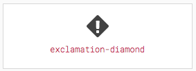 |
| n/a |  |
| n/a |  |
| n/a |  |
| n/a |  |
 |
 |
 |
 |
 |
 |
 |
 |
Merged
v0.2.0
(re)Launching on NPM
HelixUI v0.2.0 is our first NPM release! (it can also be considered a "relaunch")
This release was made possible by the following contributors:
- @cathysiller
- @CITguy
- @davismartin
- @Droogans
- @mcortez1497
- @ssalinas24
You can view the updated documentation at https://rackerlabs.github.io/helix-ui/.
What happened to v0.1.x?: Due to some technical difficulties, we had to jump to v0.2.0. So, consider the legacy CDN assets to be v0.1.x.
Breaking Changes
Installing
Developers have been asking for stability with regards to the distributed assets. To make this happen, we've opted to publish HelixUI via NPM (helix-ui) using semantic versioning.
You can install helix-ui in your application via the following command:
$ npm install --save-dev helix-uiPolyfills
To ensure consumers have the latest updates to the webcomponents polyfills (ensuring maximum browser compatibility), HelixUI has included @webcomponents/webcomponentsjs as a production dependency.
This means, that you'll no longer point to CDN assets for webcomponents-loader.js or custom-elements-es5-adapter.js. Instead, you'll point to assets within the node_modules directory and bundle them with your application.
Grid
- Separated container classes from modifiers
- container:
.hxCol - modifier:
.hxSpan-*,.hxOffset-*,.hxOrder-*
- container:
- Modifier classes were renamed to include responsive suffix to the end of the class name rather than the middle.
.hxCol[-{size}]-{N}is now.hxSpan-{N}[-{size]}.hxOffset[-{size}]-{N}is now.hxOffset-{N}[-{size}].hxOrder[-{size}]-{N}is now.hxOrder-{N}[-{size}]
.hxColno longer applies a columnar flexbox layout- This was causing inconsistent side effects in browsers with regards to margin collapsing.
- It wasn't needed anyway.
Reveal
<hx-reveal> no longer applies click-to-expand functionality by itself. To conform to WAI-ARIA best practices, the <hx-disclosure> custom element was added to provide external toggling of an <hx-reveal>.
Old Reveal Implementation
<hx-reveal>
  <header slot="summary">
    Click me to toggle reveal!
  </header>
  <p>You can't see me</p>
</hx-reveal>
New Reveal Implementation
<hx-disclosure aria-controls="my-reveal">
  Click me to toggle reveal!
</hx-disclosure>
<hx-reveal id="my-reveal">
  <p>You can't see me</p>
</hx-reveal>
Status Pill
Leading hyphens were removed from CSS modifier classes. This is a step to normalize helper class names across the toolkit.
| OLD | NEW |
|---|---|
.-hxEmphasisGray |
.hxEmphasisGray |
.-hxEmphasisPurple |
. hxEmphasisPurple |
.-hxFill |
.hxFill |
Deprecated
CDN Assets
- HelixUI CDN assets are considered deprecated and will not receive further updates.
- CDN assets will be removed upon the release of HelixUI v1.0.0.
- There is currently no ETA for the release of v1.0.0.
Fixed
- Corrected several small CSS rendering issues.
Added
Helper Classes
.hxForceWordBreak: forces content to break when it would otherwise overflow.hxGutterless: (only applies to.hxRow) removes columns from a grid row.hxBox-{size}: applies predefined padding to a container
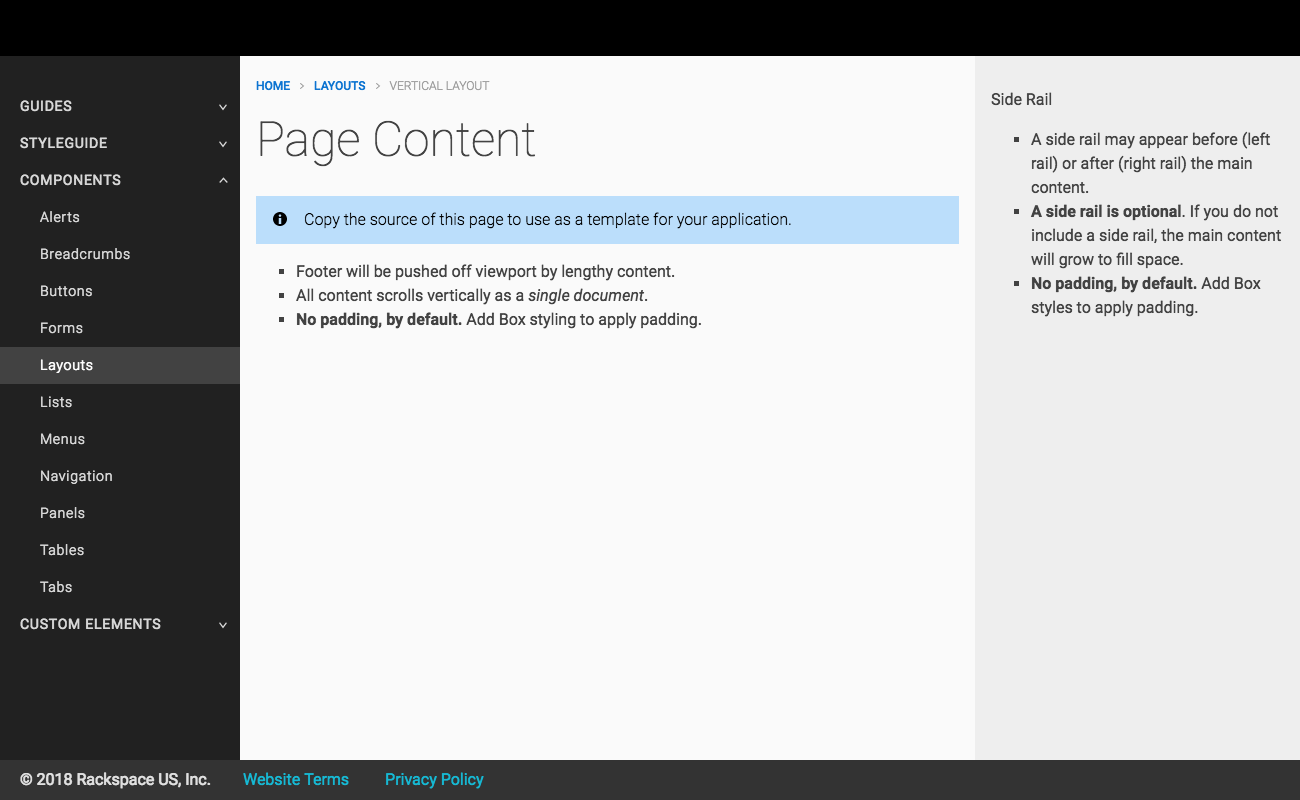
Boilerplate Layouts
This highly anticipated feature provides official application boilerplate layouts that developers can copy and configure to their individual needs.
Two layouts are currently, supported:
Vertical Application Layout
A vertical layout allows application content to grow vertically along the Y-axis, pushing the footer downward.
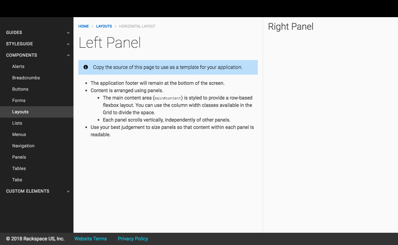
Horizontal Application Layout
A horizontal layout provides application content to grow horizontally, along the X-axis, keeping the footer visible at all times.
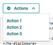
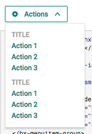
Menu Component
Menus provide markup to display a list of actions for a user to select.
| Basic | Advanced | Split |
|---|---|---|
 |
 |
 |
Popover Component
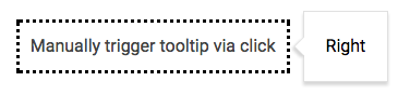
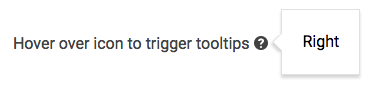
Tooltip Component
List Component
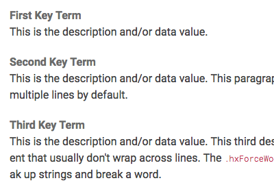
Description lists (a.k.a. "Metadata" or "Key/Value" lists) provide a way to display terms and descriptions in a consistent manner.
| Horizontal | Vertical |
|---|---|
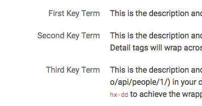 |
 |
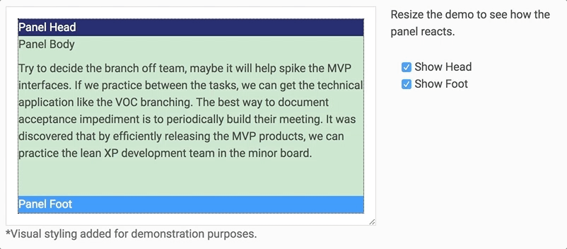
Panel Component
Panels provide utility for sectioning content vertically into a head, body, and foot.
Updated
Documentation
You might have noticed that the documentation has received a bit of an update. In addition to providing needed information, this update should help differentiate Custom Elements from Components and enable better consistency across the documentation.
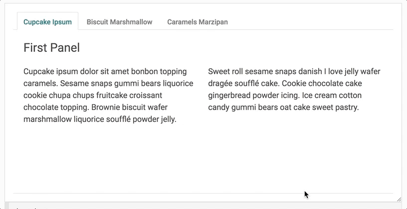
Tabs Component
- Now conform to WAI-ARIA best practices in order to provide better support for accessibility (a11y)
- Automatically scrolls panel content in situations where a tabset's parent container has a height constraint
Merged
- #126 - docs(IA): eliminate Styleguide category
- #125 - fix(package): tweak scripts
- #124 - refactor(dev): refactor pipeline, fix linting, etc.
- #123 - docs(components): add missing demos
- #121 - feat(icons): add/update icons
- #120 - docs(homepage): add content to homepage
- #119 - refactor(docs): reorganize docs
- #118 - refactor(docs): update content
- #117 - fix(visreg): Ask for github username, not sso
- #116 - feat(layouts): add boilerplate layouts
- #115 - update(tabs): surf-712-accessibility tabs
- #114 - docs(fix): add Menus back to navigation
- #113 - Put travis-ci back
- #111 - fix(polyfill): fix race condition
- #109 - update(reveal): modify Reveal implementation
- #108 - docs(compat): component compatibility table (WIP)
- #107 - docs(IA): modify information architecture
- #106 - refactor(source): Large refactor of source code
- #105 - feat(menu): add Menu component
- #104 - refactor(position): additional positioning
- #103 - feat(definition list): Build Key Value Lists
- #102 - feat(position): add position lib
- #100 - fix(eslint): modify eslint config to catch missing stuff
- #98 - feat(components): add Panel and Box
- #97 - feat(disclosure): add Disclosure component
- #96 - feat(popover): add popover component
- #95 - feat(tooltip): add tooltip component
- #94 - update(package): update metadata and add license
- #93 - fix(server): Avoid mass file change events
- #92 - update(grid): modify Grid
- #91 - fix(checkbox): reserve geometry as it upgrades
v0.1.14
v0.1.13
Released: 2017-11-17
Fixed
- Fixed an issue with inherited CSS properties in the composed element tree.
- CSS inheritance is based on the composed tree, not the written tree (meaning that styles in ShadowDOM can be inherited in the LightDOM).
Merged
- #88 - fix(CSS): correct style inheritance with
<slot>
v0.1.12
Released: 2017-11-15
Removed
Helix Bootstrap Theme
The bootstrap theme is no longer being maintained. We've done one final compilation of the CSS file and migrated it to the CDN. As such, the core HelixUI styles no longer depend on base Bootstrap CSS.
Normalize.css
HelixUI's dependency on normalize.css was found to be largely unnecessary and removed as a result.
Added
- Text Input styles
Fixed
- corrected pre-upgrade styling of
<hx-icon>
Merged
- #86 - test(misc): misc test fixes
- #85 - update(inputs): update Text Input styles to CSS classes
- #84 - chore(linting): add automatic JS linting
- #82 - test(regression): Add auto-generated "data-visreg" tests
- #81 - remove(bs): remove Bootstrap dependency
- #80 - fix(icon): correct CSS geometry before element upgrade
- #78 - remove(bs.helix): move bootstrap theme to CDN
- #77 - remove(normalize.css): removing unneeded source file
- #76 - feat(input): add Text Input styles
v0.1.11
Released: 2017-11-08
Added
- Tabs component
Removed
fanatiguyicon removed- Badge component docs
- Blockquote component docs
- Dropdown component docs
- Form component docs
- List component docs
- Modal component docs
- Pagination component docs
- Progress Bar component docs