Base Card #481
Description
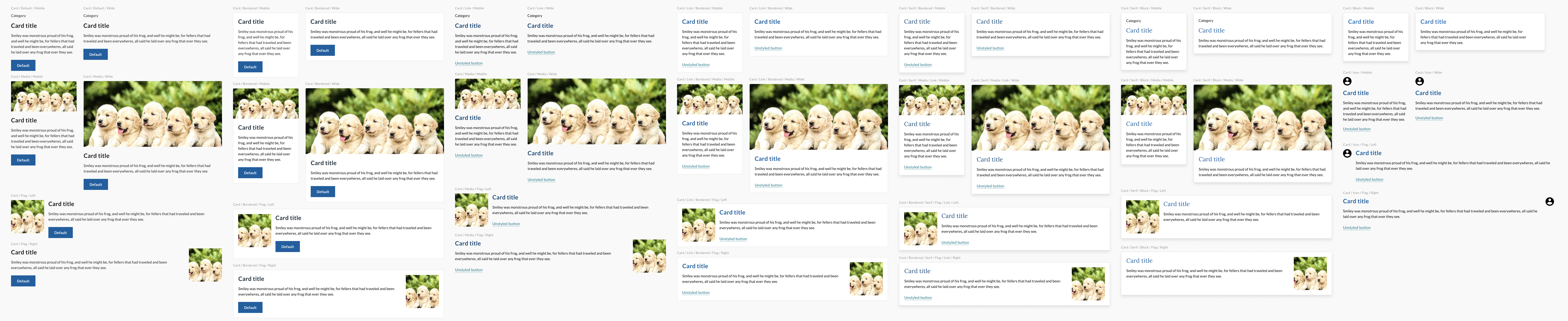
Cards contain content and actions about a single subject.
When to use the card component
- Collections of related content. When you need to present a collection of related groups of content, like articles or sections of a website.
When to consider something else
- Tabular data. Don't use a card as a substitute for a table row.
- Simple calls to action. Use a button instead.
- Standalone content. Consider an aside or another standalone element.
- Sequential, continuous text. Cards should be self-contained and modular. If the reader is meant to read from card to card, consider a list or simple body text and headings.
Usability guidance
- Make cards actionable. Since cards are used as a summary of more detailed information, any individual card should link out to that information.
Accessibility
- Use unordered lists and list items. Use a ul for a card group and an li for each card. This allows screen readers to enumerate the items in the card group and allows shortcuts between list items.
Implementation
| Field | Value | Name |
|---|---|---|
| Brow | category for the card | |
| Title | title of the card | |
| Body | copy for the card | |
| Media | media for the card (image or icon) | |
| Footer | action for the card |
| Variants | Values | Name |
|---|---|---|
| Type Style | serif or sans | |
| Media Style | photo, icon or none | |
| Action Style | button, link, title (title of the card contains link), photo and/or block (entire card is clickable) | |
| Flag Position | left, right or none | |
| Bordered | border or none | |
| Elevation | flat or high |
Related USWDS Components
- Card
Theme
| Element | Effects | Global/Component |
|---|---|---|
| $theme-card-border-color | Border | Component |
| $theme-card-border-radius | Border | Component |
| $theme-card-border-width | Component | |
| $theme-card-gap | Component | |
| $theme-card-flag-min-width | Component | |
| $theme-card-flag-image-width | Component | |
| $theme-card-font-family | Component | |
| $theme-card-header-typeset | Component | |
| $theme-card-margin-bottom | Component | |
| $theme-card-padding-perimeter | Component | |
| $theme-card-padding-y | Component |
Questions:
- How general or specific do we want to make this component? It seems this may turn out to be one of the most reused components. In SRL and TC there are several context specific cards. How many instances do we want to provide guidance for?
- Do we want explicit links to aria labels?
- How many event types should we support? Title, button, link, block. photo?
Figma:
https://www.figma.com/file/UW0WNmfKZOmAOE5zsSYEx5/JCC-Base?node-id=165%3A288
Metadata
Metadata
Assignees
Labels
No labels