Base Side Navigation #494
Description
Hierarchical, vertical navigation to place at the side of a page.
When to use the card component
- To display a navigational hierarchy with one to three levels.
- To display the “sub-navigation” within a section of the website.
When to consider something else
- Small site. If the site has fewer than five pages, consider organizing the page without a navigational hierarchy.
- Existing navigation. If your page already has a horizontal and vertical navigation bar, consider ways to simplify your navigation system.
Usability guidance
- Show the current page. Indicate where a user is within the navigational hierarchy. Use the “active” state to show users which page they have navigated to.
- Keep the navigation links short. They can be shorter derivatives of page titles themselves.
Accessibility
- Ensure the side navigational system is keyboard accessible. Users should be able to tab through each link.
Implementation
| Field | Value | Name |
|---|---|---|
| Header | title for the navigation | |
| Link: Text | label for the nav item | |
| Link: URL | url for the nav item | |
| Link: Current | status for the nav item | |
| Link: Links | if the link item has sub items |
| Variants | Values | Name |
|---|---|---|
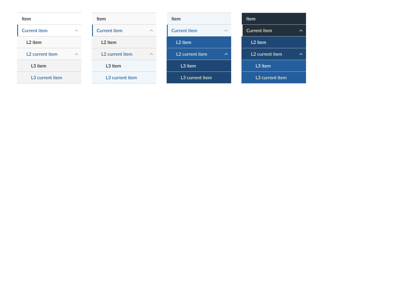
| Background | light (default), tint, primary-tint or dark. Effects: text color, background color, action color |
Related USWDS Components
- Side Navigation
Theme
| Element | Effects | Global/Component |
|---|---|---|
| $theme-sidenav-current-border-width | Border | Component |
| $theme-sidenav-font-family | Link | Component |
Questions:
- ..
Figma:
https://www.figma.com/file/UW0WNmfKZOmAOE5zsSYEx5/JCC-Base?node-id=267%3A1039