Skip to content

[FR] Plot axes names on another scale #10

@jbrea

Description

@jbrea

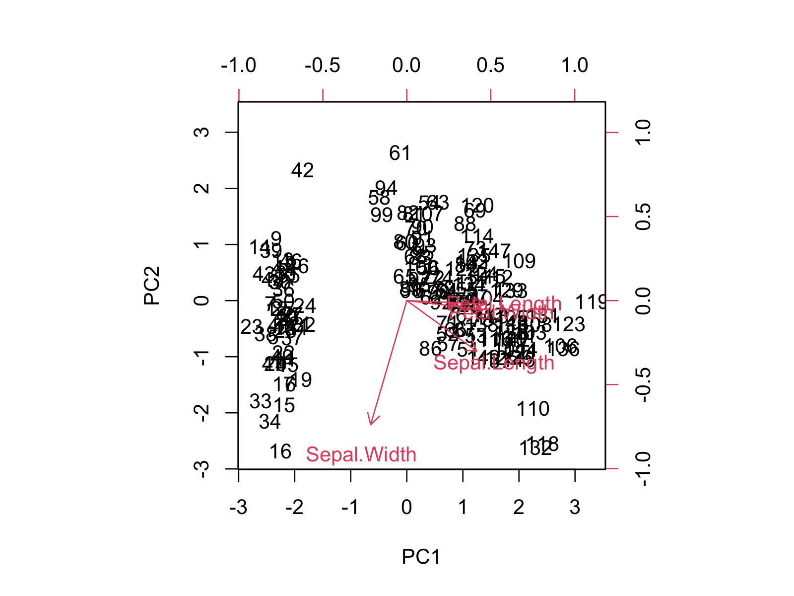
Sometimes it is useful to plot the data points and the axes names on a different scale, like e.g.

where the data is shown on the black scale and the axes names on the red scale.
Would this be easy to add as a feature?

Metadata

Metadata

Assignees

No one assigned

    Labels

    help wantedExtra attention is needed

    Type

    No type

    Projects

    No projects

    Milestone

    No milestone

    Relationships

    None yet

    Development

    No branches or pull requests

    Issue actions