TabControl - How do we customize the header? #2655
Description
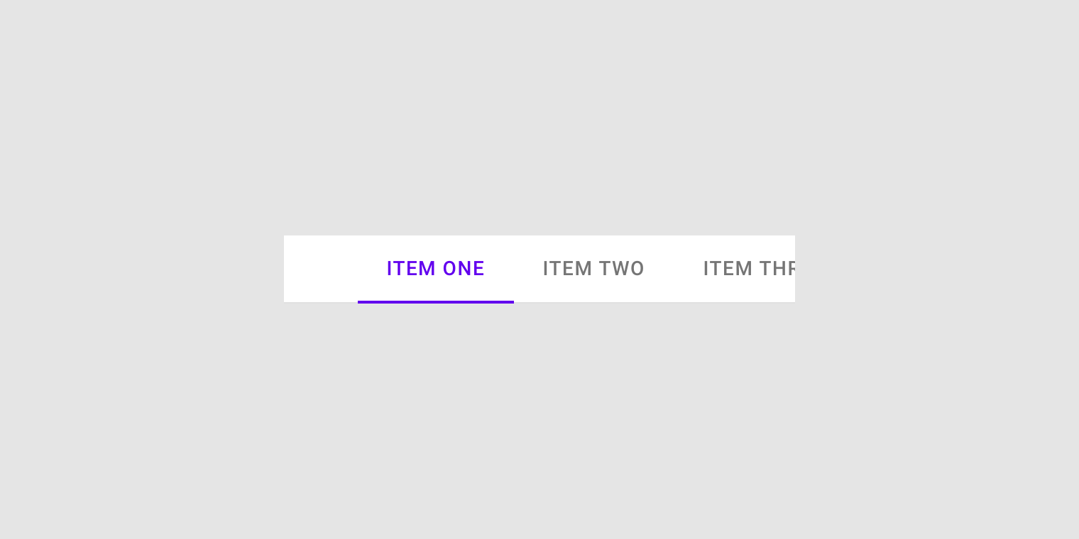
I wanted to change the following on the focus tab;
Border Bottom Thickness
Border Bottom Color
Header Color
Header Background
The result should be something like this
I couldn't find a clear wiki for this.
As of now, I have this;
<TabControl
HorizontalContentAlignment="Left"
materialDesign:ColorZoneAssist.Background="{StaticResource BrushBackground}"
materialDesign:ShadowAssist.ShadowDepth="Depth0"
Style="{StaticResource MaterialDesignFilledTabControl}">
    <TabItem Header="TAB 1" Style="{StaticResource MaterialDesignTabItem2}">
    <TextBlock Text="Tab 2" />
    </TabItem>
    <TabItem Header="TAB 2" Style="{StaticResource MaterialDesignTabItem2}">
    <TextBlock Text="Tab 3" />
    </TabItem>
    <TabItem Header="TAB 3" Style="{StaticResource MaterialDesignTabItem2}">
    <TextBlock Text="Tab 4" />
    </TabItem>
</TabControl>
and my style
<Style x:Key="MaterialDesignTabItem2" TargetType="{x:Type TabItem}">
               <Setter Property="FocusVisualStyle" Value="{StaticResource FocusVisual}" />

               <Setter Property="Background" Value="{x:Null}" />
               <!--  Foreground is for the content, not the header  -->
               <Setter Property="Foreground" Value="{Binding RelativeSource={RelativeSource AncestorType={x:Type FrameworkElement}}, Path=(TextElement.Foreground)}" />

               <Setter Property="Padding" Value="16,12" />
               <Setter Property="Height" Value="48" />
               <Setter Property="MinWidth" Value="90" />
               <Setter Property="MaxWidth" Value="360" />
               <Setter Property="materialDesign:RippleAssist.Feedback" Value="{DynamicResource MaterialDesignFlatButtonRipple}" />
               <Setter Property="materialDesign:ColorZoneAssist.Mode" Value="{Binding RelativeSource={RelativeSource AncestorType={x:Type FrameworkElement}}, Path=(materialDesign:ColorZoneAssist.Mode)}" />
               <Setter Property="materialDesign:ColorZoneAssist.Background" Value="{Binding RelativeSource={RelativeSource AncestorType={x:Type FrameworkElement}}, Path=(materialDesign:ColorZoneAssist.Background)}" />
               <Setter Property="materialDesign:ColorZoneAssist.Foreground" Value="{Binding RelativeSource={RelativeSource AncestorType={x:Type FrameworkElement}}, Path=(materialDesign:ColorZoneAssist.Foreground)}" />
               <Setter Property="Template">
                   <Setter.Value>
                       <ControlTemplate TargetType="{x:Type TabItem}">
                           <Grid x:Name="Root">
                               <!--  This is the Header label ColorZone.  -->
                               <materialDesign:ColorZone
                                   x:Name="ColorZoneHeader"
                                   HorizontalAlignment="Stretch"
                                   VerticalAlignment="Stretch"
                                   Background="{StaticResource BrushBackground}"
                                   Focusable="False"
                                   Foreground="{StaticResource BrusSecondary}">
                                   <materialDesign:Ripple
                                       x:Name="contentPresenter"
                                       Padding="{TemplateBinding Padding}"
                                       HorizontalContentAlignment="Center"
                                       VerticalContentAlignment="Center"
                                       Content="{TemplateBinding Header}"
                                       ContentStringFormat="{TemplateBinding HeaderStringFormat}"
                                       ContentTemplate="{TemplateBinding HeaderTemplate}"
                                       ContentTemplateSelector="{TemplateBinding ContentTemplateSelector}"
                                       Focusable="False"
                                       Opacity=".82"
                                       RecognizesAccessKey="True"
                                       SnapsToDevicePixels="{TemplateBinding SnapsToDevicePixels}"
                                       TextBlock.FontSize="14"
                                       TextBlock.FontWeight="Medium"
                                       TextBlock.Foreground="{StaticResource BrushBlack}"
                                       TextOptions.TextFormattingMode="Ideal"
                                       TextOptions.TextRenderingMode="Auto"
                                       Typography.Capitals="{TemplateBinding Typography.Capitals}" />
                               </materialDesign:ColorZone>
                               <Border
                                   x:Name="SelectionHighlightBorder"
                                   BorderBrush="{Binding Path=Foreground, ElementName=ColorZoneHeader}"
                                   BorderThickness="0,0,0,3"
                                   RenderTransformOrigin="0.5,0.5"
                                   Visibility="Hidden">
                                   <Border.RenderTransform>
                                       <ScaleTransform x:Name="ScaleTransform" ScaleX="0" ScaleY="1" />
                                   </Border.RenderTransform>
                                   <Rectangle
                                       x:Name="PART_BackgroundSelection"
                                       Fill="{TemplateBinding Background}"
                                       Opacity="0.12" />
                               </Border>

                               <VisualStateManager.VisualStateGroups>
                                   <VisualStateGroup x:Name="SelectionStates">
                                       <VisualState x:Name="Selected">
                                           <Storyboard>
                                               <DoubleAnimation
                                                   Storyboard.TargetName="ScaleTransform"
                                                   Storyboard.TargetProperty="ScaleX"
                                                   From="0"
                                                   To="1"
                                                   Duration="0:0:0.3">
                                                   <DoubleAnimation.EasingFunction>
                                                       <SineEase EasingMode="EaseOut" />
                                                   </DoubleAnimation.EasingFunction>
                                               </DoubleAnimation>
                                               <DoubleAnimation
                                                   BeginTime="0:0:0.3"
                                                   Storyboard.TargetName="PART_BackgroundSelection"
                                                   Storyboard.TargetProperty="Opacity"
                                                   To="0.12"
                                                   Duration="0" />
                                           </Storyboard>
                                       </VisualState>
                                       <VisualState x:Name="Unselected">
                                           <Storyboard>
                                               <DoubleAnimation
                                                   Storyboard.TargetName="ScaleTransform"
                                                   Storyboard.TargetProperty="ScaleX"
                                                   To="0"
                                                   Duration="0" />
                                               <DoubleAnimation
                                                   Storyboard.TargetName="PART_BackgroundSelection"
                                                   Storyboard.TargetProperty="Opacity"
                                                   To="0"
                                                   Duration="0" />
                                           </Storyboard>
                                       </VisualState>
                                   </VisualStateGroup>
                               </VisualStateManager.VisualStateGroups>
                           </Grid>
                           <ControlTemplate.Triggers>
                               <Trigger Property="IsEnabled" Value="False">
                                   <Setter Property="Opacity" Value="0.38" />
                               </Trigger>
                               <Trigger Property="IsSelected" Value="True">
                                   <Setter TargetName="contentPresenter" Property="Opacity" Value="1" />
                                   <Setter TargetName="contentPresenter" Property="TextBlock.Foreground" Value="{StaticResource BrusSecondary}" />
                                   <Setter TargetName="SelectionHighlightBorder" Property="Visibility" Value="Visible" />
                               </Trigger>
                               <DataTrigger Binding="{Binding TabStripPlacement, RelativeSource={RelativeSource AncestorType={x:Type TabControl}}}" Value="Bottom">
                                   <Setter TargetName="SelectionHighlightBorder" Property="BorderThickness" Value="0,2,0,0" />
                               </DataTrigger>
                               <DataTrigger Binding="{Binding TabStripPlacement, RelativeSource={RelativeSource AncestorType={x:Type TabControl}}}" Value="Left">
                                   <Setter TargetName="SelectionHighlightBorder" Property="BorderThickness" Value="0,0,2,0" />
                               </DataTrigger>
                               <DataTrigger Binding="{Binding TabStripPlacement, RelativeSource={RelativeSource AncestorType={x:Type TabControl}}}" Value="Right">
                                   <Setter TargetName="SelectionHighlightBorder" Property="BorderThickness" Value="2,0,0,0" />
                               </DataTrigger>
                           </ControlTemplate.Triggers>
                       </ControlTemplate>
                   </Setter.Value>
               </Setter>
           </Style>
I was hoping there is another light them for tab