Allow each data point to have a different maximum value within one Chart #17
Description
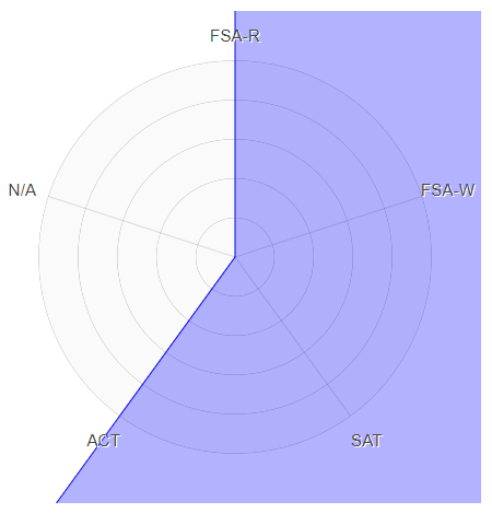
I'm not sure if this is currently possible (apologies if I'm just too much of a novice to figure it out using the available options)
I think it would be amazing if this chart allowed you to set the maximum value for each point.
For example,
I am using this chart to represent scores on various assessments, like:
ACT: Score up to 35
SAT: Score up to 2000
FSA: Score up to 500
It would be nice if the chart could display the radar points in relation to each score's maximum value.
When I try it now with the different values, the points go completely off the chart.
Thanks for any help!
Kara