-
-
Notifications
You must be signed in to change notification settings - Fork 504
Expand file tree
/
Copy pathinfo_bar.dart
More file actions
726 lines (674 loc) · 22.3 KB
/
info_bar.dart
File metadata and controls
726 lines (674 loc) · 22.3 KB
1
2
3
4
5
6
7
8
9
10
11
12
13
14
15
16
17
18
19
20
21
22
23
24
25
26
27
28
29
30
31
32
33
34
35
36
37
38
39
40
41
42
43
44
45
46
47
48
49
50
51
52
53
54
55
56
57
58
59
60
61
62
63
64
65
66
67
68
69
70
71
72
73
74
75
76
77
78
79
80
81
82
83
84
85
86
87
88
89
90
91
92
93
94
95
96
97
98
99
100
101
102
103
104
105
106
107
108
109
110
111
112
113
114
115
116
117
118
119
120
121
122
123
124
125
126
127
128
129
130
131
132
133
134
135
136
137
138
139
140
141
142
143
144
145
146
147
148
149
150
151
152
153
154
155
156
157
158
159
160
161
162
163
164
165
166
167
168
169
170
171
172
173
174
175
176
177
178
179
180
181
182
183
184
185
186
187
188
189
190
191
192
193
194
195
196
197
198
199
200
201
202
203
204
205
206
207
208
209
210
211
212
213
214
215
216
217
218
219
220
221
222
223
224
225
226
227
228
229
230
231
232
233
234
235
236
237
238
239
240
241
242
243
244
245
246
247
248
249
250
251
252
253
254
255
256
257
258
259
260
261
262
263
264
265
266
267
268
269
270
271
272
273
274
275
276
277
278
279
280
281
282
283
284
285
286
287
288
289
290
291
292
293
294
295
296
297
298
299
300
301
302
303
304
305
306
307
308
309
310
311
312
313
314
315
316
317
318
319
320
321
322
323
324
325
326
327
328
329
330
331
332
333
334
335
336
337
338
339
340
341
342
343
344
345
346
347
348
349
350
351
352
353
354
355
356
357
358
359
360
361
362
363
364
365
366
367
368
369
370
371
372
373
374
375
376
377
378
379
380
381
382
383
384
385
386
387
388
389
390
391
392
393
394
395
396
397
398
399
400
401
402
403
404
405
406
407
408
409
410
411
412
413
414
415
416
417
418
419
420
421
422
423
424
425
426
427
428
429
430
431
432
433
434
435
436
437
438
439
440
441
442
443
444
445
446
447
448
449
450
451
452
453
454
455
456
457
458
459
460
461
462
463
464
465
466
467
468
469
470
471
472
473
474
475
476
477
478
479
480
481
482
483
484
485
486
487
488
489
490
491
492
493
494
495
496
497
498
499
500
501
502
503
504
505
506
507
508
509
510
511
512
513
514
515
516
517
518
519
520
521
522
523
524
525
526
527
528
529
530
531
532
533
534
535
536
537
538
539
540
541
542
543
544
545
546
547
548
549
550
551
552
553
554
555
556
557
558
559
560
561
562
563
564
565
566
567
568
569
570
571
572
573
574
575
576
577
578
579
580
581
582
583
584
585
586
587
588
589
590
591
592
593
594
595
596
597
598
599
600
601
602
603
604
605
606
607
608
609
610
611
612
613
614
615
616
617
618
619
620
621
622
623
624
625
626
627
628
629
630
631
632
633
634
635
636
637
638
639
640
641
642
643
644
645
646
647
648
649
650
651
652
653
654
655
656
657
658
659
660
661
662
663
664
665
666
667
668
669
670
671
672
673
674
675
676
677
678
679
680
681
682
683
684
685
686
687
688
689
690
691
692
693
694
695
696
697
698
699
700
701
702
703
704
705
706
707
708
709
710
711
712
713
714
715
716
717
718
719
720
721
722
723
724
725
726
import 'dart:ui';
import 'package:fluent_ui/fluent_ui.dart';
import 'package:flutter/foundation.dart';
import 'package:flutter/material.dart' show Icons;
/// A builder function for creating an [InfoBar] within a popup.
///
/// The [close] callback should be called to dismiss the popup.
typedef InfoBarPopupBuilder =
Widget Function(BuildContext context, VoidCallback close);
/// Displays an InfoBar as a popup
///
/// [duration] is the duration that the popup will be in the screen
///
/// ```dart
/// displayInfoBar(
/// context,
/// builder: (context, close) {
/// return InfoBar(
/// title: Text('Title'),
/// action: IconButton(
/// icon: const WindowsIcon(WindowsIcons.chrome_close),
/// onPressed: close,
/// ),
/// );
/// }
/// )
/// ```
Future<void> displayInfoBar(
BuildContext context, {
required InfoBarPopupBuilder builder,
Alignment alignment = Alignment.bottomCenter,
Duration duration = const Duration(seconds: 3),
}) async {
assert(debugCheckHasOverlay(context));
assert(debugCheckHasFluentTheme(context));
final theme = FluentTheme.of(context);
late OverlayEntry entry;
var isFading = true;
var alreadyInitialized = false;
entry = OverlayEntry(
builder: (context) {
return SafeArea(
child: Align(
alignment: alignment,
child: Padding(
padding: const EdgeInsetsDirectional.symmetric(
vertical: 24,
horizontal: 16,
),
child: StatefulBuilder(
builder: (context, setState) {
Future<void> close() async {
if (!entry.mounted) return;
setState(() => isFading = true);
await Future<void>.delayed(theme.mediumAnimationDuration);
if (!entry.mounted) return;
entry.remove();
}
if (!alreadyInitialized) {
alreadyInitialized = true;
() async {
await Future<void>.delayed(theme.mediumAnimationDuration);
if (!entry.mounted) return;
setState(() => isFading = false);
await Future<void>.delayed(duration);
await close();
}();
}
return AnimatedSwitcher(
duration: theme.mediumAnimationDuration,
switchInCurve: theme.animationCurve,
switchOutCurve: theme.animationCurve,
child: isFading
? const SizedBox.shrink()
: PhysicalModel(
color: Colors.transparent,
elevation: 8,
child: builder(context, close),
),
);
},
),
),
),
);
},
);
Overlay.of(context).insert(entry);
}
/// The severity levels that can be applied to an [InfoBar].
///
/// Each severity level has a distinct visual appearance with an appropriate
/// icon and background color to convey the importance of the message.
enum InfoBarSeverity {
/// Informational message with a neutral appearance.
///
/// Use for general information that doesn't require immediate attention.
///
/// 
info,
/// Warning message with a yellow/orange appearance.
///
/// Use to alert users about potential issues or important notices that
/// may require attention but aren't critical.
///
/// 
warning,
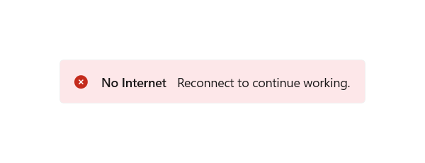
/// Error message with a red appearance.
///
/// Use to notify users about errors or problems that need to be addressed.
///
/// 
error,
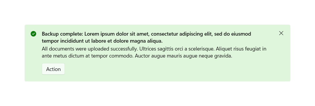
/// Success message with a green appearance.
///
/// Use to confirm that an operation completed successfully.
///
/// 
success,
}
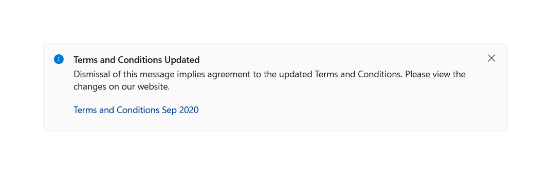
/// A control for displaying app-wide status messages that are highly visible
/// yet non-intrusive.
///
/// The [InfoBar] control is used to display important status messages inline
/// with other UI content. It supports different [severity] levels to indicate
/// the type of message (informational, warning, error, or success).
///
/// 
///
/// {@tool snippet}
/// This example shows a basic info bar with a title:
///
/// ```dart
/// InfoBar(
/// title: Text('Update available'),
/// content: Text('A new version of the app is available.'),
/// severity: InfoBarSeverity.info,
/// )
/// ```
/// {@end-tool}
///
/// {@tool snippet}
/// This example shows an info bar with an action button:
///
/// ```dart
/// InfoBar(
/// title: Text('Connection lost'),
/// content: Text('Please check your internet connection.'),
/// severity: InfoBarSeverity.error,
/// action: HyperlinkButton(
/// child: Text('Retry'),
/// onPressed: () => retryConnection(),
/// ),
/// onClose: () => dismissInfoBar(),
/// )
/// ```
/// {@end-tool}
///
/// ## Displaying as a popup
///
/// Use [displayInfoBar] to show an info bar as a temporary popup that
/// automatically dismisses after a duration:
///
/// {@tool snippet}
/// ```dart
/// displayInfoBar(
/// context,
/// builder: (context, close) {
/// return InfoBar(
/// title: Text('File saved'),
/// severity: InfoBarSeverity.success,
/// action: IconButton(
/// icon: Icon(FluentIcons.chrome_close),
/// onPressed: close,
/// ),
/// );
/// },
/// );
/// ```
/// {@end-tool}
///
/// ## Long content
///
/// For info bars with longer content, set [isLong] to true to display the
/// content vertically instead of horizontally.
///
/// See also:
///
/// * [displayInfoBar], a function to show an info bar as a popup
/// * [ContentDialog], for modal dialogs that require user interaction
/// * [Flyout], for lightweight contextual information
/// * <https://learn.microsoft.com/en-us/windows/apps/design/controls/infobar>
class InfoBar extends StatelessWidget {
/// Creates an info bar.
const InfoBar({
required this.title,
super.key,
this.content,
this.action,
this.severity = InfoBarSeverity.info,
this.style,
this.isLong = false,
this.onClose,
this.isIconVisible = true,
});
/// Creates an info bar with [InfoBarSeverity.info] severity.
const InfoBar.info({
required this.title,
super.key,
this.content,
this.action,
this.style,
this.isLong = false,
this.onClose,
this.isIconVisible = true,
}) : severity = InfoBarSeverity.info;
/// Creates an info bar with [InfoBarSeverity.warning] severity.
const InfoBar.warning({
required this.title,
super.key,
this.content,
this.action,
this.style,
this.isLong = false,
this.onClose,
this.isIconVisible = true,
}) : severity = InfoBarSeverity.warning;
/// Creates an info bar with [InfoBarSeverity.success] severity.
const InfoBar.success({
required this.title,
super.key,
this.content,
this.action,
this.style,
this.isLong = false,
this.onClose,
this.isIconVisible = true,
}) : severity = InfoBarSeverity.success;
/// Creates an info bar with [InfoBarSeverity.error] severity.
const InfoBar.error({
required this.title,
super.key,
this.content,
this.action,
this.style,
this.isLong = false,
this.onClose,
this.isIconVisible = true,
}) : severity = InfoBarSeverity.error;
/// The severity of this info bar.
///
/// The severity determines the visual appearance of the info bar, including
/// its icon, background color, and overall styling.
///
/// Defaults to [InfoBarSeverity.info].
final InfoBarSeverity severity;
/// The style applied to this info bar.
///
/// If non-null, this is merged with [FluentThemeData.infoBarTheme].
///
/// Use this to customize the appearance of individual info bars beyond
/// the default theme.
final InfoBarThemeData? style;
/// The primary text displayed in the info bar.
///
/// Typically a short, descriptive message. This is displayed in bold
/// to distinguish it from the [content].
///
/// Usually a [Text] widget.
final Widget title;
/// Additional information displayed below or beside the [title].
///
/// Use this for longer explanatory text. For info bars with substantial
/// content, consider setting [isLong] to true.
///
/// Usually a [Text] widget.
final Widget? content;
/// An optional action widget displayed in the info bar.
///
/// Typically a [Button], [HyperlinkButton], or [IconButton] that allows
/// the user to take action based on the info bar's message.
final Widget? action;
/// Called when the close button is pressed.
///
/// If null, the info bar will not display a close button and cannot be
/// dismissed by the user.
///
/// When provided, a close button appears at the end of the info bar.
final VoidCallback? onClose;
/// Whether the info bar should display content vertically.
///
/// When `true`, the [title], [content], and [action] are arranged in a
/// vertical column, which is better for longer content.
///
/// When `false` (the default), content is arranged horizontally.
///
/// 
final bool isLong;
/// Whether the severity icon is visible.
///
/// The icon is determined by the [severity] and appears at the start
/// of the info bar.
///
/// Defaults to `true`.
final bool isIconVisible;
@override
void debugFillProperties(DiagnosticPropertiesBuilder properties) {
super.debugFillProperties(properties);
properties
..add(
FlagProperty(
'long',
value: isLong,
ifFalse: 'short',
defaultValue: false,
),
)
..add(
FlagProperty(
'isIconVisible',
value: isIconVisible,
ifFalse: 'icon not visible',
defaultValue: true,
),
)
..add(
EnumProperty<InfoBarSeverity>(
'severity',
severity,
defaultValue: InfoBarSeverity.info,
),
)
..add(ObjectFlagProperty.has('onClose', onClose))
..add(DiagnosticsProperty('style', style, ifNull: 'no style'));
}
@override
Widget build(BuildContext context) {
assert(debugCheckHasFluentTheme(context));
assert(debugCheckHasFluentLocalizations(context));
final theme = FluentTheme.of(context);
final localizations = FluentLocalizations.of(context);
final style = InfoBarTheme.of(context).merge(this.style);
final icon = isIconVisible ? style.icon?.call(severity) : null;
final closeIcon = style.closeIcon;
final title = Padding(
padding: const EdgeInsetsDirectional.only(end: 6),
child: DefaultTextStyle.merge(
style: theme.typography.bodyStrong ?? const TextStyle(),
child: this.title,
),
);
final content = () {
if (this.content == null) return null;
return DefaultTextStyle.merge(
style: theme.typography.body ?? const TextStyle(),
child: this.content!,
);
}();
final action = () {
if (this.action == null) return null;
return ButtonTheme.merge(
child: this.action!,
data: ButtonThemeData.all(style.actionStyle),
);
}();
return Container(
constraints: BoxConstraints(
minHeight: (48 + theme.visualDensity.baseSizeAdjustment.dy).clamp(
0.0,
double.infinity,
),
),
decoration: style.decoration?.call(severity),
padding: style.padding ?? const EdgeInsetsDirectional.all(10),
child: Row(
mainAxisSize: MainAxisSize.min,
crossAxisAlignment: isLong
? CrossAxisAlignment.start
: CrossAxisAlignment.center,
children: [
if (icon != null)
Padding(
padding: const EdgeInsetsDirectional.only(end: 14),
child: Icon(icon, color: style.iconColor?.call(severity)),
),
if (isLong)
Flexible(
child: Column(
mainAxisSize: MainAxisSize.min,
crossAxisAlignment: CrossAxisAlignment.start,
children: [
title,
if (content != null)
Padding(
padding: const EdgeInsetsDirectional.only(top: 6),
child: content,
),
if (action != null)
Padding(
padding: const EdgeInsetsDirectional.only(top: 12),
child: action,
),
],
),
)
else
Flexible(
child: Wrap(
crossAxisAlignment: WrapCrossAlignment.center,
spacing: 6,
children: [
title,
?content,
if (action != null)
Padding(
padding: const EdgeInsetsDirectional.only(start: 16),
child: action,
),
],
),
),
if (closeIcon != null && onClose != null)
Padding(
padding: const EdgeInsetsDirectional.only(start: 10),
child: Tooltip(
message: localizations.closeButtonLabel,
child: IconButton(
icon: Icon(closeIcon, size: style.closeIconSize),
onPressed: onClose,
style: style.closeButtonStyle,
),
),
),
],
),
);
}
}
/// An inherited widget that defines the configuration for
/// [InfoBar]s in this widget's subtree.
///
/// Values specified here are used for [InfoBar] properties that are not
/// given an explicit non-null value.
class InfoBarTheme extends InheritedTheme {
/// Creates a theme that controls how descendant [InfoBar]s should look like.
const InfoBarTheme({required this.data, required super.child, super.key});
/// The properties for descendant [InfoBar] widgets.
final InfoBarThemeData data;
/// Creates a theme that merges the nearest [InfoBarTheme] with [data].
static Widget merge({
required InfoBarThemeData data,
required Widget child,
Key? key,
}) {
return Builder(
builder: (context) {
return InfoBarTheme(
key: key,
data: InfoBarTheme.of(context).merge(data),
child: child,
);
},
);
}
/// Returns the closest [InfoBarThemeData] which encloses the given context.
///
/// Resolution order:
/// 1. Defaults from [InfoBarThemeData.standard]
/// 2. Global theme from [FluentThemeData.infoBarTheme]
/// 3. Local [InfoBarTheme] ancestor
///
/// Typical usage is as follows:
///
/// ```dart
/// InfoBarThemeData theme = InfoBarTheme.of(context);
/// ```
static InfoBarThemeData of(BuildContext context) {
assert(debugCheckHasFluentTheme(context));
final theme = FluentTheme.of(context);
final inheritedTheme = context
.dependOnInheritedWidgetOfExactType<InfoBarTheme>();
return InfoBarThemeData.standard(
theme,
).merge(theme.infoBarTheme).merge(inheritedTheme?.data);
}
@override
Widget wrap(BuildContext context, Widget child) {
return InfoBarTheme(data: data, child: child);
}
@override
bool updateShouldNotify(InfoBarTheme oldWidget) => data != oldWidget.data;
}
/// A function that returns a value based on the [InfoBarSeverity].
typedef InfoBarSeverityCheck<T> = T Function(InfoBarSeverity severity);
/// Theme data for [InfoBar] widgets.
///
/// This class defines the visual appearance of info bars, including their
/// decoration, icons, and styling for different severity levels.
class InfoBarThemeData with Diagnosticable {
/// Returns the decoration based on the severity level.
final InfoBarSeverityCheck<Decoration?>? decoration;
/// Returns the icon color based on the severity level.
final InfoBarSeverityCheck<Color?>? iconColor;
/// Returns the icon to display based on the severity level.
final InfoBarSeverityCheck<IconData>? icon;
/// The style for the close button.
final ButtonStyle? closeButtonStyle;
/// The icon to display for the close button.
final IconData? closeIcon;
/// The size of the close icon.
final double? closeIconSize;
/// The style for the action button.
final ButtonStyle? actionStyle;
/// The padding around the info bar content.
final EdgeInsetsGeometry? padding;
/// Creates a theme data for [InfoBar] widgets.
const InfoBarThemeData({
this.decoration,
this.icon,
this.iconColor,
this.closeButtonStyle,
this.closeIcon,
this.closeIconSize,
this.actionStyle,
this.padding,
});
/// Creates a standard theme data for [InfoBar] widgets.
factory InfoBarThemeData.standard(FluentThemeData theme) {
return InfoBarThemeData(
padding: const EdgeInsetsDirectional.only(
top: 14,
bottom: 14,
start: 14,
end: 8,
),
decoration: (severity) {
late Color color;
switch (severity) {
case InfoBarSeverity.info:
color = theme.resources.systemFillColorAttentionBackground;
case InfoBarSeverity.warning:
color = theme.resources.systemFillColorCautionBackground;
case InfoBarSeverity.success:
color = theme.resources.systemFillColorSuccessBackground;
case InfoBarSeverity.error:
color = theme.resources.systemFillColorCriticalBackground;
}
return BoxDecoration(
color: color,
borderRadius: BorderRadius.circular(4),
border: Border.all(color: theme.resources.cardStrokeColorDefault),
);
},
closeIcon: FluentIcons.chrome_close,
icon: (severity) {
switch (severity) {
case InfoBarSeverity.info:
return FluentIcons.info_solid;
case InfoBarSeverity.warning:
return FluentIcons.critical_error_solid;
case InfoBarSeverity.success:
return Icons.check_circle;
case InfoBarSeverity.error:
return Icons.cancel;
}
},
iconColor: (severity) {
switch (severity) {
case InfoBarSeverity.info:
return theme.accentColor.defaultBrushFor(theme.brightness);
case InfoBarSeverity.warning:
return theme.resources.systemFillColorCaution;
case InfoBarSeverity.success:
return theme.resources.systemFillColorSuccess;
case InfoBarSeverity.error:
return theme.resources.systemFillColorCritical;
}
},
actionStyle: const ButtonStyle(
padding: WidgetStatePropertyAll(EdgeInsetsDirectional.all(6)),
),
closeButtonStyle: const ButtonStyle(iconSize: WidgetStatePropertyAll(16)),
);
}
/// Lerps between two [InfoBarThemeData] objects.
///
/// {@macro fluent_ui.lerp.t}
static InfoBarThemeData lerp(
InfoBarThemeData? a,
InfoBarThemeData? b,
double t,
) {
return InfoBarThemeData(
closeIconSize: lerpDouble(a?.closeIconSize, b?.closeIconSize, t),
closeIcon: t < 0.5 ? a?.closeIcon : b?.closeIcon,
closeButtonStyle: ButtonStyle.lerp(
a?.closeButtonStyle,
b?.closeButtonStyle,
t,
),
icon: t < 0.5 ? a?.icon : b?.icon,
decoration: () {
final aDecoration = a?.decoration;
final bDecoration = b?.decoration;
if (aDecoration == null && bDecoration == null) return null;
if (aDecoration == null) return bDecoration;
if (bDecoration == null) return aDecoration;
return (InfoBarSeverity severity) {
return Decoration.lerp(
aDecoration.call(severity),
bDecoration.call(severity),
t,
);
};
}(),
actionStyle: ButtonStyle.lerp(a?.actionStyle, b?.actionStyle, t),
iconColor: () {
final aIconColor = a?.iconColor;
final bIconColor = b?.iconColor;
if (aIconColor == null && bIconColor == null) return null;
if (aIconColor == null) return bIconColor;
if (bIconColor == null) return aIconColor;
return (InfoBarSeverity severity) {
return Color.lerp(
aIconColor.call(severity),
bIconColor.call(severity),
t,
);
};
}(),
padding: () {
if (a?.padding == null && b?.padding == null) return null;
if (a?.padding == null) return b?.padding;
if (b?.padding == null) return a?.padding;
return EdgeInsetsGeometry.lerp(a?.padding, b?.padding, t);
}(),
);
}
/// Merges this [InfoBarThemeData] with another, with the other taking
/// precedence.
InfoBarThemeData merge(InfoBarThemeData? style) {
if (style == null) return this;
return InfoBarThemeData(
closeIcon: style.closeIcon ?? closeIcon,
closeIconSize: style.closeIconSize ?? closeIconSize,
closeButtonStyle: style.closeButtonStyle ?? closeButtonStyle,
icon: style.icon ?? icon,
decoration: style.decoration ?? decoration,
actionStyle: style.actionStyle ?? actionStyle,
iconColor: style.iconColor ?? iconColor,
padding: style.padding ?? padding,
);
}
@override
void debugFillProperties(DiagnosticPropertiesBuilder properties) {
super.debugFillProperties(properties);
properties
..add(ObjectFlagProperty.has('icon', icon))
..add(IconDataProperty('closeIcon', closeIcon))
..add(DoubleProperty('closeIconSize', closeIconSize))
..add(
DiagnosticsProperty<ButtonStyle>('closeButtonStyle', closeButtonStyle),
)
..add(ObjectFlagProperty.has('decoration', decoration))
..add(ObjectFlagProperty.has('iconColor', iconColor))
..add(
DiagnosticsProperty<ButtonStyle>(
'actionStyle',
actionStyle,
ifNull: 'no style',
),
);
}
}