Display of active cases vs time #84
Description
Thanks for sharing this, very nice project! I'd like to make a few small suggestions on the time evolution graphs:
-
it seems that the active cases over time should be normalized by the number people (country size). I found the closed issue Normalize time evolution #3, but it seems not to be effective yet? The number of cases in itself is a meaningless object, in particular when compared across countries. The effect of a single case is always relative to the number of health care professionals who can take care of it.
-
Using
logas default scale: if I click a new country, the scale switches back to linear and displaying these data on linear scale is to me close to useless. Of course, it is good enough if the scale does not switch back. -
I'd prefer if the two figures, world map and time evolution, were on top of each other rather than side-by-side, such that they can be displayed larger on the screen.
I made a similar effort that you can find here
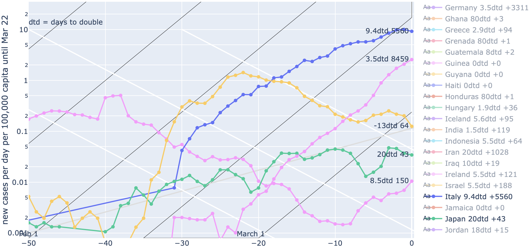
with my rationales given here but I'd also be happy to join forces. I did it because I couldn't find a single source plotting new cases per day on a log scale for a variety of countries.