Simulating a heavy stroke next to a normal stroke, 2-finger versus 10-finger typing #24
Description
I will make an attempt to describe a possible enhancement request of TT2020, mixing the ideas of type B/E/G into one font with a small variation in font weight (300-650) to simulate that some fingers are weaker than other fingers on an analogue typewriter, causing the imprint of ink being bolder in one glyph and weaker on the following glyph depending on the finger strength or stroke technique, 2-finger or 10-finger typing method.
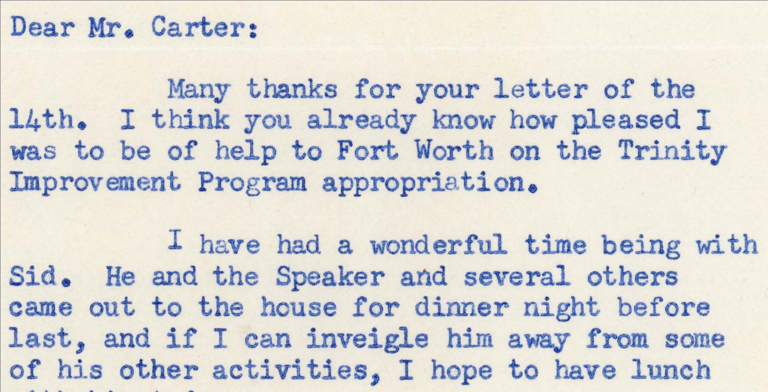
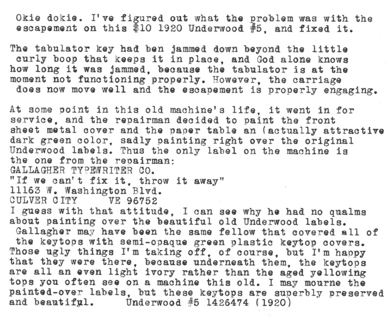
Following the article on the background to TT2020, especially image_sampling_1 and image_sampling_2 and looking at the type B/E/G my question is how to mimic those sample images where different letters were written using different fingers which are different in strength. The stronger fingers, usually placed around F, G, T, R, V, B, J, H, Y, U, N, M will probably on average have a bit more strength (boldness) than the letters S, W, X, L, O which on 10-finger mechanical typing without electrical stroke help would render the sampling image 1 result, a stronger (more bold/ink) letter next to a somewhat weaker letter (normal or light weight). image_sampling_2 is much more consistent in strength of stroke where some letters typed by both hands end up closer to each other since the machine didn't have time to move all the way to the next position before a new key stroke was made, see "mme" on line 3 on image_sampling_2.
Using LibreOffice Writer, it would probably be needed a Type E with a different strength something similar to mixing a normal distribution pattern with the illustration of these glyphs in post #4045, where some glyphs are bolder and some thinner, plus "missing parts" of the glyph shape related to weaker key strokes.
Maybe one solution in LibreOffice Writer could be to have a python3 or ooobasic script that alternates between two or four different TT2020 fonts between light and semibold weight at random for every glyph as part of a final post processing of a document.
A person typing with two fingers would obviously create something more like a Type E look, meanwhile a 10-finger typing would mix semibold (600-650), medium (500-550), normal (400-450) and light (300-350) one letter next to another depending on which finger would do the stroke. See sample image 2 at the bottom "#5" and "(1920)", especially the "#" and "2", where compared to surrounding letters and other letters on the top of the image show possibly different strengths in key strokes. The "s" seems to be positioned slightly below the line, meanwhile "e" seems to be positioned slightly above the line compared to other glyphs. Type E is much more consistent in key strength and position of glyph. Type G is maybe "too" worn out sometimes, making it hard to see what the letter is.
Type G is probably the closest realistic fit to a "used ink tape" where parts of the letter may be missing due to lack of ink on that place, or maybe lack of strength in finger stroke. The variation in key stroke strength is not seen in type G where the missing parts of a glyph are more noticeable than that the glyphs vary in font weight.
I hope I have managed to describe the idea to mimic the word "letter" on line 2 and the word "appropriation" on line 5 in image_sampling_1.