This repository was archived by the owner on Jun 1, 2021. It is now read-only.
Line Graph to Show progression of Covid Cases and Suspected Signaling #23
Description
Disease Progression
It would be very useful to display the pace at which the disease has been progressing in time. We have the history of reported cases, provided daily, but we also have the signaling of suspected cases.
Solution
We could display a (Y=Cases, X=Date) line graph that would provide a simple visualization of the data we have.
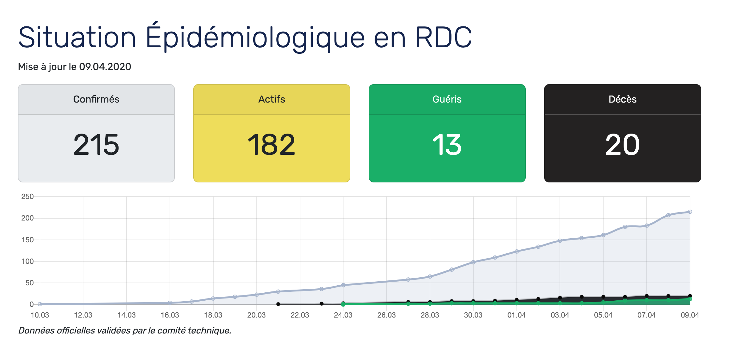
https://www.stopcoronavirusrdc.info/ has a good approach, and we could enhance the visualization by adding suspected cases reported to our system.
Illustration