Fancybox on smaller screens #22
Replies: 1 comment 4 replies
-
|
Hi, First, you must understand that the space around image (or other content) is created by applying padding to the slide element. There are two ways for you to choose to customize it. One way is using SASS. Every Fancyapps UI component offers Sass variables, but Fancybox even has powerful mixin that you can use to create your own breakpoints and defaults. That means, you can build your own CSS file with custom spacing for any screen size. Check this file - Or you can always choose to simply override CSS, example: Fancybox v4 is very, very flexible and highly customizable, and it is also difficult to choose the default settings. v3 has a |
Beta Was this translation helpful? Give feedback.
-
|
Thank you, you're absolutely right and I had no problems adding a couple lines of CSS to override some values. Version 3 felt very mobile design first, swiping through full screen images was similar to the experience as the native photos application on the phone. On a desktop the small icons almost got lost though. In Version 4 the desktop experience is vastly improved, the default thumbnails are a great use of space. I felt the default interface just doesn't scale down as well. Many photos are displaying smaller in the fancybox gallery view than they did in the page layout. It feels like Version 4 could benefit from some additional break points for various screens. Phones and tablets would likely benefit from reduced padding around the images and smaller thumbnails at the bottom. While I've already adjusted the CSS to my needs this is the first time I've had to modify my Fancybox install. The defaults have always suited me well. Great work on v4, I've already licensed it and put it to use. |
Beta Was this translation helpful? Give feedback.
-
|
Thanks for your feedback, I'll definitely take that into account. I have a few ideas to make it work more like v3 (or native Photos) on devices with small screens. |
Beta Was this translation helpful? Give feedback.
-
|
The first beta was released yesterday and has some changes, for example, decreased default padding and thumbnails not automatically appearing on small screens. Please let me know if you have any further suggestions for improvement. |
Beta Was this translation helpful? Give feedback.
-
|
Thank you! The reduced padding was a big help. Thumbnails are still appearing on the iPhone by default in both landscape and portrait orientation. With thumbnails on, viewing images in portrait orientation leads to a larger photo than viewing in landscape which displays a smaller photo.
|
Beta Was this translation helpful? Give feedback.
Uh oh!
There was an error while loading. Please reload this page.
-
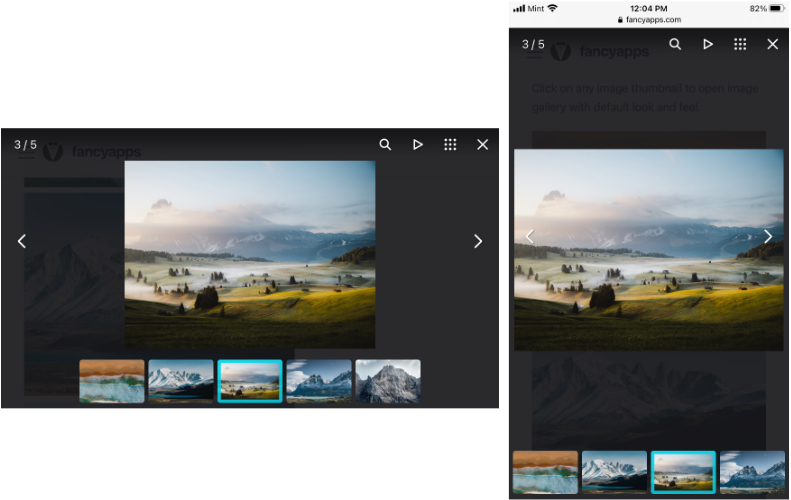
The default user interface with Fancybox 4 on a desktop is a great improvement over previous versions. However, as the display gets smaller on tablets and phones the interface takes up more screen space than the photo it's trying to highlight. It's a big difference coming from v3. Are there changes coming for smaller screen sizes?
Side by side of version 4 compared to version 3.
Beta Was this translation helpful? Give feedback.
All reactions