Input
The input control allows the user to enter in text into an input box. This control is similar to input boxes found in other applications. These controls can be configured to return true upon every text entered or only when the user presses the 'Return' key. Below are some examples of how this control can be used.
Slab.BeginWindow('MyFirstWindow', {Title = "My First Window"})

Slab.Input('MyInput')

Slab.EndWindow()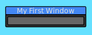
The text of an input field can be stored to be referenced later. By default, the Input control will return true for every character entered.
Slab.BeginWindow('MyFirstWindow', {Title = "My First Window"})

if Slab.Input('MyInput', {Text = InputText}) then
	InputText = Slab.GetInputText()
end

Slab.EndWindow()
Input controls can also be set to only return true when the user presses the 'Return' key. If the control loses focus by either clicking outside the control or through other means, the text will be reverted back to what was previously used.
Slab.BeginWindow('MyFirstWindow', {Title = "My First Window"})

if Slab.Input('MyInput', {Text = InputText, ReturnOnText = false}) then
	InputText = Slab.GetInputText()
end

Slab.EndWindow()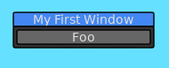
Input controls can also be configured to only accept numeric text.
Slab.BeginWindow('MyFirstWindow', {Title = "My First Window"})

if Slab.Input('MyInput', {Text = tostring(Value), ReturnOnText = false, NumbersOnly = true}) then
	Value = tonumber(Slab.GetInputText())
end

Slab.EndWindow()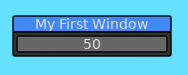
Below is a list of functions associated with the Input API.
This function will render an input box for a user to input text in. This widget behaves like input boxes found in other applications. This function will only return true if it has focus and user has either input text or pressed the return key.
| Parameter | Type | Description |
|---|---|---|
| Id | String | A string that uniquely identifies this Input within the context of the window. |
| Options | Table | List of options for how this Input will behave. |
| Option | Type | Description |
|---|---|---|
| Tooltip | String | Text to be displayed if the user hovers over the Input box. |
| ReturnOnText | Boolean | Will cause this function to return true whenever the user has input a new character into the Input box. This is true by default. |
| Text | String | The text to be supplied to the input box. It is recommended to use this option when ReturnOnText is true. |
| BgColor | Table | The background color for the input box. |
| SelectColor | Table | The color used when the user is selecting text within the input box. |
| SelectOnFocus | Boolean | When this input box is focused by the user, the text contents within the input will be selected. This is true by default. |
| NumbersOnly | Boolean | When true, only numeric characters and the '.' character are allowed to be input into the input box. If no text is input, the input box will display '0'. |
| W | Number | The width of the input box. By default, will be 150.0 |
| H | Number | The height of the input box. By default, will be the height of the current font. |
| ReadOnly | Boolean | Whether this input field can be editable or not. |
| Align | String | Aligns the text within the input box. Options are: left: Aligns the text to the left. This will be set when this Input is focused. center: Aligns the text in the center. This is the default for when the text is not focused. |
| Rounding | Number | Amount of rounding to apply to the corners of the input box. |
| MinNumber | Number | The minimum value that can be entered into this input box. Only valid when NumbersOnly is true. |
| MaxNumber | Number | The maximum value that can be entered into this input box. Only valid when NumbersOnly is true. |
| Return | Description |
|---|---|
| Boolean | Returns true if the user has pressed the return key while focused on this input box. If ReturnOnText is set to true, then this function will return true whenever the user has input any character into the input box. |
Retrieves the text entered into the focused input box. Refer to the documentation for Slab.Input for an example on how to use this function.
| Return | Description |
|---|---|
| String | Returns the text entered into the focused input box. |
Retrieves the text entered into the focused input box and attempts to conver the text into a number. Will always return a valid number.
| Return | Description |
|---|---|
| Number | Returns the text entered into the focused input box as a number. |