Lighthouse: Insufficient contrast on fronts cards #5552
Description
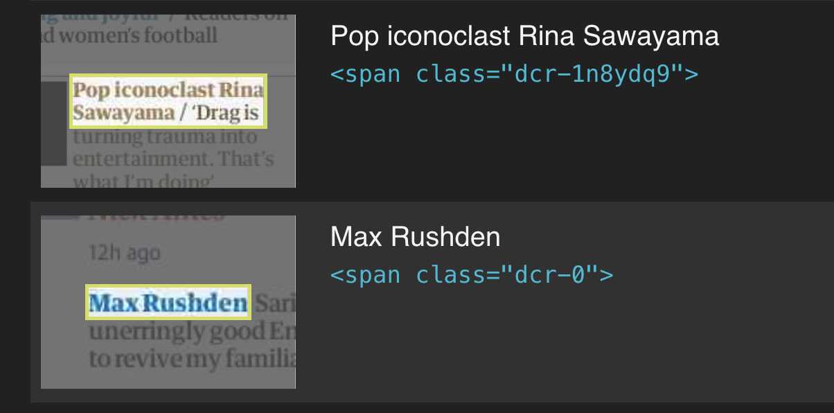
Our lighthouse reports for the DCR-rendered uk front are showing that some card text has insufficient contrast with the background:
I believe that @HarryFischer said that this figma file should be considered the source of truth for colour contrasts on cards.
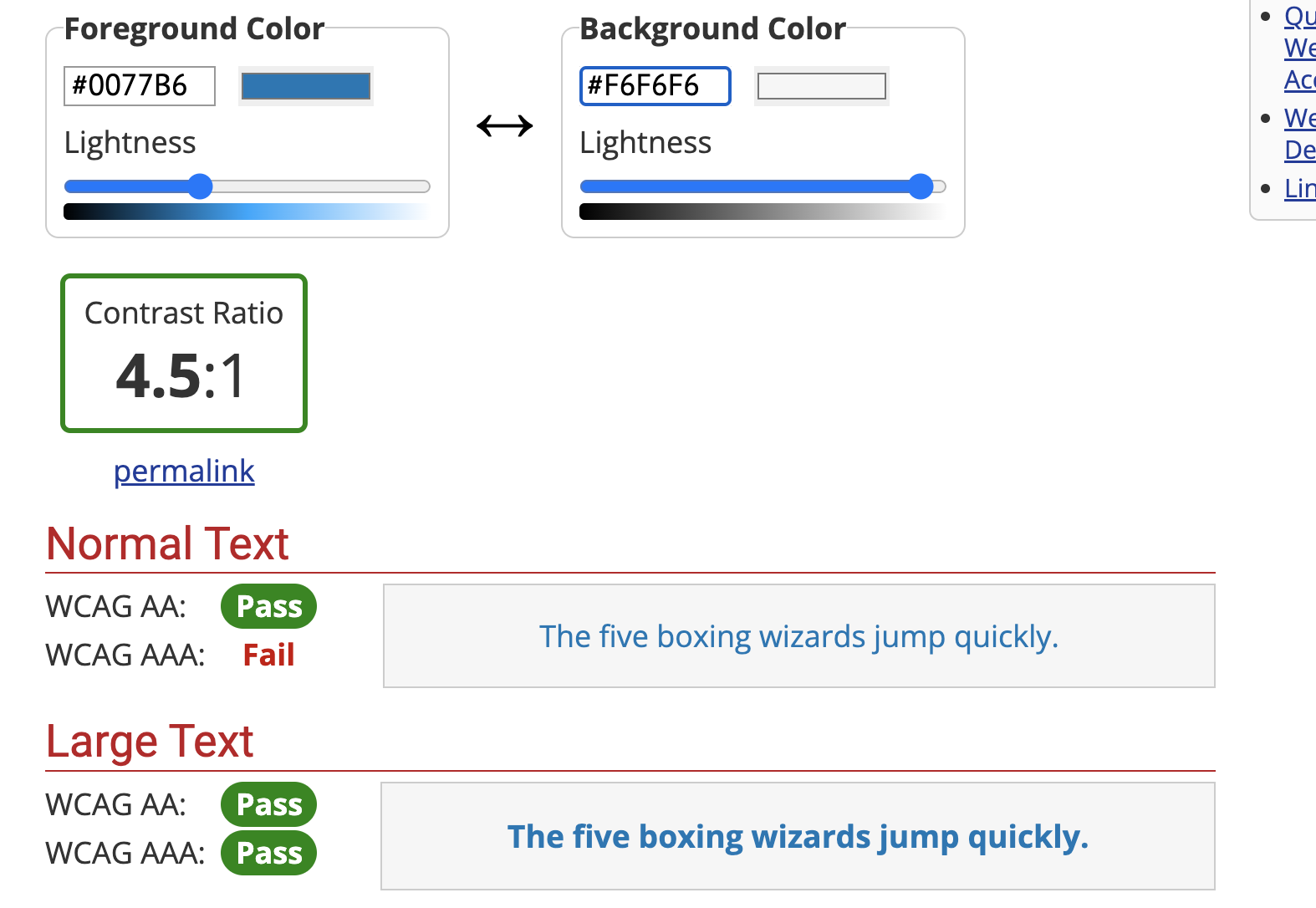
It looks like, at least for the sport card, we are using the intended colour (sport.400/#0077B6). The colour contrasts pass most tests (using https://webaim.org/resources/contrastchecker/) but not the AAA standard for small text. I'm assuming that this must be the standard that Lighthouse is applying. Given this, I think we need input from the design team about how to adjust the colour: should we use e.g. sport.300/#005689, which does pass?