Bottom navigation on mobile #10492
Replies: 6 comments 5 replies
-
|
I would love to see if we could entertain a cool bottom menu. Something where the default dashboard would be larger than the rest. Doubt the Materialness of that but would be cool |
Beta Was this translation helpful? Give feedback.
-
|
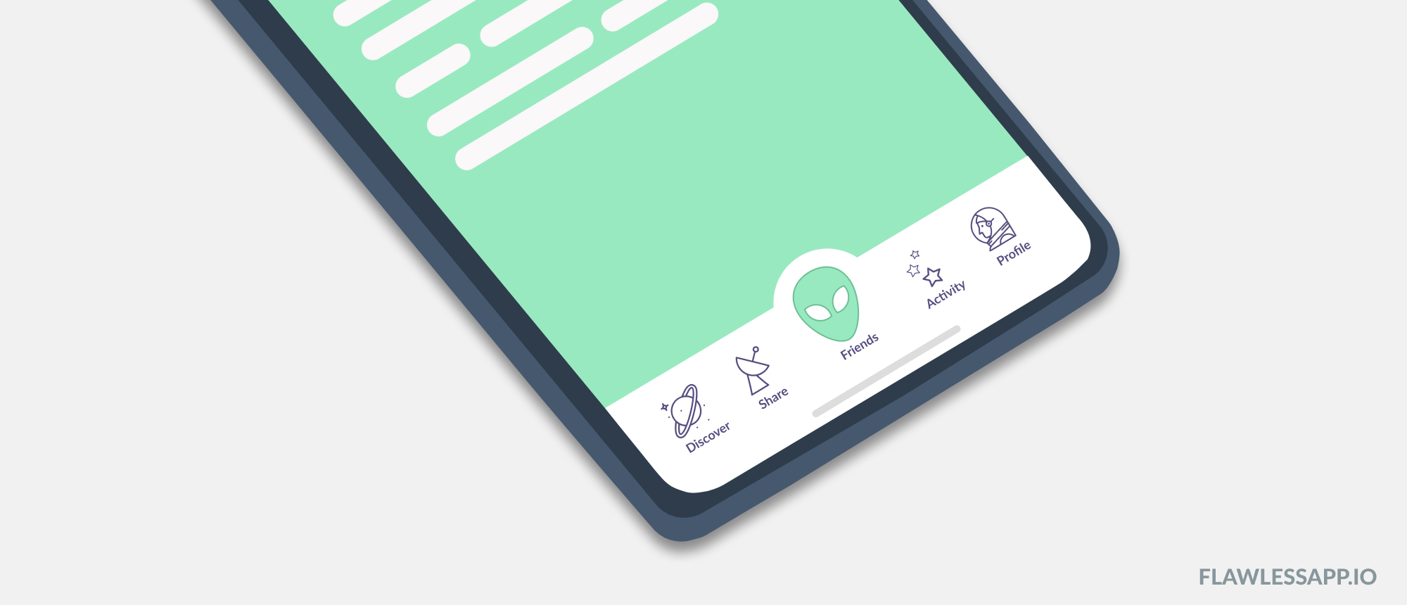
you mean something like this example? |
Beta Was this translation helpful? Give feedback.
-
|
YESSSSS |
Beta Was this translation helpful? Give feedback.
-
|
Yes pleaseee! |
Beta Was this translation helpful? Give feedback.
-
|
I would want to push back on marking a difference between mobile and desktop UI as an inconsistency. On mobile your hands are at the bottom and that's where you can move to fast. Reaching to the top of your phone requires 2 hands. On desktop however we do not have t his constraint and can go for top-tabs, which provide a better experience for bigger screens. |
Beta Was this translation helpful? Give feedback.
-
|
The inconsistency is between tabs on mobile. If we want to follow the guides on Tabs, it should be at the top. I agree that on mobile your hands are at the bottom for easier navigation. My assumption is that if a person has to choose between tabs at the top on mobile or hide them, they will choose the latter. On mobile an user is used to see less navigation options and you have to swipe for it. |
Beta Was this translation helpful? Give feedback.
-
|
On my iOS app the Lovelace Pages Tabs are at the top. There used to be a custom add-on that put it at the bottom, but it became too flaky to use (and I thought abandoned). I too wish it was an option in the UI, top or bottom. |
Beta Was this translation helpful? Give feedback.
-
|
I like the tabs at the bottom as well and really like the current selection highlighted like in the image above. That said, while I sometimes do configuration on my mobile, I just use it to control things about 100x as often. I'd prefer the tabs at the bottom on mobile correspond to the tabs at the top rather than the side menu for mobile. I'd much rather have to swipe or have an extra tap to get to energy, map, logbook etc, than have them always present as pictured. |
Beta Was this translation helpful? Give feedback.
-
|
Great suggestion : allow bottom menu tabs/icons. Please make that optional and configurable per device. with custom header we had the ‘split’ option which was perfect. also: please mind the iOS handle at the bottom of the screen… for me that has always been reason to have the tabs/icons in the top menu bar and tab title and option menu in the footer. on desktop the other way round. so yes, please! Split menu, user configurable, device dependant. |
Beta Was this translation helpful? Give feedback.
-
|
Yes to this! Also, if it's possible, it would be awesome if there could be "default" options set for different user groups, like admins and users. (Hopefully other user groups will be possible in the future too). But this way the admin can set the default tabs at the bottom for a user, and if the user wants to, they can then specify different tabs from an approved list. |
Beta Was this translation helpful? Give feedback.
-
|
@balloob Resurrecting this older thread. I have a proposal for a solution that would allow for consistency between mobile and desktop, and would improve usability on mobile if the user chooses. Instead of reformatting the drawer navigation to appear as tabs on mobile, what if there was an option to move the tab bar (where user configured 'views' are displayed) to the bottom of the screen? This would allow for much easier access to everyone's configured views when they're using Home Assistant on mobile. Placement could be done similar to how we handle 'Theme' and 'Dashboard' selection in the profile section and would allow for a per-device configuration of the tabs position by the user. |
Beta Was this translation helpful? Give feedback.
Uh oh!
There was an error while loading. Please reload this page.
Uh oh!
There was an error while loading. Please reload this page.
-
Introduction
Currently Home Assistant uses tabs and bottom navigation inconsistently. For example:
UX guidelines
Tabs organize and allow navigation between groups of content that are related and at the same level of hierarchy. Tabs can be joined with components like top app bars and control the UI region displayed below them.
Bottom navigation bar allow movement between primary destinations in an app. It display three to five destinations at the bottom of a screen. Each destination is represented by an icon and an optional text label. When a bottom navigation icon is tapped, the user is taken to the top-level navigation destination associated with that icon.
Proposal
From a mobile first perspective I would like to propose the following changes:
Tabs are always on top or hidden on smaller screens
On configuration we could join the tabs with the top app bar or just hide it on mobile. Hiding it on smaller screens makes room for some extra configuration options. With a swipe you can navigate back to open a grouped configuration.
Only use bottom navigation for top-level menu items if we want to use it.
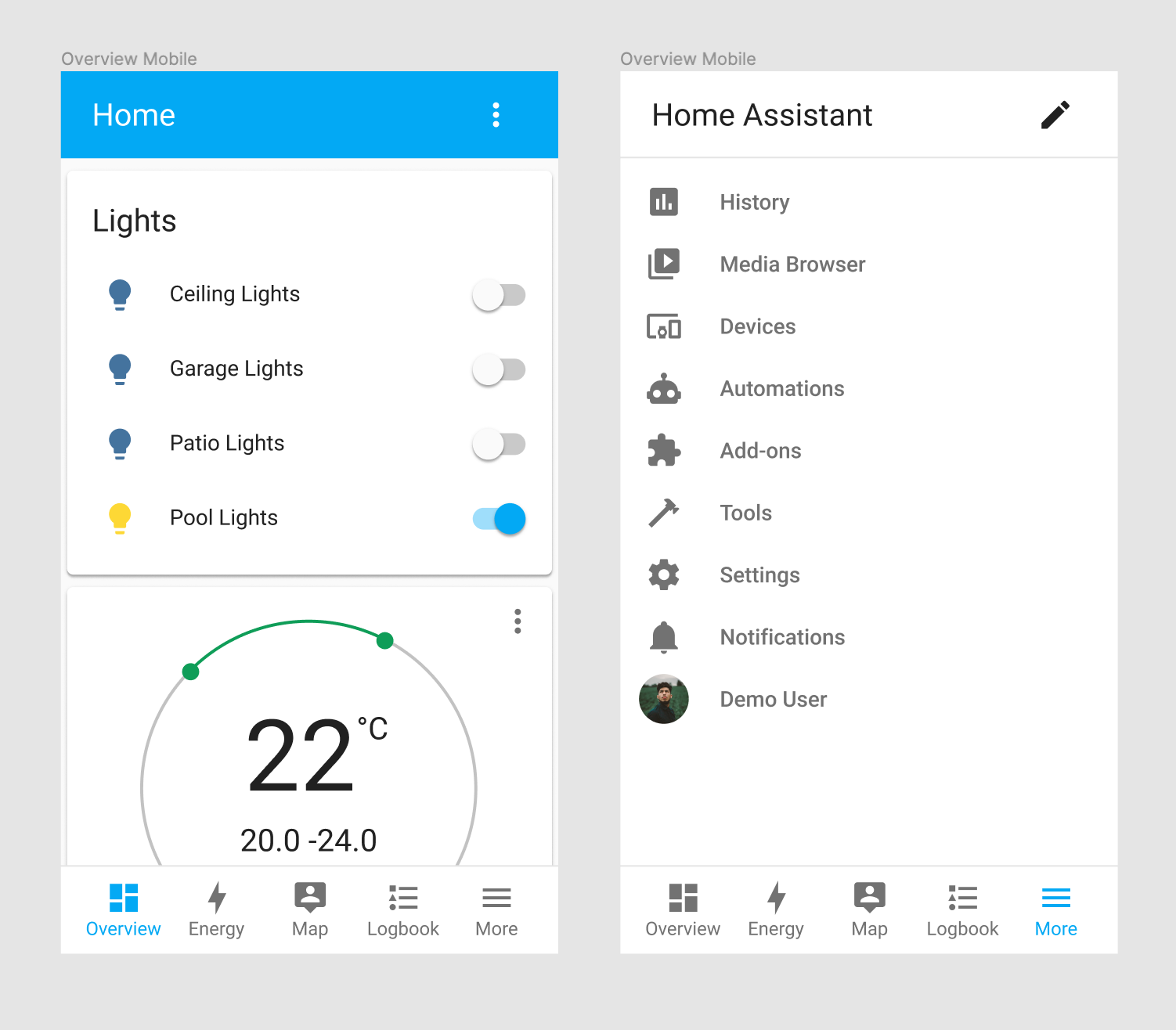
This means that the sidebar on desktop is the bottom navigation on mobile. With the default menu option it could look like as below. Related discussion: #10491
Beta Was this translation helpful? Give feedback.
All reactions