Better readability of add-ons states in Supervisor #11263
Replies: 9 comments
-
|
The full color card doesn't look good at all. We should maybe just make the color border larger. |
Beta Was this translation helpful? Give feedback.
-
|
I think the icon could work |
Beta Was this translation helpful? Give feedback.
-
|
How about filtering "installed add-ons" out of the store entirely? Then the user doesn't have to figure out what the blue color or icon means. And it will be faster to actually find things in the store because it's not cluttered with stuff you already own. And it would give the tabs a clear separation - dashboard is for stuff you have, store is for finding/installing new things. I don't like the full color cards, but the icon idea for update available and stopped seems OK to me. There is a potential for multiple statuses though - you can have an add-on that is stopped and has an update available. So that would need to be figured out, either display two icons or pick one that gets priority. |
Beta Was this translation helpful? Give feedback.
-
|
How about no cards? |
Beta Was this translation helpful? Give feedback.
-
|
That looks nice, how would it work on really wide screens? |
Beta Was this translation helpful? Give feedback.
-
Since it's not built, however we want it to look 😉 |
Beta Was this translation helpful? Give feedback.
-
Why not ! :)
|
Beta Was this translation helpful? Give feedback.
-
|
If this hasn't already been resolved along with the menu restructuring (I kinda thing it has), I really hope a grouping method gains favor so that this can be done without relying on colors. Ignoring color blindness (or low-sight) usability related issues that should be considered, it will takes away part of the concept of having a theme in the first place when things start getting locked down - especially because there's a chance those locked down things may actually conflict with the theme. i.e. what happens when a widely used color of the theme matches one of the red or yellow or green "traffic light" colors? Now because it's locked down, there's no way to make it actually stand out. |
Beta Was this translation helpful? Give feedback.
-
|
+1 with @ludeeus implementation. |
Beta Was this translation helpful? Give feedback.
Uh oh!
There was an error while loading. Please reload this page.
Uh oh!
There was an error while loading. Please reload this page.
-
The request
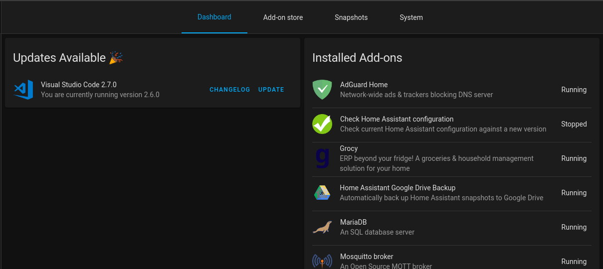
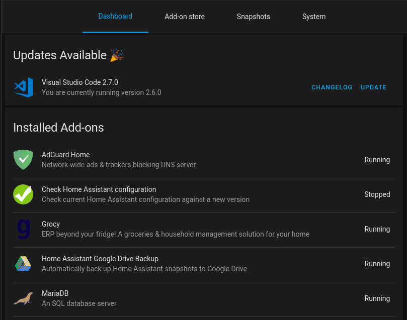
Better readability of add-ons states in Supervisor. At that time it is hard to have an effective quick view because the cases box are too similar. The thin colored line at the top of the box is not enought.
Idea :
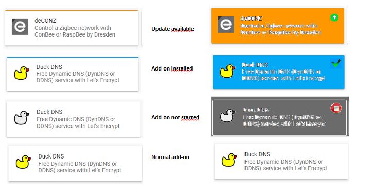
Color the full box for better readability.
As a simple color is not explicit you could add an icon associate with each color.
A (very) quick and dirty example :
But it still missing a lot of information, it's not compact and you can't manage anything befor clicking on an add-on.
The alternatives
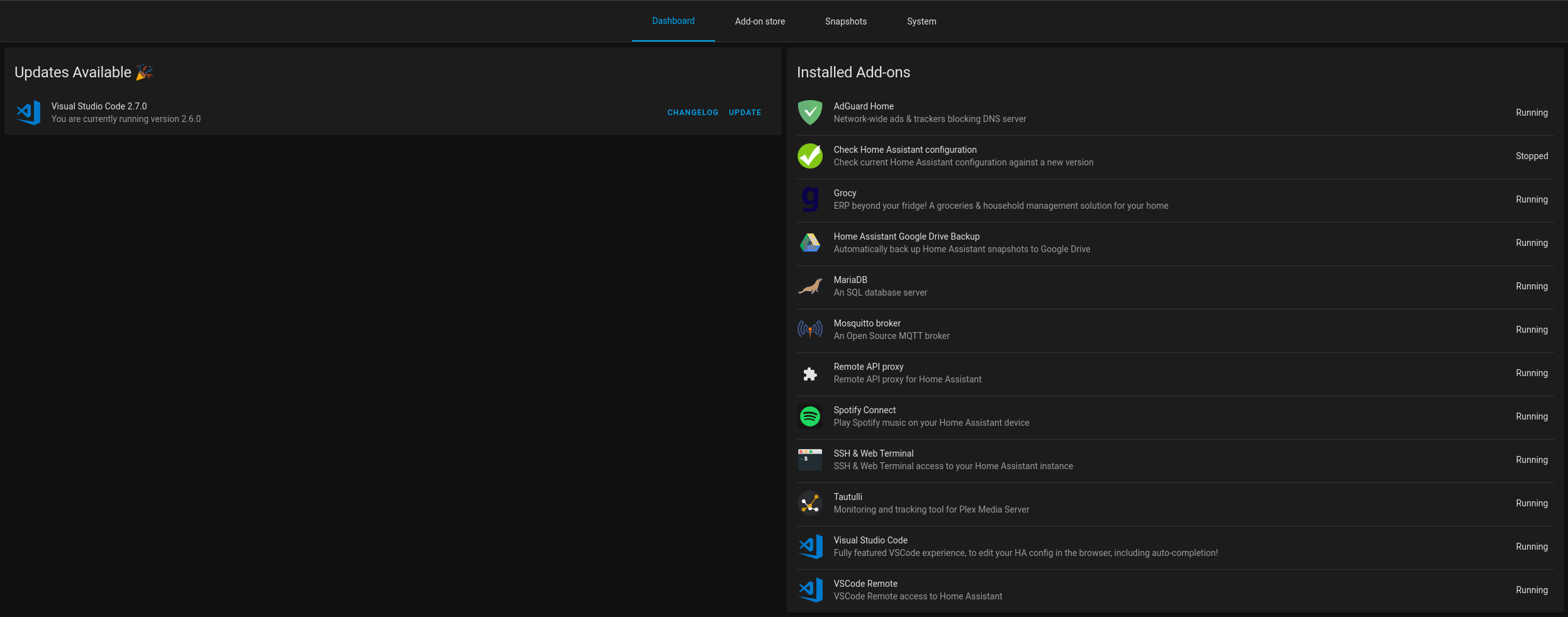
This is another proposition :
Additional information
Some details explained :
With this view you can unify the store and the dashboard and you're able to make a lot of things on one screen.
You could also add another coloum with start on boot state.
@SeanPM5
Beta Was this translation helpful? Give feedback.
All reactions