Bring visual alignment between developer and configuration menus #11295
Unanswered
poldim
asked this question in
Other feature requests
Replies: 1 comment
-
|
@bramkragten feel free to reopen this one, I mistakenly thought this was more about the alignment between the elements in the header of dev tools rather than a redesign of the page itself. My apologies. |
Beta Was this translation helpful? Give feedback.
0 replies
Sign up for free
to join this conversation on GitHub.
Already have an account?
Sign in to comment
Uh oh!
There was an error while loading. Please reload this page.
-
Bring visual alignment between developer and configuration menus
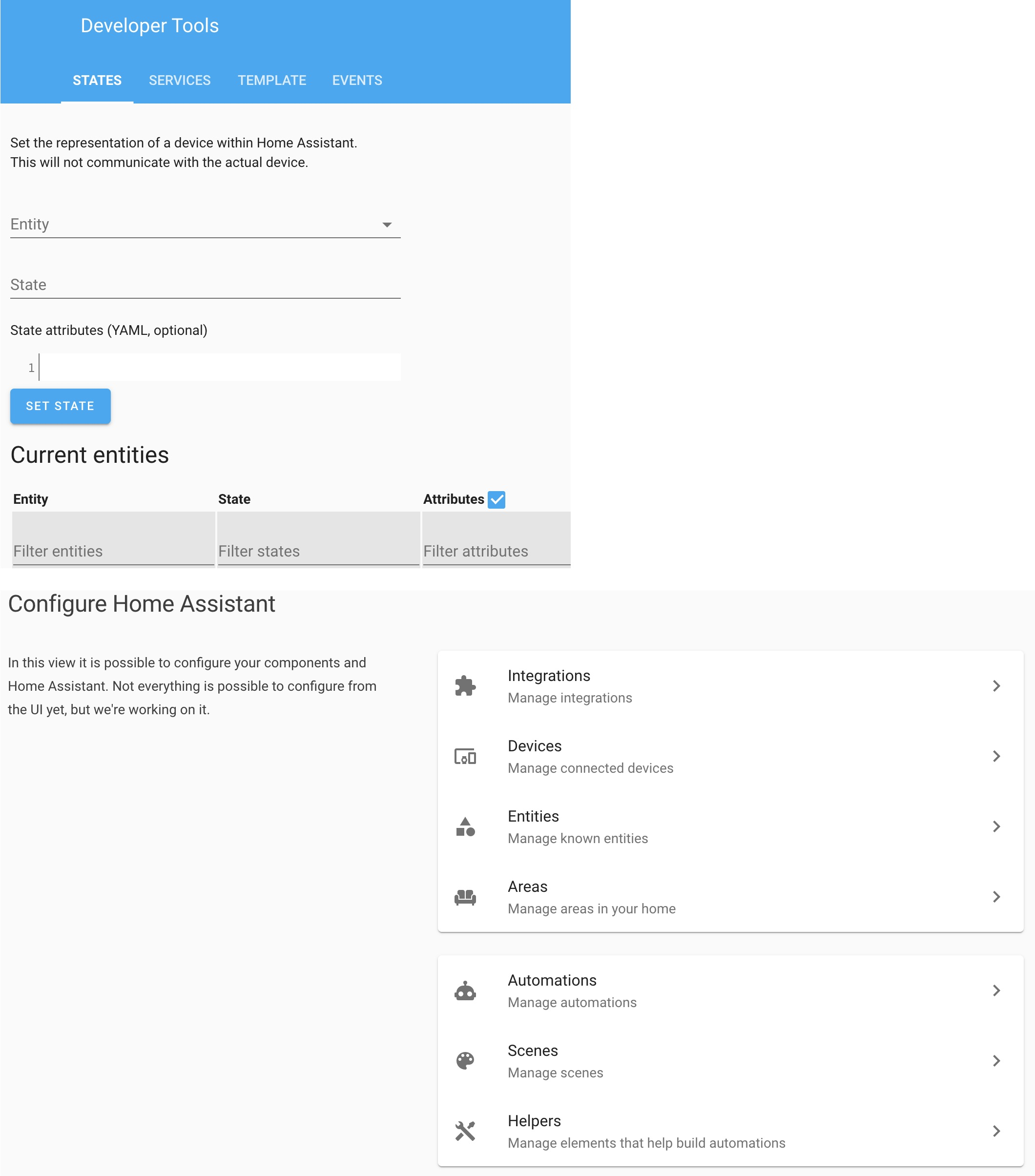
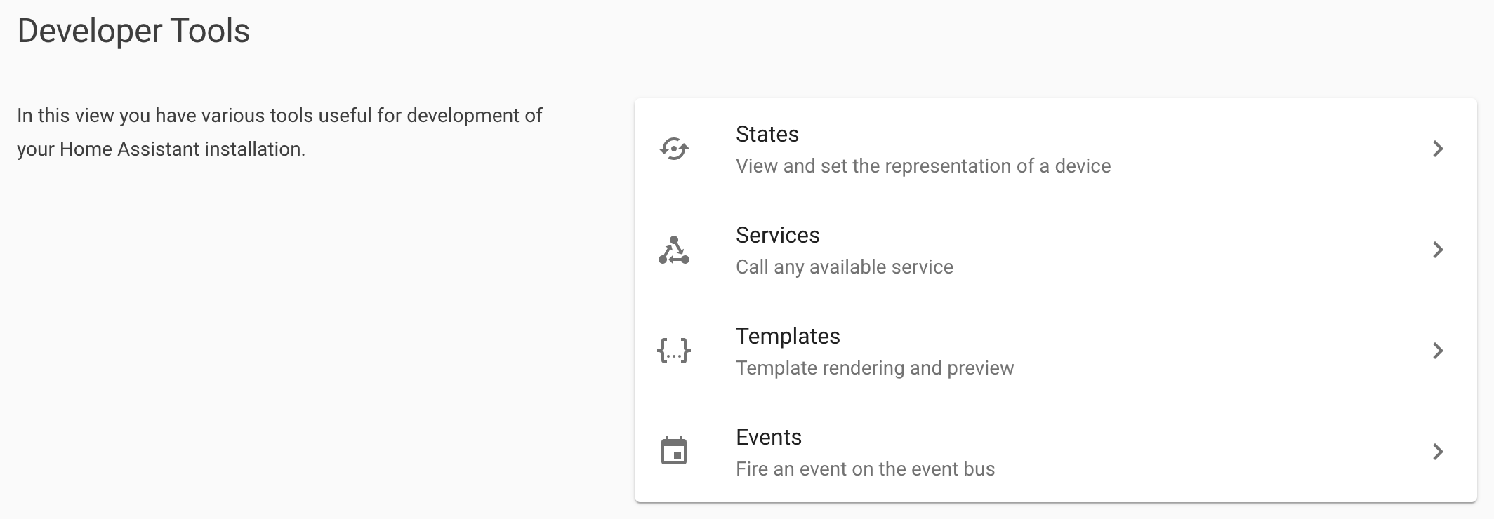
It would be great to have a similar look and feel between the Developer and the Configuration Menus. It currently looks like these two were designed by completely different teams (which could be entirely possible).
While being cognizant that the overall design should not make too many clicks to get to the services tab, but this would only add one click to get to the services screen
TODAY:
POSSIBLE:
The alternatives
Additional information
I have the Chrome Inspect window open but can’t copy the HTML code because of what I think are these shadow-root errors. If anyone knows how to fix this, LMK.
Beta Was this translation helpful? Give feedback.
All reactions