Map should have more contrast #12932
-
|
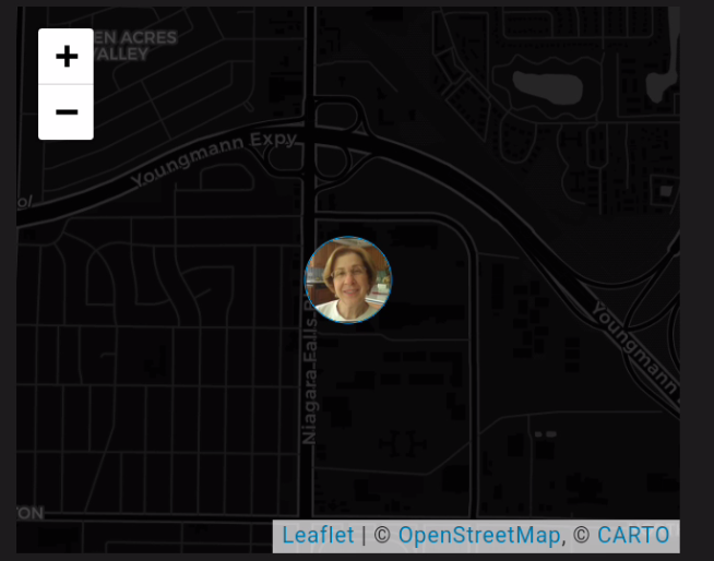
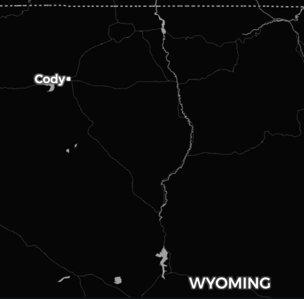
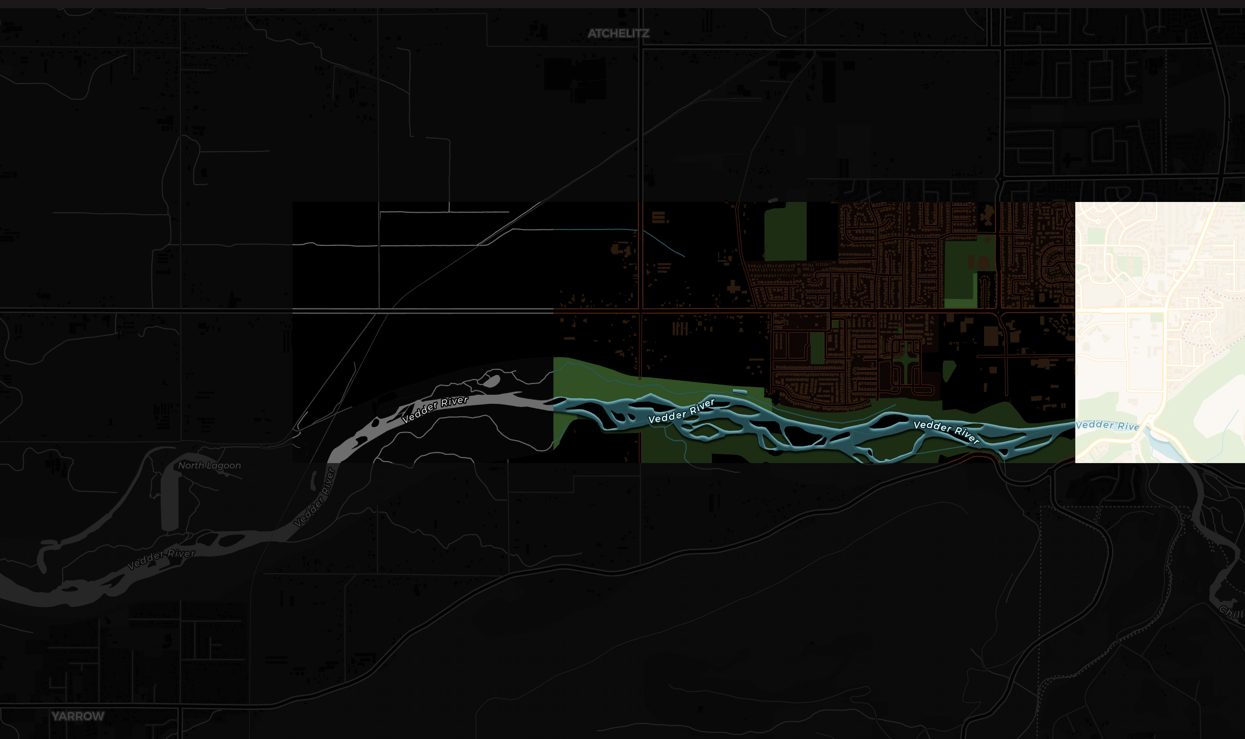
I have a person badge on the dashboard. When I click on it, it takes me to a map showing where the person is. But the map, at least in dark mode on my Galaxy S10, is too dark to make out where they are on the map. I can see hints of roads that are just a dark gray on a what looks like a black background. And the screen captures on Phone Link on the PC that I attached here look better than they do on the phone.
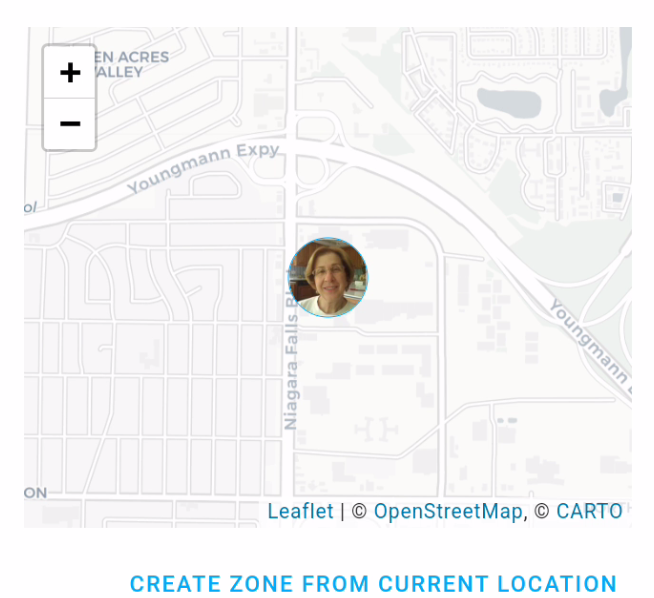
In light mode, the roads show up a little better, but I see no reason to have such low contrast on the items on the map.
|
Beta Was this translation helpful? Give feedback.
Replies: 3 comments 7 replies
This comment was marked as disruptive content.
This comment was marked as disruptive content.
-
|
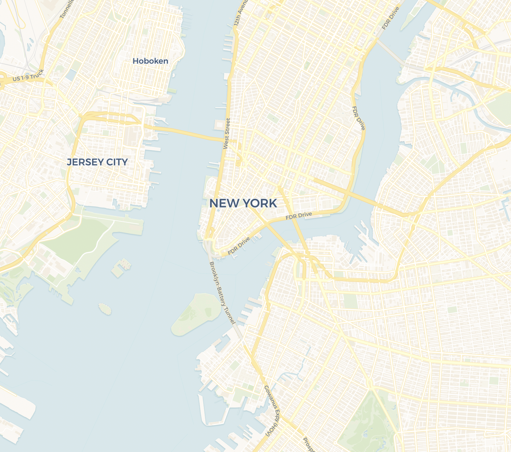
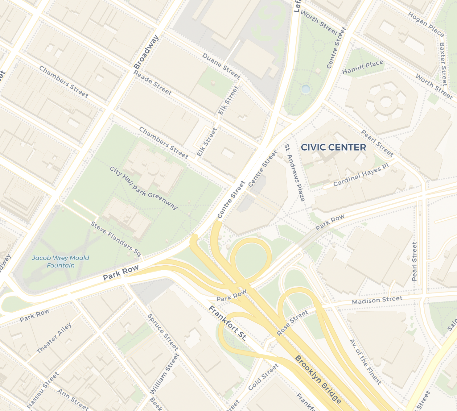
We currently use CARTO. Examples: They also have a version we don't use, I would recommend applying |
Beta Was this translation helpful? Give feedback.
This comment was marked as disruptive content.
This comment was marked as disruptive content.
-
|
I'm not using a card. I was just tracking a person. When I click on the person badge, the map is shown. |
Beta Was this translation helpful? Give feedback.
This comment was marked as disruptive content.
This comment was marked as disruptive content.
-
|
How do I get that to show up for the badge? |
Beta Was this translation helpful? Give feedback.
-
Beta Was this translation helpful? Give feedback.
-
|
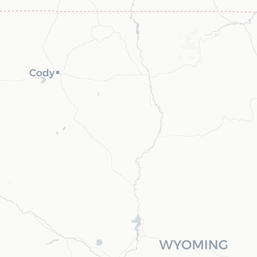
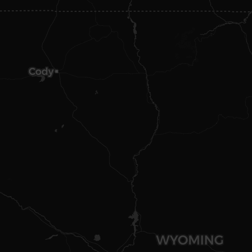
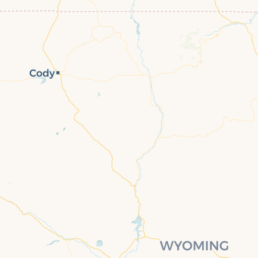
Edit: Fixed in #13227 Personally, I would like to use a more vibrant map style with more contrast that users are familiar with, for example from Google Maps. For the CARTO basemap, that would be the Voyager style. We're only adding zones and people to our map, so I think this would work perfectly with a more detailed map. Downside is that there isn't a dark mode version of Voyager. In that case we could invert the colors or apply a hue rotate effect, described in this blog post.
|
Beta Was this translation helpful? Give feedback.
-
|
How's |
Beta Was this translation helpful? Give feedback.
Edit: Fixed in #13227
Personally, I would like to use a more vibrant map style with more contrast that users are familiar with, for example from Google Maps. For the CARTO basemap, that would be the Voyager style. We're only adding zones and people to our map, so I think this would work perfectly with a more detailed map.
Downside is that there isn't a dark mode version of Voyager. In that case we could invert the colors or apply a hue rotate effect, described in this blog post.