Disability for Color blind Men improvements #14402
Replies: 7 comments 2 replies
-
|
Please do file issues here regarding use of color and color contrast. Try to be as specific as possible and keep different issues separate. I will make sure they get added to the accessibility project and triaged for the best visibility. Personally, my eyesight is too poor at this point to notice contrast or color issues, so I'll need to rely on users like you to point them out and file issues. I'm happy to facilitate fixing them though. |
Beta Was this translation helpful? Give feedback.
-
|
Fair enough! Happy to help! jeff |
Beta Was this translation helpful? Give feedback.
-
|
Thanks for pointing this out! We want to make Home Assistant accessible to all our users. It's a work in progress, so please keep reporting issues. About the tracer, it's on my list to make a mockup for the next iteration. Will take this issue into account. |
Beta Was this translation helpful? Give feedback.
-
|
In future color themes and styling designs, we should make sure to take into account all the relevant WCAG criteria. These fall under the distinguishable guideline. |
Beta Was this translation helpful? Give feedback.
-
|
Great thanks. I was just informed by my better half that 1 in 200 women also suffer from this affliction! |
Beta Was this translation helpful? Give feedback.
-
|
The easiest way around this is with creative use of icons. Subtle changes like line color around a circle are really hard for me to detect. An icon that changes shape is much more obvious and thus helpful. |
Beta Was this translation helpful? Give feedback.
-
|
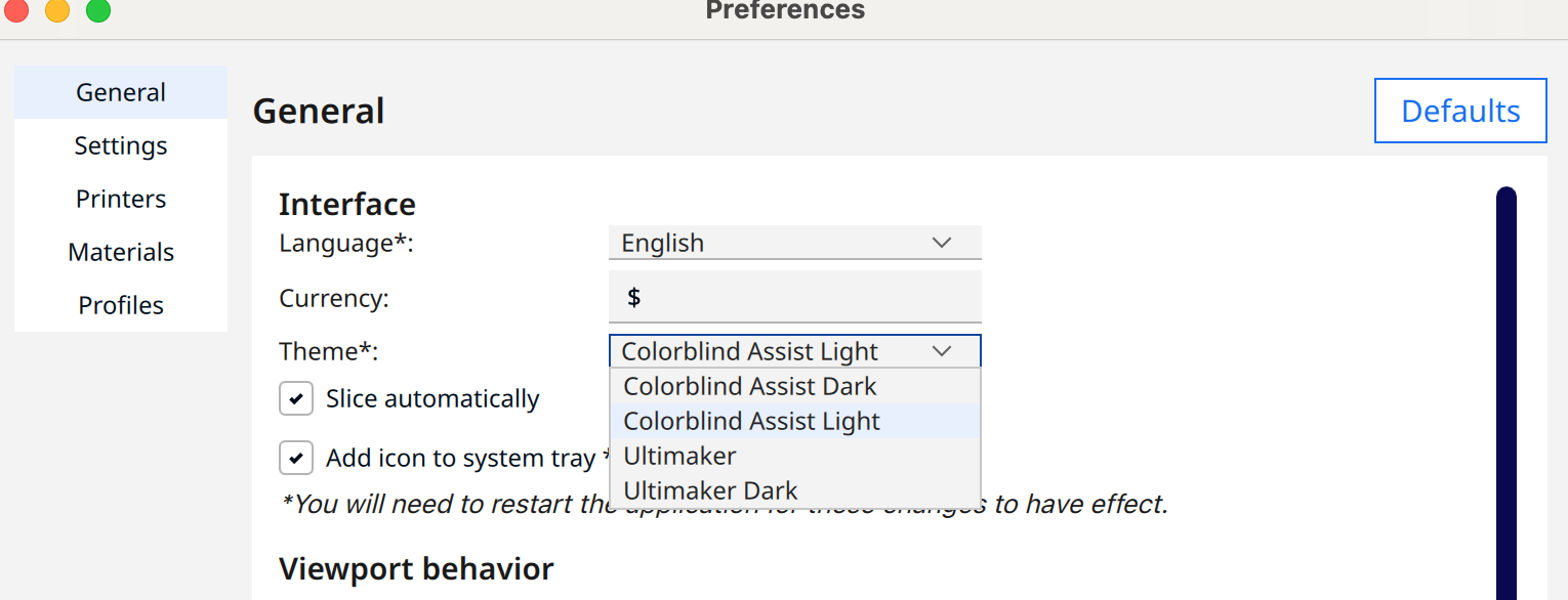
Check this out! This is literally the FIRST time in 35 years I've ever seen an option in software to address colorblindness. This is Cura Ultimaker 3D printer slicing software.
|
Beta Was this translation helpful? Give feedback.
-
|
I assume you are familiar with OS accessibility settings? At this point nearly all of them have color filters you can apply for different types of color blindness. Although one thing I would like to see HA ship with in the future is a high contrast theme. |
Beta Was this translation helpful? Give feedback.
-
|
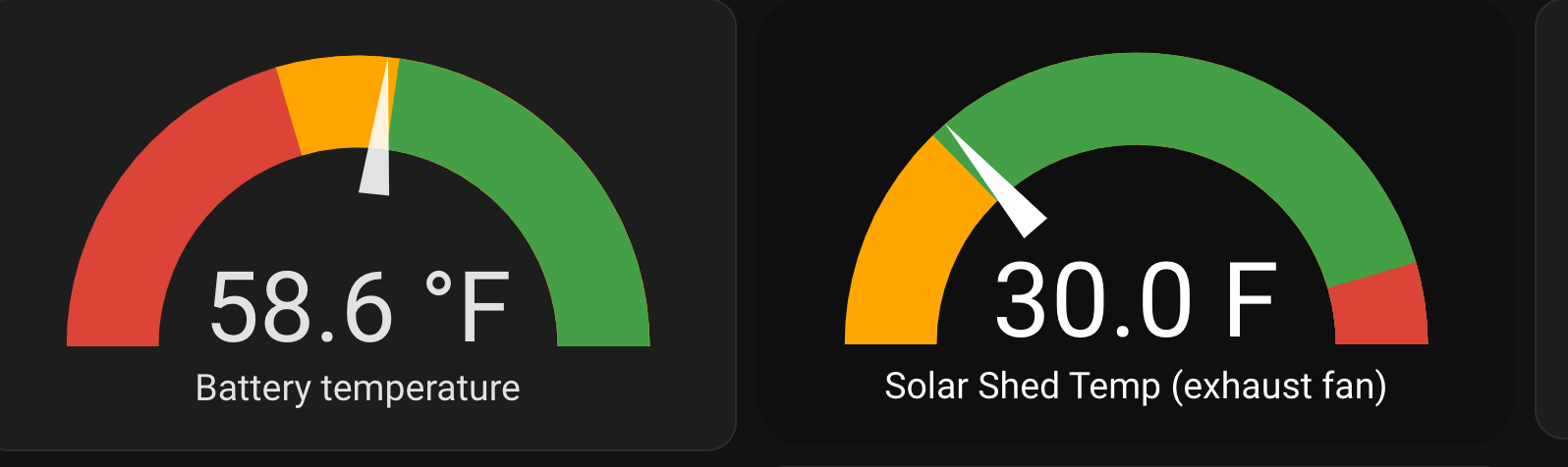
Honestly, the OS color blind filters look like crap and don't make it any easier to see colors, at least not Red/Green. Here's a REALLY good example of red/green deficiency.
EDIT: interesting observation.... once I published this message, the graphic was set against a white background. I can now see the red/green. in HOME ASSISTANT, I have a dark theme and bc the surrounding screen is all black, I cant make out the difference. So strange. |
Beta Was this translation helpful? Give feedback.
Uh oh!
There was an error while loading. Please reload this page.
Uh oh!
There was an error while loading. Please reload this page.
-
Fact: 1 in 12 men are colorblind. Red/Green is one of the worst. The gene carried by the mother, but only passed to the sons. Talk about discrimination....
Home Assistant is now in my area of difficulty. I was just trying to debug an automation and could not figure out the trace info. Why was a circle in the trace timeline that I pressed changing, but for absolutely no apparent reason. Then I held the iPad screen up close to my eyes and I could see some well intentioned programmer changed the state of an icon in a way that to 11 out of 12 guys could probably see, but the 1 out if 12 of us who are colorblind cannot easily see.
It may be a small thing, but after watching the livestream the other day, if you're going to preach the "we care about disability" walk, then walk the walk...
Dont get me wrong, I LOVE the improvements to the automation section. Massive strides here. This is the one issue that is front and center right now because I just caught it, and you guys are making noises that you want to improve this area of the product. There have been many others, but I'm so used to insensitivity by designers at large, not just home assistant, but ALL UI designers, I dont let it bother me much and just move on.
if you guys really are interested in helping those of us with disabilities, then tell me where to report issues like this that will get attention.
Perhaps a new PR or request area called Disability Improvements. Don't be PC about the name, call it what it is. We are disabled. It's a fact.
When I was at Netscape in the early days (1994/95) I often sat with the UI engineers and programmers to review how their design ideas impacted guys who were colorblind. I was their Guinea Pig. Happy to be so for you all as well.
Jeff
Beta Was this translation helpful? Give feedback.
All reactions