Re-arrange cards, shrink padding or make the QR button a link for adding a zwave device #15661
Unanswered
kellya
asked this question in
Configuration
Replies: 0 comments
Sign up for free
to join this conversation on GitHub.
Already have an account?
Sign in to comment
Uh oh!
There was an error while loading. Please reload this page.
Uh oh!
There was an error while loading. Please reload this page.
-
I have been running home assistant for about a month, and one of the things I have been doing frequently is adding zwave devices via the ios companion app on my iphone SE (so a smaller screen iPhone).
When I navigate to add a z-wave device, I am greeted with this:
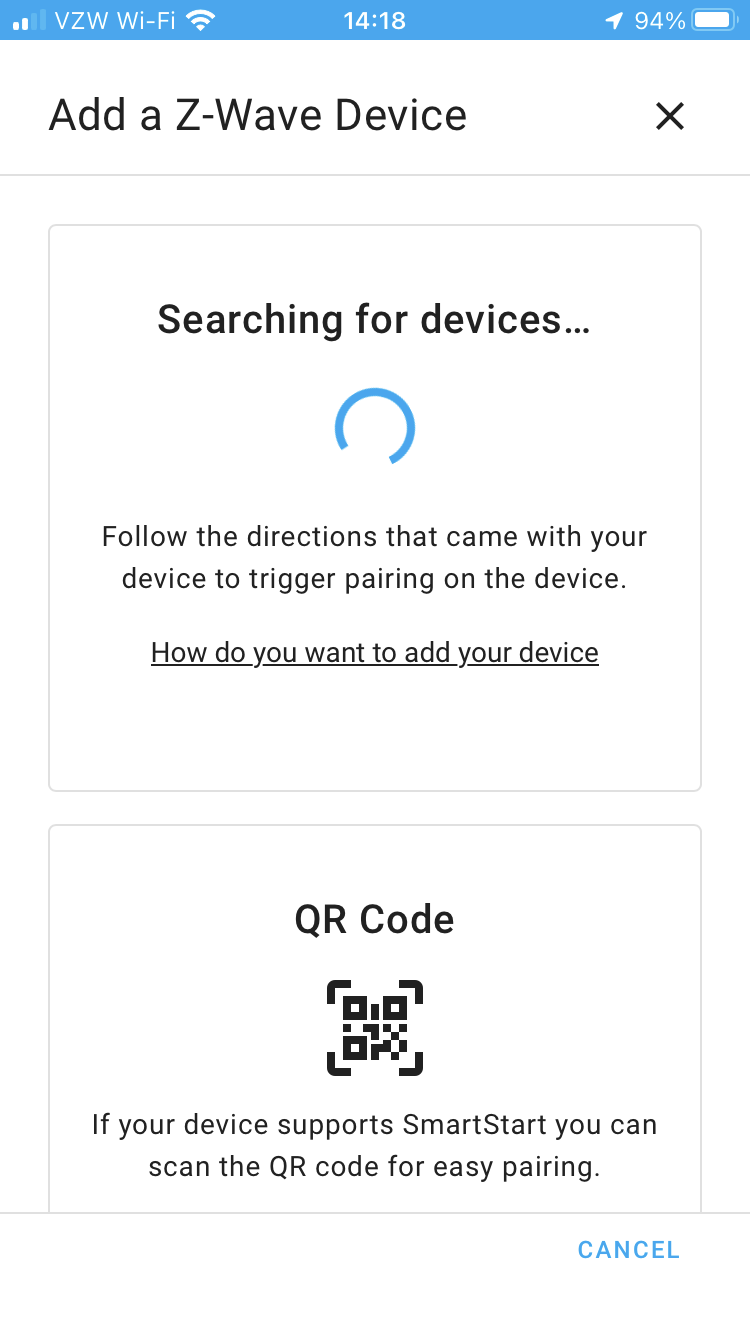
I want to scan the qr code, so the first thing I tried is hitting the little QR code image, which doesn't do anything. I eventually figured out that there is a "Scan QR Code" link that is "hidden" just out of reach. You have to scroll the page a little bit. Then the link is visible and can be clicked to take action.
Once it's figured out, it's easy to do (though mildly annoying to have to always scroll to get it). The main problem though is it's just not visibly obvious at a glance, and there is a lot of padding around everything that wastes space and makes the content long enough that it has to scroll.
I am not a UI expert, but it seems there a number of things that could make it more accessible/obvious:
Maybe I'm the last person to have a 4.7" screen, and no one else sees this issue :) But it seemed like an area that could use a little update to make it more obvious.
Beta Was this translation helpful? Give feedback.
All reactions