Replies: 1 comment
-
|
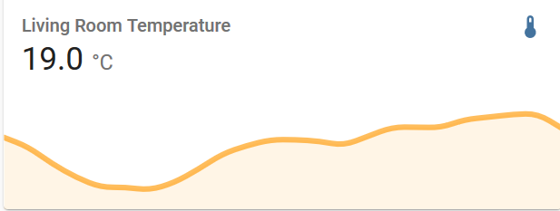
Case in point: Right now I cannot tell on first glance whether the living room temperature varied between 19.1 and 18 or between 21 and 15 degC.
I know I can click on the card to see the history plot, but it would add value to the sensor cards if I could see this directly. |
Beta Was this translation helpful? Give feedback.
0 replies
Sign up for free
to join this conversation on GitHub.
Already have an account?
Sign in to comment
Uh oh!
There was an error while loading. Please reload this page.
-
Hi, I find the plots on sensor cards to be prettier than the history plots, but because of the lack of any scale information, they are near impossible to read quantitatively. I guess that adding some sort of information about the y axis scale would mess with the design, but maybe it would be useful to just set a fixed min and max value for the y-axis instead. Then the up and down movements on the card could actually tell us something about the size of the swings of the sensor value.
Beta Was this translation helpful? Give feedback.
All reactions