-
|
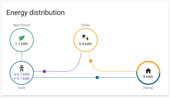
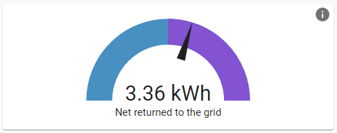
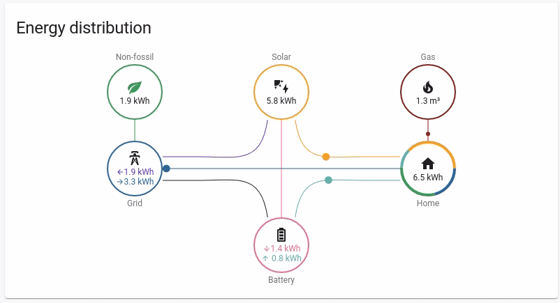
(Per @balloob's suggestion, I have broken some of the below issues out into #9975, #9976, #9977, #9978.) The new energy dashboard is fantastic. But I think that the presentation of information in the sidebar cards (which are also available for any Lovelace view) could be improved. Here are my suggestions. For reference, I'm including the images from the documentation for these cards. Energy distributionCurrent look (more or less): One thing that might confuse users is that the animation (energy dots flowing between nodes) suggests a live view of energy flow. But the numbers and the speed of the animation actually reflect production or consumption for the whole day so far, or for an entire past day if you've scrolled back in the energy dashboard. Some ways to address this: allow the user to select a time period, up to as narrow as the last 15m, perhaps (I know that v2021.9 will allow some customization here); don't animate the dots when showing a previous day (or other period that has concluded); at the very least, indicate to the user that the numbers reflect daily usage (in fact, this goes for all of the cards, since none of them say this, making interpretation unclear when they are placed on custom Lovelace dashboards besides the energy dashboard). Another confusing thing is that the blue number represents total grid consumption (fossil and non-fossil) on the "Grid" circle, but the blue pie slice represents only fossil grid consumption on the "Home" circle (with non-fossil being split out into a green pie slice). One (admittedly imperfect) fix here would be to eliminate the "Non-fossil" circle, making that information a new line in the "Grid" circle (since it's really just part of the grid anyway), turning the "Grid" circle into a blue, green, and purple pie chart like the "Home" circle is, and somehow making it more clear that blue specifically means fossil grid consumption. (The blue bars on the main energy usage graph could then also be subdivided into blue and green as well.) Grid neutrality gaugeCurrent look: This card is basically redundant with the energy distribution card above. It’s just doing a few operations to tell you whether you returned more than you consumed, which you can tell by glancing at the "Grid" circle on the energy distribution card anyway. Second, it’s not immediately clear what the needle position represents. It’s relatively clear that the number displayed in the gauge is just
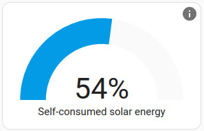
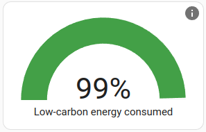
Solar consumed gaugeCurrent look: First of all, it is not clear how to compare the tooltip with the graph. It takes a second to realize that “produce more than you consume” counterintuitively refers to a situation where the displayed number is low. Secondly, I don’t think it’s correct to say that channeling energy into a battery or an electric car is “conserving” energy compared to returning it to the grid. Batteries are not even necessarily advantageous for solar users with good net metering, such as in many US states. Third, the text sort of makes excess production seem like a bad thing, which is hard to square with the green/red color choice in the previous card (which, as I said, I think should be changed or eliminated anyway). So my suggested text is: Carbon consumed gaugeCurrent look: I would clarify that this includes both local and grid sources. I would also clarify that higher is better, since the valence of the other gauges is not totally straightforward. (In other words, whether it is better to aim for production or parity depends on your goals, your net metering situation, etc.) But a high proportion of non-fossil consumption is unequivocally good—so why not make that clear? Suggested text: Thoughts? I'm happy to open a PR if a consensus opinion emerges. |
Beta Was this translation helpful? Give feedback.
Replies: 2 comments 3 replies
-
|
I'd also like to point out there is an inconsistency in the color usage in the newest Energy Distribution card. As seen below the grid circle is blue and the output line to the home is also blue. Solar is yellow with a yellow output line to the home, etc. However, the battery circle is a pinkish color, but the output line it light blue. For consistency either the battery circle should be changed to light blue to match the output or the input & output values and lines should swap colors. Also, in my opinion, I would make all 3 lines out from solar (to grid, home, battery) yellow to match the circle. In the same fashion the line between the grid and the battery would actively switch between the grid color, when more energy transferred from grid to battery, or the battery color. There could still be the unique purple and pink colors on the grid and battery inputs since these would be a sum of solar + battery (for grid return) and solar + grid (for battery charge). |
Beta Was this translation helpful? Give feedback.
-
|
Further discussion about this to take place under #9949. |
Beta Was this translation helpful? Give feedback.
-
|
Create a single discussion thread per topic please. Putting 3 topics in one won't help discussing it. Now @EnochPrime introduced even a new issue and that makes it impossible to conclude anything |
Beta Was this translation helpful? Give feedback.
-
|
Started a new discussion specifically for Energy Distribution card color usage. #9949 |
Beta Was this translation helpful? Give feedback.
-
Beta Was this translation helpful? Give feedback.
Create a single discussion thread per topic please. Putting 3 topics in one won't help discussing it. Now @EnochPrime introduced even a new issue and that makes it impossible to conclude anything