-
|
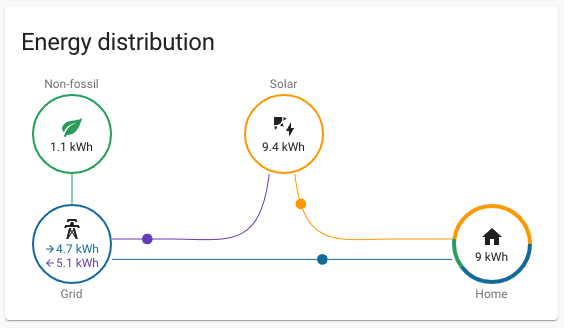
Current look: Just as the perimeter of the Home circle on the Energy Distribution card is a orange/green/blue pie chart indicating the breakdown of energy usage source, the perimeter of the Grid circle could be a blue/purple pie chart indicating the balance of grid energy consumed and returned. This would provide useful information at a glance. As an additional benefit, it would essentially render the Grid Neutrality Gauge card redundant, which could then be removed in favor of additional information (see #9976). |
Beta Was this translation helpful? Give feedback.
Replies: 1 comment 1 reply
-
|
We have explored this but decided against it. It would require us to also include the green color and it becomes confusing fast. Breaking it out and having it as a gauge is a lot easier for people to understand. When you add too much information in a single card, people will overlook things. |
Beta Was this translation helpful? Give feedback.
-
|
I agree—especially with green being (sort of) a subset of blue. And with the addition of battery and gas, things are getting a bit out of hand, and I see the need for this to be as minimal as possible. I really like @matthiasdebaat's mockup here—seems promising. |
Beta Was this translation helpful? Give feedback.
We have explored this but decided against it. It would require us to also include the green color and it becomes confusing fast. Breaking it out and having it as a gauge is a lot easier for people to understand. When you add too much information in a single card, people will overlook things.