Replies: 3 comments
-
|
I believe this will largely depend on the theme, which will make a generic solution tough. Your theme allows the header to move downwards, but e.g. the default one keeps the header stuck to the top when the rubberband/refresh is happening, so if there was some kind of scroll/distance-based overlay, it would break. Long-term: we shouldn't have an app-specific overlay on the top, the theme/frontend should be entirely in charge of the gutter space. That solves this issue, but it also requires changes in a few different places. |
Beta Was this translation helpful? Give feedback.
-
|
I see it on default too. It only happens when the rubberband is broken and the actual reload happens. In the pull down it’s fine |
Beta Was this translation helpful? Give feedback.
-
|
|

Beta Was this translation helpful? Give feedback.
Uh oh!
There was an error while loading. Please reload this page.
Uh oh!
There was an error while loading. Please reload this page.
-
Is your feature request related to a problem? Please describe.
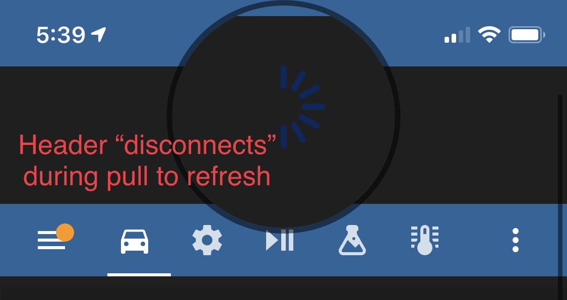
This has been a "problem" since pull to refresh was introduced last year. Nobody really complains about it because it's minor, but visually it feels weird to me to have this gap here, it sorta looks like a bug. And it's an action users perform very often.
I am talking about how the header appears to detach from itself when refreshing:
Describe the solution you'd like
I think it would look nicer if the header was just extended down. So in my above screenshot, rather than showing the background (which is black) the whole top part would be blue. Really quick mockup of what I mean, I know the icon is wrong:
This would make it one consistent color and it would never appear detached. It would also make the icon color consistent too.
But this issue is more of a nitpick really, so if it's hard or not worth the effort, I'm totally fine with it being closed :)
Describe alternatives you've considered
Additional context
Beta Was this translation helpful? Give feedback.
All reactions