Bug/feature: Adding multiple metrics makes the graph visualisation values disappear #1745
Description
Use Case
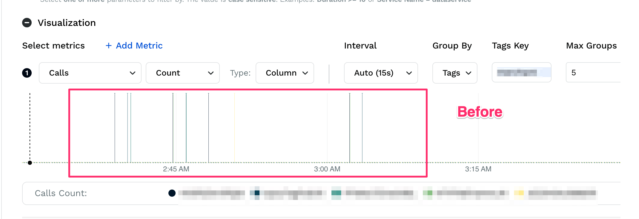
As a user, I want to view different graphs simultaneously on the Explorer screen to get an overview of my API's performance. This is very difficult with the current UI that overlaps all the metrics into one graph.
Proposal
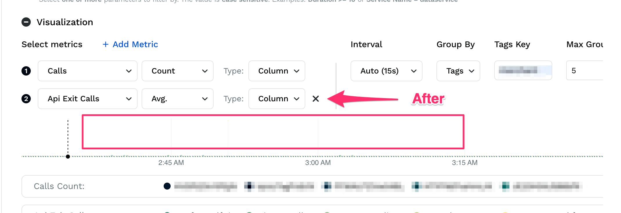
The problem with overlapping all metrics into one graph is that the metrics selected are often unrelated and have different y-axis scales. So when we add a new metric, the graph of the previous metric disappears due the scale of y-axis getting changed.
Questions to address (if any)
Even if there's a way to fix this y-axis problem, superimposing graphs of unrelated metrics on each other is a very confusing UX for the user when all they're trying to do is see different kinds of graphs that have nothing to compare by superimposing them.
Possibly related to #1101