A short foray into data visualization, mapping and cartogramming, using the US presidential elections results.
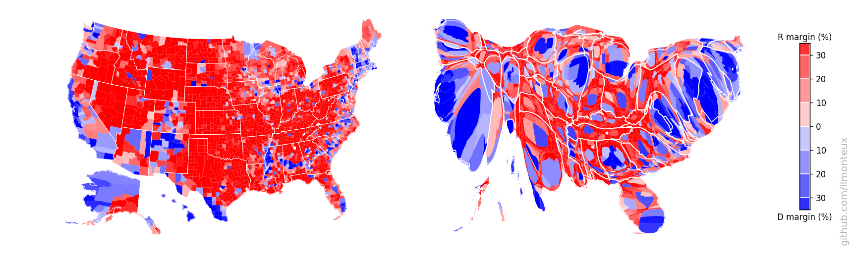
In addition to plotting the election results in the blue/red scheme at the state or county level, I create a cartogram, that is a morphed map where the size of each state or county is based on its population.
Head to the github.io page for details and a tutorial.
Here is a sample of visualizations for the 2016 elections:


You can find more plots in the github.io page, including state-level results, comparisons to the 2008 and 2012 elections, zoomed single-state cartograms and exploration of correlations between voting and demographics. The analysis is done in two Jupyter python notebooks:
- election_maps.ipynb for generating the maps and the cartograms.
- demographics.ipynb for analysis of voting patterns and correlations with demographics.
Amazingly, there exist no central government source from which to download election results. The raw county-level election data was downloaded from OpenDataSoft, which repackaged data first created on GitHub by Deleetdk, which in turns scraped the New York Times website.
The dataset was missing Alaska results, but fortunately the people at rrhelections.com repackaged the precinct-level data into county-level data.
State-level maps were downloaded from the US Census Bureau, but are also included in the input directory as they are not too big.
In order to reproduce the analysis made here, you can git clone this repository. The only missing file is the 240MB JSON file with election results and coordinates for each county border. You will need to download it directly from OpenDataSoft into the input/ directory.
To analyze and plot the data, I have mostly used common packages:
matplotlib,numpy,pandas,geopandas,shapely.geometryfor importing, data manipulation and plotting.mpl_toolkits.basemapfor projecting latitude/longitude coordinates into projection coordinates.joblibfor speeding up the execution of a couple of steps via parallel processing.
The last two packages are not strictly necessary, for example geopandas already includes the projection mapping.
For making the cartograms, I have used the diffusion based algorithm of Gastner and Newmann (link to paper), in particular using the C++ implementation provided by one of the authors. After downloading and compiling it, in my setup the executable is in a subfolder of the parent directory, that is, ../cart-1.2.2/ from the main directory.
All the plots are saved in the figs/ subdirectory. See the short_summary.md for a quick summary, and the Jupyter notebooks election_maps.ipynb and demographics.ipynb to reproduce the plots and make your own.
- Angelo Monteux - ilmonteux
This project was inspired by this blog post by Akkana Peck.
Most of the hard work was done by the people that put together the datasets, in particular
- New York Times where most of the data comes from.
- Deleetdk for scraping the NYT website to get the raw data.
- OpenDataSoft for repackaging the data
- rrhelections.com for repackaging results from Alaska into county-level data.