Replies: 3 comments 3 replies
-
|
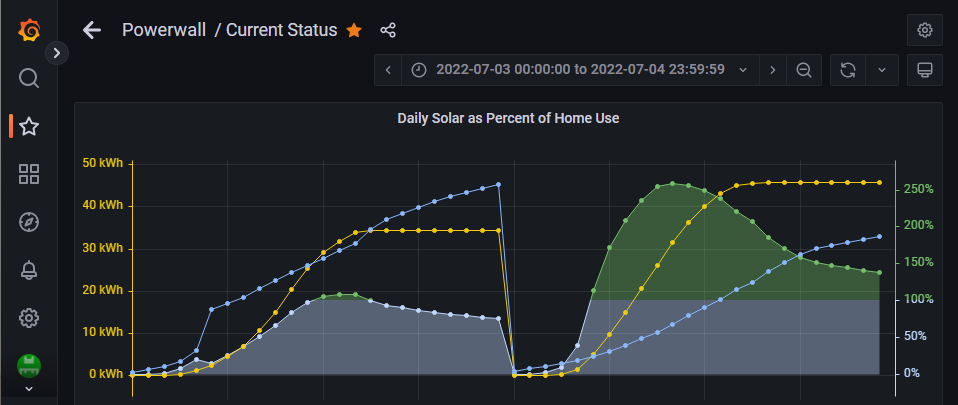
Hi @nullgel - I love the look of your yearly graph with those moving averages. Can you share how you did that? For getting a graph to show the ratio of solar production over home usage, you could use a query like this: SELECT sum("solar")/sum("home")
FROM "kwh"."http"
WHERE $timeFilter GROUP BY time(1d) fill(0) tz('America/Los_Angeles')You would want to add a series override to move it to a separate axis so it shows up. Here is my test: |
Beta Was this translation helpful? Give feedback.
0 replies
-
Beta Was this translation helpful? Give feedback.
1 reply
-
|
Exactly! Yeah... I kicked it around for a few more hours yesterday with no
luck. It sure seemed simple at first glance, but it's tricky to implement.
…On Fri, Feb 10, 2023 at 1:10 AM Jason Cox ***@***.***> wrote:
Thanks @nullgel <https://github.com/nullgel> - I love the simple
moving-average graph you built. Looks nice.
Ok, I think I understand what you are looking for. You are right, it is
more complex. You want data points on the time series graph (t=0 to t=n) to
be a sum of the (home/solar) for that duration. Assuming the graph you want
is represented by function ratio(n). And home(n) and solar(n) are the
sums of home usage for the day n.
ratio(0) = (home(0)/solar(0))
ratio(1) = (home(0) + home(1)) / (solar(0) + solar(1))
ratio(n) = (home(0) + ... + home(n)) / (solar(0) + ... + solar(n))
Is that right? If so, we can look at how we reduce or use that to plot.
—
Reply to this email directly, view it on GitHub
<#176 (reply in thread)>,
or unsubscribe
<https://github.com/notifications/unsubscribe-auth/AGTUYXMFZ6WCUARU2BZRFE3WWXLVRANCNFSM6AAAAAAUVM35UE>
.
You are receiving this because you were mentioned.Message ID:
<jasonacox/Powerwall-Dashboard/repo-discussions/176/comments/4928596@
github.com>
--
Nate Winesett
|
Beta Was this translation helpful? Give feedback.
2 replies
Sign up for free
to join this conversation on GitHub.
Already have an account?
Sign in to comment


Uh oh!
There was an error while loading. Please reload this page.
-
A number that I'm obsessed with watching is the (hopefully positive) number denoting the amount of excess energy that I produce. I generate this number this way:
However, I would really like to watch this number over time in the year long graph:
(Note: In the above graph, the bright yellow line is a 30-day average of solar production and the bright blue is home usage)
But I am having a tough time getting it to work. I feel like I'm over-complicating it and would really appreciate some advice. Even a point in the right direction may be sufficient.
Thanks!
Beta Was this translation helpful? Give feedback.
All reactions