Last September, I gave a talk which included a bunch of two-dimensional plots of a high-dimensional objective I was developing specialized algorithms for optimizing. A month later, at least three of my colleagues told me that my plots had inspired them to make similar plots. The plotting trick is really simple and not original, but nonetheless I'll still write it up for all to enjoy.
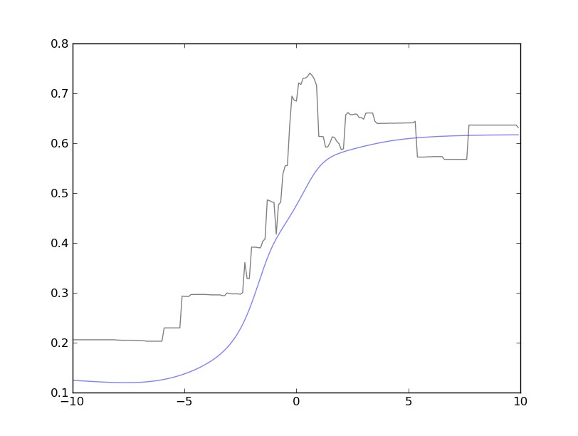
Example plot: This image shows cross-sections of two related functions: a non-smooth (black) and a smooth approximating function (blue). The plot shows that the approximation is faithful to the overall shape, but sometimes over-smooths. In this case, we miss the maximum, which happens near the middle of the figure.
Details: Let
One simple thing to do is take a nonzero vector
Of course, you'll have to pick a reasonable range and discretize it. Note,
Picking directions: There are many alternatives for picking
- Coordinate vectors: Varying one (or two) dimensions.
- Gradient (if it exists), this direction is guaranteed to show a local
increase/decrease in the objective, unless it's zero because we're at a
local optimum. Some variations on "descent" directions:
- Use the gradient direction of a different objective, e.g., plot (nondifferentiable) accuracy on dev data along the (differentiable) likelihood direction on training data.
- Optimizer trajectory: Use PCA on the optimizer's trajectory to find the directions which summarize the most variation.
- The difference of two interesting points, e.g., the start and end points of your optimization, two different solutions.
- Random:
If all your parameters are on an equal scale, I recommend directions drawn
from a spherical Gaussian. [[#^ba9f4b|1]]
The reason being that such a
vector is uniformly distributed across all unit-length directions (i.e., the
angle of the vector, not it's length). We will vary the length ourselves via
However, often components of
Extension to 3d: It's pretty easy to extend these ideas to generating
three-dimensional plots by using two vectors,
Closing remarks: These types of plots are probably best used to: empirically verify/explore properties of an objective function, compare approximations, test sensitivity to certain parameters/hyperparameters, visually debug optimization algorithms.
Further reading:
- More formally, vectors drawn from a spherical Gaussian are
points uniformly distributed on the surface of a
$d$ -dimensional unit sphere,$\mathbb{S}^d$ . Sampling a vector from a spherical Gaussian is straightforward: sample$\boldsymbol{d'} \sim \mathcal{N}(\boldsymbol{0},\boldsymbol{I})$ ,$\boldsymbol{d} = \boldsymbol{d'} / | \boldsymbol{d'} |_2$ [[#^1b3294|↩]] ^ba9f4b