This repository was archived by the owner on Apr 6, 2022. It is now read-only.
Dynamic UI scale (Header) on mobile devices #512
Description
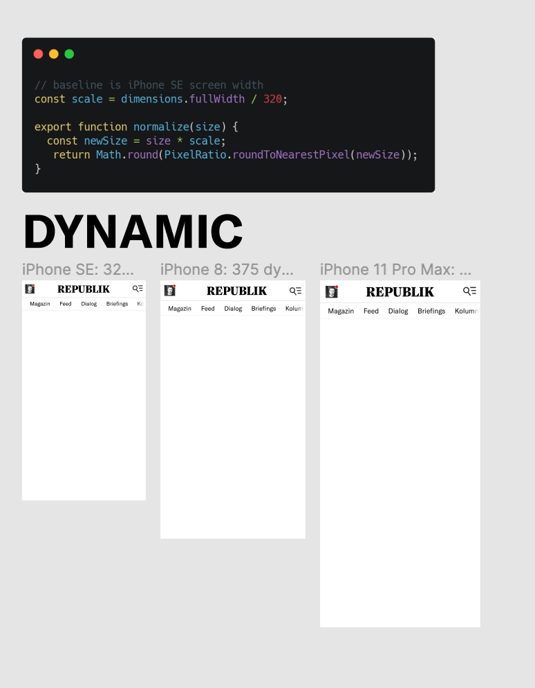
Currently our UI elements, and the header in particular, are made to work with the smallest current mobile device screen width, the iPhone SE (320px). While this guarantees usability for users with small devices, it sacrifices balance and usability on larger screen-sizes, which are much more common today. So much so, that many more users have a suboptimal UI experience than an optimal one.
Suggested Solution:
Certain prominent UI elements should scale with screen size (on mobile devices).
Example:
https://www.figma.com/file/ZTbL40GSkPvExl01mhO2r2/Dynamic-Type-Sizes?node-id=0%3A1