Revert sidebar appearance on small screens in V1.3 #5409
Replies: 2 comments 11 replies
-
|
Could you share some screenshots exhibiting your issue and share maybe the repository? For example, the behaviour for Quarto website. |
Beta Was this translation helpful? Give feedback.
-
|
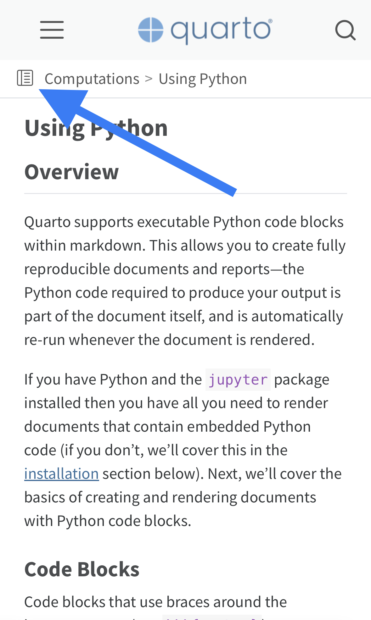
Thanks! The options approach is pretty consistent across Quarto, so I was surprised it wasn’t available here. Would you consider adding an option for the old small screen navbar and sidebar? For me it’s not just about appearance—I felt the UX design for the old navbar and sidebar was friendlier and more accessible. So the changes also impact me as a reader of other Quarto sites too. The changes mainly seem tailored to sites that focus on technical documentation, at the cost of being less friendly for other types of sites. Here’s why I prefer the old navbar and sidebar: navbarFor the navbar, the move of the hamburger menu from the right side of the screen to the left is frustrating as a right-handed person. Before I could comfortably open the menu while holding my phone with one hand, but now I have to either strain my thumb or use both hands. Most people are right-handed, so I’d imagine this affects more mobile readers of Quarto sites than just me. Having the search icon always visible in the navbar also makes it feel too cramped to me. It is natural to have it there for some sites where you might regularly use the search function (like the Quarto site); but for sites where search functionality is nice to have but isn’t something readers would do regularly, making it pinned just adds visual noise to the navbar while also occupying the space where the hamburger menu would ideally be. sidebarI find interacting with the new sidebar is frustrating compared to the old one. With the old one you could click anywhere in the space to expand the sidebar; but with the new one you have to click the tiny page icon to expand it (or blank space if there is any), but if you click the text it reloads the page (because the text is hyperlinked to the current page)… (Would it be possible to revert to the old behaviour here, where clicking anywhere in the space expands the sidebar?) The text is also considerably smaller, which deemphasizes it. Since this is also the title text for a page, I feel like it should be more prominent. It makes it look like posts no longer have titles, which is disorienting. For example, compare these: Old:
New:
With the old style the title immediate catches your eye, and it’s clear what the post is about. With the new style it takes awhile to locate the title since it’s smaller and has more visual noise around it (the icon and the breadcrumb text). This might be fine for a sidebar used in a documentation site, but for other sites a prominent title is expected by the reader. However, simply increasing the font size with the breadcrumb style isn’t a great solution because of the additional breadcrumb text, which would take up a lot of space if made bigger. SummaryIn summary, I feel like the old styles had friendlier UX design, and would really appreciate being able to use them again in newer versions of Quarto. Short of that, I feel like the new styles could use some improvements to be more accessible or less frustrating to interact with. |


Beta Was this translation helpful? Give feedback.
-
|
Thanks for the thoughtful documentation of your thoughts and the issues you see with the current implementation - it is really helpful to review.
|

Beta Was this translation helpful? Give feedback.
-
|
One other note (was just looking at how we're positioning elements in the navbar), some CSS can reposition the responsive toggle back on the right, just add the following to your We plan to support this natively with Quarto 1.4 (e.g. |
Beta Was this translation helpful? Give feedback.
-
|
You’re welcome—glad it was helpful and came off as constructive. With #5296 fixed, now I can see what you meant by it being a consensus improvement. I agree with that. Does this also resolve the issue where the page will reload if you click the title text in the sidebar, because it’s hyperlinked to the current page? If not, would you like me to file an issue for that? Thanks for the navbar code! I’ll give that a try and see how it feels. Having position toggles seems the right way to go, so it’s great it’ll go into v1.4. Thanks for discussing this with me! |
Beta Was this translation helpful? Give feedback.
-
|
Glad to hear the fix makes some progress! This doesn't change anything about the behavior of the bread crumbs themselves - the tap target to show the menu remains the icon or the whitespace (if any) and the breadcrumb links merely navigate whatever the url of the page is (including the current page). If you wouldn't mind opening an issue for that, it would be great. I've already made the Navbar toggle-position improvement for Quarto 1.4, FYI. |
Beta Was this translation helpful? Give feedback.
-
|
I hope it's okay if I add to this thread rather than starting a new one, since my comment is on the same topic. I'm sorry to say that I have serious misgivings about the new appearance and functionality of the sidebar (or, more precisely, its associated buttons on small screens). I consider it a significant regression from 1.2 and I would argue that it's not a matter of personal preference (or simply being accustomed to the previous solution), but rather a serious usability issue. For some context, I use Quarto for a book website with no header or main navbar, so the sidebar is the only way to access navigation. My main criticism is that neither the small icon on the left nor the white space on the right appear to be the target for invoking the menu. It's just extremely unintuitive. The icon is located in the area where most websites display their logo, and at first glance it looks like it serves a decorative function attached to the breadcrumbs. In mobile interfaces, the conventional and intuitive position for a menu button is on the right side with a "hamburger" icon (I realize you're using the hamburger for the navbar; but the arrow from 1.2 was also great). I hope I don't have to explain why white space makes a bad button; how is a user supposed to guess that nothing is an interactive interface element? I realize this is anecdotal, but after updating to 1.3 (and then 1.4 to see if it's any better), I sent a link to my book to two different people, and both of them were confused (one even asked if they needed to download EPUB to read my book). I had to explain that they are supposed to tap the small icon in the upper left to access the contents of my book. This is very concerning to me, because it implies that a visitor with whom I have no personal contact may simply leave my website irritated, believing there is nothing beyond the first page. A simple website like this should not require instructions! I'm currently considering reverting to 1.2, but for obvious reasons this is a sub-optimal solution. I would be extremely grateful if the developers would consider adding some customization options for the appearance of the sidebar button on small screens; personally, I would be overjoyed if it could appear exactly as it did in 1.2, as it was perfect for my purposes and caused no problems for my readers. Thank you for all of your hard work on Quarto! |
Beta Was this translation helpful? Give feedback.
-
|
Thanks for the feedback - this is an area we'll continue to work on. FWIW we pretty frequently received the same feedback about the collapsed sidebar navigation that used a disclosure arrow (in Quarto 1.2) - users reported that it was difficult to discover that it was interactive (.e.g the disclosure arrow wasn't a strong enough affordance). We surveyed a variety of different designs when we came to the approach we took in 1.3, so there is prior art, though I don't mean this to imply that it is suitable / desirable for every website (or yours, which you certainly know better than I). Our 1.3 version was in part a response to try to making this more discoverable, but I agree we have more work to do. |
Beta Was this translation helpful? Give feedback.
-
|
Thanks for your reply! It's great to hear that future developments in this area are possible. I'll keep an eye on this, but in the meantime, I've reverted to 1.2. It's fascinating how different people's experiences and opinions can differ when it comes to what is and isn't "intuitive," but I imagine it must be very frustrating on your end. Thank you for your efforts in finding a solution! |
Beta Was this translation helpful? Give feedback.
Uh oh!
There was an error while loading. Please reload this page.
-
The sidebar appearance on small screens changed somewhere in v1.3. In previous versions it just took the page's title and added an arrow to the right of it; you could click the title or arrow to bring down the sidebar. Whereas now there's a page icon followed by a breadcrumb for the current page; you can only click the small icon to bring down the sidebar.
I can't find the relevant issue or PR where this change occurred, but I was wondering if it's currently possible to revert to the old style small screen sidebar?
The old appearance and UX worked better for me and my website, but I don't want to be stuck on an older version of Quarto just to keep this how it was.
Beta Was this translation helpful? Give feedback.
All reactions