-
Notifications
You must be signed in to change notification settings - Fork 1
Expand file tree
/
Copy path11_scRNAseq_overview.Rmd
More file actions
980 lines (702 loc) · 57.7 KB
/
11_scRNAseq_overview.Rmd
File metadata and controls
980 lines (702 loc) · 57.7 KB
1
2
3
4
5
6
7
8
9
10
11
12
13
14
15
16
17
18
19
20
21
22
23
24
25
26
27
28
29
30
31
32
33
34
35
36
37
38
39
40
41
42
43
44
45
46
47
48
49
50
51
52
53
54
55
56
57
58
59
60
61
62
63
64
65
66
67
68
69
70
71
72
73
74
75
76
77
78
79
80
81
82
83
84
85
86
87
88
89
90
91
92
93
94
95
96
97
98
99
100
101
102
103
104
105
106
107
108
109
110
111
112
113
114
115
116
117
118
119
120
121
122
123
124
125
126
127
128
129
130
131
132
133
134
135
136
137
138
139
140
141
142
143
144
145
146
147
148
149
150
151
152
153
154
155
156
157
158
159
160
161
162
163
164
165
166
167
168
169
170
171
172
173
174
175
176
177
178
179
180
181
182
183
184
185
186
187
188
189
190
191
192
193
194
195
196
197
198
199
200
201
202
203
204
205
206
207
208
209
210
211
212
213
214
215
216
217
218
219
220
221
222
223
224
225
226
227
228
229
230
231
232
233
234
235
236
237
238
239
240
241
242
243
244
245
246
247
248
249
250
251
252
253
254
255
256
257
258
259
260
261
262
263
264
265
266
267
268
269
270
271
272
273
274
275
276
277
278
279
280
281
282
283
284
285
286
287
288
289
290
291
292
293
294
295
296
297
298
299
300
301
302
303
304
305
306
307
308
309
310
311
312
313
314
315
316
317
318
319
320
321
322
323
324
325
326
327
328
329
330
331
332
333
334
335
336
337
338
339
340
341
342
343
344
345
346
347
348
349
350
351
352
353
354
355
356
357
358
359
360
361
362
363
364
365
366
367
368
369
370
371
372
373
374
375
376
377
378
379
380
381
382
383
384
385
386
387
388
389
390
391
392
393
394
395
396
397
398
399
400
401
402
403
404
405
406
407
408
409
410
411
412
413
414
415
416
417
418
419
420
421
422
423
424
425
426
427
428
429
430
431
432
433
434
435
436
437
438
439
440
441
442
443
444
445
446
447
448
449
450
451
452
453
454
455
456
457
458
459
460
461
462
463
464
465
466
467
468
469
470
471
472
473
474
475
476
477
478
479
480
481
482
483
484
485
486
487
488
489
490
491
492
493
494
495
496
497
498
499
500
501
502
503
504
505
506
507
508
509
510
511
512
513
514
515
516
517
518
519
520
521
522
523
524
525
526
527
528
529
530
531
532
533
534
535
536
537
538
539
540
541
542
543
544
545
546
547
548
549
550
551
552
553
554
555
556
557
558
559
560
561
562
563
564
565
566
567
568
569
570
571
572
573
574
575
576
577
578
579
580
581
582
583
584
585
586
587
588
589
590
591
592
593
594
595
596
597
598
599
600
601
602
603
604
605
606
607
608
609
610
611
612
613
614
615
616
617
618
619
620
621
622
623
624
625
626
627
628
629
630
631
632
633
634
635
636
637
638
639
640
641
642
643
644
645
646
647
648
649
650
651
652
653
654
655
656
657
658
659
660
661
662
663
664
665
666
667
668
669
670
671
672
673
674
675
676
677
678
679
680
681
682
683
684
685
686
687
688
689
690
691
692
693
694
695
696
697
698
699
700
701
702
703
704
705
706
707
708
709
710
711
712
713
714
715
716
717
718
719
720
721
722
723
724
725
726
727
728
729
730
731
732
733
734
735
736
737
738
739
740
741
742
743
744
745
746
747
748
749
750
751
752
753
754
755
756
757
758
759
760
761
762
763
764
765
766
767
768
769
770
771
772
773
774
775
776
777
778
779
780
781
782
783
784
785
786
787
788
789
790
791
792
793
794
795
796
797
798
799
800
801
802
803
804
805
806
807
808
809
810
811
812
813
814
815
816
817
818
819
820
821
822
823
824
825
826
827
828
829
830
831
832
833
834
835
836
837
838
839
840
841
842
843
844
845
846
847
848
849
850
851
852
853
854
855
856
857
858
859
860
861
862
863
864
865
866
867
868
869
870
871
872
873
874
875
876
877
878
879
880
881
882
883
884
885
886
887
888
889
890
891
892
893
894
895
896
897
898
899
900
901
902
903
904
905
906
907
908
909
910
911
912
913
914
915
916
917
918
919
920
921
922
923
924
925
926
927
928
929
930
931
932
933
934
935
936
937
938
939
940
941
942
943
944
945
946
947
948
949
950
951
952
953
954
955
956
957
958
959
960
961
962
963
964
965
966
967
968
969
970
971
972
973
974
975
976
977
978
979
980
# scRNA-seq data analysis overview
Instructor: Melissa Mayén Quiroz
Adapted from: [OSCA: Basics of Single-Cell Analysis with Bioconductor](https://bioconductor.org/books/3.19/OSCA.basic/)
## Single cell RNA sequencing
Single-cell RNA sequencing (scRNA-seq) is a cutting-edge technology used to analyze the gene expression profiles of individual cells. Unlike traditional bulk RNA sequencing, which provides an average expression profile of a population of cells, scRNA-seq allows researchers to study the gene expression patterns of single cells.
- Cell heterogeneity
- Cell type identification
- Cell state dynamics
[Orchestrating Single-Cell Analysis with Bioconductor](https://bioconductor.org/books/release/OSCA/)

*Authors: Robert Amezquita [aut], Aaron Lun [aut], Stephanie Hicks [aut], Raphael Gottardo [aut], Alan O’Callaghan [cre]*
### Pre-processing of scRNA-seq Data (Before R)
- Quality Control of the reads (FastQC):
Assess the quality of raw sequencing reads. Check GC content, overrepresented sequences, presence of N bases, and other quality metrics.
- Alignment to Reference Transcriptome:
Align sequencing reads to a reference transcriptome. Generate aligned read files.
- Generation of Expression Count Matrix:
Quantify gene expression levels by counting the number of reads mapped to each gene.
Create a matrix with genes as rows and cells as columns, where each entry represents the count of reads for a specific gene in a specific cell.
For 10x Genomics data, the Cellranger software suite (Zheng et al. 2017) provides a custom pipeline to obtain a count matrix. This uses STAR to align reads to the reference genome and then counts the number of unique UMIs mapped to each gene.
### Different Technologies
- Droplet-based: 10x Genomics, inDrop, Drop-seq
- Plate-based with unique molecular identifiers (UMIs): CEL-seq, MARS-seq
- Plate-based with reads: Smart-seq2
- Other: sci-RNA-seq, Seq-Well
In practical terms, droplet-based technologies are the current de facto standard due to their throughput and low cost per cell. Plate-based methods can capture other phenotypic information (e.g., morphology) and are more amenable to customization. Read-based methods provide whole-transcript coverage, which is useful in some applications (e.g., splicing, exome mutations); otherwise, UMI-based methods are more popular as they mitigate the effects of PCR amplification noise.
## Basic Workflow
In the simplest case, the workflow has the following form:
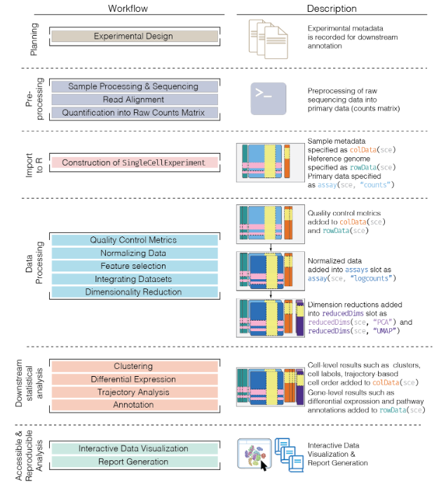
- We compute quality control metrics to remove low-quality cells that would interfere with downstream analyses. These cells may have been damaged during processing or may not have been fully captured by the sequencing protocol. Common metrics includes the total counts per cell, the proportion of spike-in or mitochondrial reads and the number of detected features.
- We convert the counts into normalized expression values to eliminate cell-specific biases (e.g., in capture efficiency). This allows us to perform explicit comparisons across cells in downstream steps like clustering. We also apply a transformation, typically log, to adjust for the mean-variance relationship.
- We perform feature selection to pick a subset of interesting features for downstream analysis. This is done by modelling the variance across cells for each gene and retaining genes that are highly variable. The aim is to reduce computational overhead and noise from uninteresting genes.
- We apply dimensionality reduction to compact the data and further reduce noise. Principal components analysis is typically used to obtain an initial low-rank representation for more computational work, followed by more aggressive methods like
t-stochastic neighbor embedding for visualization purposes.
- We cluster cells into groups according to similarities in their (normalized) expression profiles. This aims to obtain groupings that serve as empirical proxies for distinct biological states. We typically interpret these groupings by identifying differentially expressed marker genes between clusters.
## The SingleCellExperiment class
This object is specifically designed to store and analyze single-cell RNA sequencing (scRNA-seq) data. It extends the `SummarizedExperiment` class to include specialized features for single-cell data, such as cell identifiers, dimensionality reduction results, and methods for quality control and normalization.
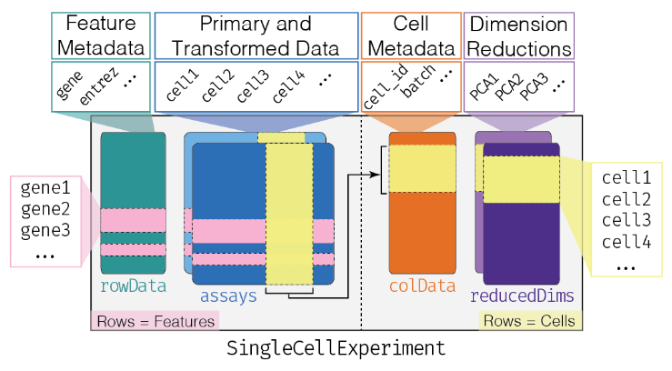
- Assay Data: The primary data matrix containing gene expression values or other measurements. Rows represent genes and columns represent cells.
- `colData` (Column Metadata): Additional information about each cell, such as cell type, experimental condition, or any other relevant metadata.
- `rowData` (Row Metadata): Additional information about each gene, such as gene symbols, genomic coordinates, or functional annotations.
- `reducedDims`: Dimensionality reduction results, such as "principal component analysis" (PCA), "t-distributed stochastic neighbor embedding" (t-SNE), and
"Uniform Manifold Approximation and Projection" (UMAP), used for visualizing and clustering cells.
- `altExpNames` and `altExps`: Names of alternative experiments (such as spike-in control genes used for normalization) and alternative experiment counts matrices.
- `metadata`: Additional metadata about the experiment.
### Data Loading
The Lun et al. (2017) dataset contains two 96-well plates of 416B cells (an immortalized mouse myeloid progenitor cell line), processed using the Smart-seq2 protocol (Picelli et al. 2014). A constant amount of spike-in RNA from the External RNA Controls Consortium (ERCC) was also added to each cell’s lysate prior to library preparation.
```{r, load_416b}
library("scRNAseq")
library("SingleCellExperiment")
library("AnnotationHub")
library("scater")
## Load the data set
sce.416b <- LunSpikeInData(which = "416b")
## We convert the blocking factor to a factor so that downstream steps do not treat it as an integer.
sce.416b$block <- factor(sce.416b$block)
## rename the rows with the symbols, reverting to Ensembl identifiers
ens.mm.v97 <- AnnotationHub()[["AH73905"]]
rowData(sce.416b)$ENSEMBL <- rownames(sce.416b)
rowData(sce.416b)$SYMBOL <- mapIds(ens.mm.v97,
keys = rownames(sce.416b),
keytype = "GENEID", column = "SYMBOL"
)
rowData(sce.416b)$SEQNAME <- mapIds(ens.mm.v97,
keys = rownames(sce.416b),
keytype = "GENEID", column = "SEQNAME"
)
rownames(sce.416b) <- uniquifyFeatureNames(
rowData(sce.416b)$ENSEMBL,
rowData(sce.416b)$SYMBOL
)
```
### Basics of your SCE
```{r, sce_basics}
## Look at your SCE
sce.416b
## Get in the slot "assay", in the count matrix
## [genes, cells]
assay(sce.416b, "counts")[110:113, 1:2] # gene, cell
## We can do it like this too
counts(sce.416b)[110:113, 1:2]
## We could add more assays to our SCE
sce.416b <- logNormCounts(sce.416b)
sce.416b
## Acces to the column names (cell identifyers)
head(colnames(sce.416b))
## Acces to the column data (cell information)
head(colData(sce.416b))
## Acces to the row names (gene names)
head(rownames(sce.416b))
## Acces to the row data (gene information)
head(rowData(sce.416b))
## We can create another SCE subsetitng the first one
sce_2 <- sce.416b[110:130, 1:2]
sce_2
```
As in the `SummarizedExperiment`, `$` is the operator used to access a specific column within the cell metadata. That is, it's a shortcut for `colData(obj)$`.
```{r, $_operator}
head(sce.416b$`cell type`)
```
Now, we will look at the dimension reductions
```{r, reducedDimNames}
## This is empty
reducedDimNames(sce_2)
## Compute PCA
sce_2 <- runPCA(sce_2)
## Check again
reducedDimNames(sce_2)
```
## Quality Control
Low-quality libraries in scRNA-seq data can arise from a variety of sources such as cell damage during dissociation or failure in library preparation (e.g., inefficient reverse transcription or PCR amplification). These usually manifest as “cells” with low total counts, few expressed genes and high mitochondrial or spike-in proportions. These low-quality libraries are problematic as they can contribute to misleading results in downstream analyses.
### Common choices of QC metrics
For each cell, we calculate these QC metrics using the `perCellQCMetrics()` function from the `scater` package (McCarthy et al. 2017). The sum column contains the total count for each cell and the detected column contains the number of detected genes. The `subsets_Mito_percent` column contains the percentage of reads mapped to mitochondrial transcripts. Finally, the `altexps_ERCC_percent` column contains the percentage of reads mapped to ERCC transcripts.
```{r, identify_mito_percellQC}
library("scuttle")
## Identify mitochondrial genes (those with SEQNAME equal to "MT") in the row data
mito <- which(rowData(sce.416b)$SEQNAME == "MT")
## Compute per-cell QC metrics, including a subset for mitochondrial genes
stats <- perCellQCMetrics(sce.416b, subsets = list(Mt = mito))
summary(stats$sum) # total library sizes for all cells
summary(stats$detected) # detected features (genes)
summary(stats$subsets_Mt_percent) # percentage of reads mapping to mitochondrial genes
summary(stats$altexps_ERCC_percent) # percentage of reads mapping to spike-in controls
```
Alternatively, users may prefer to use the `addPerCellQC()` function. This computes and appends the per-cell QC statistics to the colData of the `SingleCellExperiment` object, allowing us to retain all relevant information in a single object for later manipulation.
```{r, addpercellQC_subMito}
## Compute addPerCellQCMetrics, including a subset for mitochondrial genes
sce.416b <- addPerCellQCMetrics(sce.416b, subsets = list(Mito = mito))
colnames(colData(sce.416b))
```
A key assumption here is that the QC metrics are independent of the biological state of each cell. Poor values (e.g., low library sizes, high mitochondrial proportions) are presumed to be driven by technical factors rather than biological processes, meaning that the subsequent removal of cells will not misrepresent the biology in downstream analyses.
### Identifying low-quality cells
#### With fixed thresholds
The simplest approach to identifying low-quality cells involves applying fixed thresholds to the QC metrics. For example, we might consider cells to be low quality if they have library sizes below 100,000 reads; express fewer than 5,000 genes; have spike-in proportions above 10%; or have mitochondrial proportions above 10%.
```{r, QC_fixedThresholds}
## Using our previous perCellQCMetrics data:
## Identify cells with a total library size (sum of counts) less than 100,000
c.lib <- stats$sum < 1e5
## Identify cells with fewer than 5,000 detected features (genes)
qc.nexprs <- stats$detected < 5e3
## Identify cells with more than 10% of reads mapping to spike-in controls (e.g., ERCC)
qc.spike <- stats$altexps_ERCC_percent > 10
## Identify cells with more than 10% of reads mapping to mitochondrial genes
qc.mito <- stats$subsets_Mt_percent > 10
## Create a combined logical vector that marks cells to discard if they meet any of the above criteria
discard <- c.lib | qc.nexprs | qc.spike | qc.mito
## Summarize the number of cells removed for each reason.
DataFrame(
LibSize = sum(c.lib), # Number of cells removed due to low library size
NExprs = sum(qc.nexprs), # Number of cells removed due to low number of detected features
SpikeProp = sum(qc.spike), # Number of cells removed due to high spike-in proportion
MitoProp = sum(qc.mito), # Number of cells removed due to high mitochondrial proportion
Total = sum(discard) # Total number of cells removed
)
```
While simple, this strategy requires considerable experience to determine appropriate thresholds for each experimental protocol and biological system. Thresholds for read count-based data are not applicable for UMI-based data, and vice versa. Differences in mitochondrial activity or total RNA content require constant adjustment of the mitochondrial and spike-in thresholds, respectively, for different biological systems. Indeed, even with the same protocol and system, the appropriate threshold can vary from run to run due to the vagaries of cDNA capture efficiency and sequencing depth per cell.
#### With adaptive threshold
Here, we assume that most of the dataset consists of high-quality cells. We then identify cells that are outliers for the various QC metrics, based on the **median absolute deviation** (MAD) from the median value of each metric across all cells.
By default, we consider a value to be an outlier if it is more than 3 MADs from the median in the “problematic” direction.
We can do that using the `perCellQCFilters()` function. It will allow to identify cells with log-transformed library sizes that are more than 3 MADs below the median. A log-transformation is used to improve resolution at small values when `type = "lower"` and to avoid negative thresholds that would be meaningless for a non-negative metric.
`perCellQCFilters()` will also identify outliers for the proportion-based metrics specified in the sub.fields= arguments. These distributions frequently exhibit a heavy right tail, but unlike the two previous metrics, it is the right tail itself that contains the putative low-quality cells. Thus, we do not perform any transformation to shrink the tail - rather, our hope is that the cells in the tail are identified as large outliers.
A cell that is an outlier for any of these metrics is considered to be of low quality and discarded. This is captured in the discard column, which can be used for later filtering
```{r, QC_adaptiveThreshold}
## Identify cells that are outlier
reasons <- perCellQCFilters(stats,
sub.fields = c("subsets_Mt_percent", "altexps_ERCC_percent")
) # No transformation
colSums(as.matrix(reasons))
## Extract the exact filter thresholds
attr(reasons$low_lib_size, "thresholds")
attr(reasons$low_n_features, "thresholds")
```
With this strategy, the thresholds adapt to both the location and spread of the distribution of values for a given metric. This allows the QC procedure to adjust to changes in sequencing depth, cDNA capture efficiency, mitochondrial content, etc. without requiring any user intervention or prior experience.
**However, the underlying assumption of a high-quality majority may not always be appropriate**
### Checking diagnostic plots
It is good practice to inspect the distributions of QC metrics to identify possible problems. In the most ideal case, we would see normal distributions that would justify the 3 MAD threshold used in outlier detection. A large proportion of cells in another mode suggests that the QC metrics might be correlated with some biological state, potentially leading to the loss of distinct cell types during filtering; or that there were inconsistencies with library preparation for a subset of cells, a not-uncommon phenomenon in plate-based protocols.
```{r, QC_sce416b_plots}
library("scater")
## Add the information to the SCE columns
colData(sce.416b) <- cbind(colData(sce.416b), stats)
sce.416b$block <- factor(sce.416b$block)
sce.416b$phenotype <- ifelse(grepl("induced", sce.416b$phenotype), "induced", "wild type")
sce.416b$discard <- reasons$discard
## Plot
gridExtra::grid.arrange(
## Diccard low total counts
plotColData(sce.416b,
x = "block", y = "sum", colour_by = "discard",
other_fields = "phenotype"
) + facet_wrap(~phenotype) +
scale_y_log10() + ggtitle("Total count"),
## Discard low detected genes
plotColData(sce.416b,
x = "block", y = "detected", colour_by = "discard",
other_fields = "phenotype"
) + facet_wrap(~phenotype) +
scale_y_log10() + ggtitle("Detected features"),
## Discard high mitocondrial percentage
plotColData(sce.416b,
x = "block", y = "subsets_Mito_percent",
colour_by = "discard", other_fields = "phenotype"
) +
facet_wrap(~phenotype) + ggtitle("Mito percent"),
## Discard high
plotColData(sce.416b,
x = "block", y = "altexps_ERCC_percent",
colour_by = "discard", other_fields = "phenotype"
) +
facet_wrap(~phenotype) + ggtitle("ERCC percent"),
ncol = 1
)
```
You can also create some plots via `iSEE` :)
<style>
p.exercise {
background-color: #E4EDE2;
padding: 9px;
border: 1px solid black;
border-radius: 10px;
font-family: sans-serif;
}
</style>
<p class="exercise">
**Optional:**:
Create at least 1 QC plot using iSEE.
*Clue: Use the Column Data Plot 1 panel*
</p>
```{r, eval=interactive()}
library("iSEE")
iSEE(sce.416b)
```
### Removing low-quality cells
Once low-quality cells have been identified, we can choose to either remove them or mark them. Removal is the most straightforward option and is achieved by subsetting the `SingleCellExperiment` by column. In this case, we use the previous low-quality calls to generate a subsetted `SingleCellExperiment` that we would use for downstream analyses.
```{r, discard_sce416b}
## Keep the columns we DON'T want to discard.
filtered <- sce.416b[, !reasons$discard]
```
Other option is to simply mark the low-quality cells as such and retain them in the downstream analysis.
## Normalization
Systematic differences in sequencing coverage between libraries are often observed in single-cell RNA sequencing data which typically arise from technical differences in cDNA capture or PCR amplification efficiency across cells, attributable to the difficulty of achieving consistent library preparation. Normalization aims to remove these differences such that they do not interfere with comparisons of the expression profiles between cells. This will ensure that any observed heterogeneity or differential expression within the cell population are driven by biology and not technical biases.
Let´s load before another dataset and review quickly what we have learned.
```{r, load_sceZeisel}
library("scRNAseq")
library("scater")
## Load dataset
sce.zeisel <- ZeiselBrainData()
sce.zeisel <- aggregateAcrossFeatures(sce.zeisel,
ids = sub("_loc[0-9]+$", "", rownames(sce.zeisel))
)
## Compute perCellQCMetrics
stats <- perCellQCMetrics(sce.zeisel, subsets = list(
Mt = rowData(sce.zeisel)$featureType == "mito"
))
## Compute quickPerCellQC
qc <- quickPerCellQC(stats, percent_subsets = c(
"altexps_ERCC_percent",
"subsets_Mt_percent"
))
## Discard low quality cells
sce.zeisel <- sce.zeisel[, !qc$discard]
```
**Scaling normalization**
Scaling normalization is the simplest and most commonly used class of normalization strategies. This involves dividing all counts for each cell by a cell-specific scaling factor, often called a “size factor” (Anders and Huber 2010). The assumption here is that any cell-specific bias (e.g., in capture or amplification efficiency) affects all genes equally via scaling of the expected mean count for that cell. The size factor for each cell represents the estimate of the relative bias in that cell, so division of its counts by its size factor should remove that bias.
### Library size normalization
Library size normalization is the simplest strategy for performing scaling normalization. We define the library size as the total sum of counts across all genes for each cell, the expected value of which is assumed to scale with any cell-specific biases. The “library size factor” for each cell is then directly proportional to its library size where the proportionality constant is defined such that the mean size factor across all cells is equal to 1. This definition ensures that the normalized expression values are on the same scale as the original counts, which is useful for interpretation (especially when dealing with transformed data).
```{r, ibrarySizeFactors_zeisel}
library("scater")
## Compute librarySizeFactors
lib.sf.zeisel <- librarySizeFactors(sce.zeisel)
summary(lib.sf.zeisel)
```
In the Zeisel brain data, the library size factors differ by up to 10-fold across cells. This is typical of the variability in coverage in scRNA-seq data.
```{r, hist_libSizeFactors}
## Plot the library size factors differences
hist(log10(lib.sf.zeisel), xlab = "Log10[Size factor]", col = "grey80")
```
Strictly speaking, the use of library size factors assumes that there is no “imbalance” in the differentially expressed (DE) genes between any pair of cells.
Although, in practice, normalization accuracy is not a major consideration for exploratory scRNA-seq data analyses. Composition biases do not usually affect the separation of clusters, only the magnitude - and to a lesser extent, direction - of the log-fold changes between clusters or cell types
### Normalization by deconvolution
composition biases will be present when any unbalanced differential expression exists between samples. Consider the simple example of two cells where a single gene "X" is upregulated in one cell "A" compared to the other cell "B". This upregulation means that either more sequencing resources are devoted to "X in "A", thus decreasing coverage of all other non-DE genes when the total library size of each cell is experimentally fixed; or the library size of "A" increases when "X" is assigned more reads or UMIs.
The removal of composition biases is a well-studied problem for bulk RNA sequencing data analysis.
- `estimateSizeFactorsFromMatrix()` function in the `DESeq2` package (Anders and Huber 2010; Love, Huber, and Anders 2014)
- `calcNormFactors()`function in the `edgeR` package (Robinson and Oshlack 2010).
Single-cell data can be problematic for these bulk normalization methods due to the dominance of low and zero counts. To overcome this, we pool counts from many cells to increase the size of the counts for accurate size factor estimation (Lun, Bach, and Marioni 2016). Pool-based size factors are then “deconvolved” into cell-based factors for normalization of each cell’s expression profile. This is performed using the `calculateSumFactors()` function from `scran`.
First we have a pre-clustering step with `quickCluster()` where cells in each cluster are normalized separately and the size factors are rescaled to be comparable across clusters. This avoids the assumption that most genes are non-DE across the entire population - only a non-DE majority is required between pairs of clusters, which is a weaker assumption for highly heterogeneous populations.
```{r, deconvolution_norm}
library("scran")
## Compute quickCluster + calculateSumFactor for deconvolution normalization
set.seed(100)
clust.zeisel <- quickCluster(sce.zeisel)
table(clust.zeisel)
deconv.sf.zeisel <- calculateSumFactors(sce.zeisel, clusters = clust.zeisel)
summary(deconv.sf.zeisel)
```
### Normalization by spike-ins
Spike-in normalization is based on the assumption that the same amount of spike-in RNA was added to each cell, so, systematic differences in the coverage of the spike-in transcripts can only be due to cell-specific biases, e.g., in capture efficiency or sequencing depth. To remove these biases, we equalize spike-in coverage across cells by scaling with “spike-in size factors”.
Compared to the previous methods, **spike-in normalization requires no assumption about the biology of the system.** Practically, spike-in normalization should be used if differences in the total RNA content of individual cells are of interest and must be preserved in downstream analyses.
To demonstrate the use of spike-in normalization on a different dataset involving T cell activation after stimulation with T cell receptor ligands of varying affinity (Richard et al. 2018).
```{r, spike-ins_norm}
library("scRNAseq")
sce.richard <- RichardTCellData()
sce.richard <- sce.richard[, sce.richard$`single cell quality` == "OK"]
sce.richard
```
We apply the `computeSpikeFactors()` method to estimate spike-in size factors for all cells. This is defined by converting the total spike-in count per cell into a size factor, using the same reasoning as in `librarySizeFactors()`.
(Scaling will subsequently remove any differences in spike-in coverage across cells).
```{r, computeSpikeFactors}
## computeSpikeFactors() to estimate spike-in size factors
sce.richard <- computeSpikeFactors(sce.richard, "ERCC")
summary(sizeFactors(sce.richard))
```
### Scaling and log-transforming
Once we have computed the size factors, we use the `logNormCounts()` function from `scater` to compute normalized expression values for each cell. This is done by dividing the count for each gene/spike-in transcript with the appropriate size factor for that cell. The function also log-transforms the normalized values, creating a new assay called `"logcounts"`. (Technically, these are “log-transformed normalized expression values”).
```{r, logNormCounts_zeisel}
## Compute normalized expression values and log-transformation
sce.zeisel <- logNormCounts(sce.zeisel)
assayNames(sce.zeisel)
```
The log-transformation is useful as differences in the log-values represent log-fold changes in expression.
By operating on log-transformed data, we ensure that these procedures are measuring distances between cells based on log-fold changes in expression. Log-transformation focuses on the former by promoting contributions from genes with strong relative differences.
## Feature selection
**highly variable genes (HVGs)**
We often use scRNA-seq data in exploratory analyses to characterize heterogeneity across cells. Procedures like clustering and dimensionality reduction compare cells based on their gene expression profiles, which involves aggregating per-gene differences into a single (dis)similarity metric between a pair of cells. The choice of genes to use in this calculation has a major impact on the behavior of the metric and the performance of downstream methods. We want to select genes that contain useful information about the biology of the system while removing genes that contain random noise. This aims to preserve interesting biological structure without the variance that obscures that structure, and to reduce the size of the data to improve computational efficiency of later steps.
The simplest approach to feature selection is to **select the most variable genes based on their expression across the population**. This assumes that genuine biological differences will manifest as increased variation in the affected genes, compared to other genes that are only affected by technical noise or a baseline level of “uninteresting” biological variation.
### Quantifying per-gene variation
The simplest approach to quantifying per-gene variation is to compute the variance of the log-normalized expression values (“log-counts”) for each gene across all cells (A. T. L. Lun, McCarthy, and Marioni 2016). The advantage of this approach is that the feature selection is based on the same log-values that are used for later downstream steps. In particular, genes with the largest variances in log-values will contribute most to the Euclidean distances between cells during procedures like clustering and dimensionality reduction. By using log-values here, we ensure that our quantitative definition of heterogeneity is consistent throughout the entire analysis.
Calculation of the per-gene variance is simple, but feature selection requires modelling of the mean-variance relationship. The log-transformation is not a variance stabilizing transformation in most cases, which means that the total variance of a gene is driven more by its abundance than its underlying biological heterogeneity. To account for this effect, we use the `modelGeneVar()` function to fit a trend to the variance with respect to abundance across all genes (Figure 3.1).
```{r, modelGeneVar_zeisel}
library("scran")
## Model the mean-variance relationship
dec.zeisel <- modelGeneVar(sce.zeisel)
## Plot the fit
fit.zeisel <- metadata(dec.zeisel)
plot(fit.zeisel$mean, fit.zeisel$var,
xlab = "Mean of log-expression",
ylab = "Variance of log-expression"
)
curve(fit.zeisel$trend(x), col = "dodgerblue", add = TRUE, lwd = 2)
```
*At any given abundance, we assume that the variation in expression for most genes is driven by uninteresting processes like sampling noise. Under this assumption, the fitted value of the trend at any given gene’s abundance represents an estimate of its uninteresting variation, which we call the technical component. We then define the biological component for each gene as the difference between its total variance and the technical component. This biological component represents the “interesting” variation for each gene and can be used as the metric for HVG selection.*
```{r, HVGs_zeisel}
## Order by most interesting genes for inspection
dec.zeisel[order(dec.zeisel$bio, decreasing = TRUE), ]
```
### Quantifying technical noise (spike-ins)
The assumptions made by quantifying per-gene variation may be problematic in rare scenarios where many genes at a particular abundance are affected by a biological process. For example, strong upregulation of cell type-specific genes may result in an enrichment of HVGs at high abundances. This would inflate the fitted trend in that abundance interval and compromise the detection of the relevant genes.
We can avoid this problem by fitting a mean-dependent trend to the variance of the spike-in transcripts, if they are available. The premise here is that spike-ins should not be affected by biological variation, so the fitted value of the spike-in trend should represent a better estimate of the technical component for each gene.
```{r, modelGeneVarWithSpikes_416b}
## Fit a mean-dependent trend to the variance of the spike-in transcripts
dec.spike.416b <- modelGeneVarWithSpikes(sce.416b, "ERCC")
## Order by most interesting genes for inspection
dec.spike.416b[order(dec.spike.416b$bio, decreasing = TRUE), ]
## Plot the fit
plot(dec.spike.416b$mean, dec.spike.416b$total,
xlab = "Mean of log-expression",
ylab = "Variance of log-expression"
)
fit.spike.416b <- metadata(dec.spike.416b)
points(fit.spike.416b$mean, fit.spike.416b$var, col = "red", pch = 16)
curve(fit.spike.416b$trend(x), col = "dodgerblue", add = TRUE, lwd = 2)
```
### Quantifying technical noise (mean-variance trend)
In the absence of spike-in data, one can attempt to create a trend by making some distributional assumptions about the noise. For example, UMI counts typically exhibit near-Poisson variation if we only consider technical noise from library preparation and sequencing. This can be used to construct a mean-variance trend in the log-counts with the `modelGeneVarByPoisson()` function.
```{r, modelGeneVarByPoisson_zeisel}
## construct a mean-variance trend in the log-counts
set.seed(0010101)
dec.pois.zeisel <- modelGeneVarByPoisson(sce.zeisel)
## Order by most interesting genes for inspection
dec.pois.zeisel <- dec.pois.zeisel[order(dec.pois.zeisel$bio, decreasing = TRUE), ]
head(dec.pois.zeisel)
## Plot the fit
plot(dec.pois.zeisel$mean, dec.pois.zeisel$total,
pch = 16, xlab = "Mean of log-expression",
ylab = "Variance of log-expression"
)
curve(metadata(dec.pois.zeisel)$trend(x), col = "dodgerblue", add = TRUE)
```
*Trends based purely on technical noise tend to yield large biological components for highly-expressed genes*. This often includes so-called “house-keeping” genes coding for essential cellular components such as ribosomal proteins, which are considered uninteresting for characterizing cellular heterogeneity. These observations suggest that a more accurate noise model does not necessarily yield a better ranking of HVGs.
**Though, one should keep an open mind that house-keeping genes are regularly DE in a variety of conditions**
### Handling batch effects
Data containing multiple batches will often exhibit batch effects. We are usually not interested in HVGs that are driven by batch effects; instead, we want to focus on genes that are highly variable within each batch.
This is naturally achieved by performing trend fitting and variance decomposition separately for each batch.
We will try now this approach by treating each plate (block) in the 416B dataset as a different batch, using the `modelGeneVarWithSpikes()` function. (The same argument is available in all other variance-modelling functions.)
```{r, modelGeneVar_batch}
## Fit a mean-dependent trend to the variance of the spike-in transcripts
## Independently for each batch (block)
dec.block.416b <- modelGeneVarWithSpikes(sce.416b, "ERCC", block = sce.416b$block) # block=sce.416b$block
head(dec.block.416b[order(dec.block.416b$bio, decreasing = TRUE), 1:6])
## Plot the fit by batch (block)
par(mfrow = c(1, 2))
blocked.stats <- dec.block.416b$per.block
for (i in colnames(blocked.stats)) {
current <- blocked.stats[[i]]
plot(current$mean, current$total,
main = i, pch = 16, cex = 0.5,
xlab = "Mean of log-expression", ylab = "Variance of log-expression"
)
curfit <- metadata(current)
points(curfit$mean, curfit$var, col = "red", pch = 16)
curve(curfit$trend(x), col = "dodgerblue", add = TRUE, lwd = 2)
}
```
The use of a batch-specific trend fit is useful as it accommodates differences in the mean-variance trends between batches. This is especially important if batches exhibit systematic technical differences, e.g., differences in coverage or in the amount of spike-in RNA added.
### Selecting highly variable genes
Once we have quantified the per-gene variation, the next step is to select the subset of HVGs to use in downstream analyses. A larger subset will reduce the risk of discarding interesting biological signal by retaining more potentially relevant genes, at the cost of increasing noise from irrelevant genes that might obscure said signal. It is difficult to determine the optimal trade-off for any given application as noise in one context may be useful signal in another.
The most obvious selection strategy is to take the top "n" genes with the largest values for the relevant variance metric. The main advantage of this approach is that the user can directly control the number of genes retained, which ensures that the computational complexity of downstream calculations is easily predicted. For `modelGeneVar()` and `modelGeneVarWithSpikes()`, we would select the genes with the largest biological components.
This is conveniently done for us via `getTopHVgs()`, as shown with `n = 1000`.
```{r, Select_TopHVGs}
## Top 1000 genes
hvg.zeisel.var <- getTopHVGs(dec.zeisel, n = 1000)
str(hvg.zeisel.var)
```
The choice of "n" also has a fairly straightforward biological interpretation.
The main disadvantage of this approach that it turns HVG selection into a competition between genes, whereby a subset of very highly variable genes can push other informative genes out of the top set. This can be problematic for analyses of highly heterogeneous populations if the loss of important markers prevents the resolution of certain subpopulations.
## Dimensionality reduction
Many scRNA-seq analysis procedures involve comparing cells based on their expression values across multiple genes. For example, clustering aims to identify cells with similar transcriptomic profiles by computing Euclidean distances across genes. In these applications, each individual gene represents a dimension of the data.
As the name suggests, dimensionality reduction aims to reduce the number of separate dimensions in the data. This is possible because different genes are correlated if they are affected by the same biological process. Thus, we do not need to store separate information for individual genes, but can instead compress multiple features into a single dimension, e.g., an “eigengene” (Langfelder and Horvath 2007). This reduces computational work in downstream analyses like clustering, as calculations only need to be performed for a few dimensions rather than thousands of genes; reduces noise by averaging across multiple genes to obtain a more precise representation of the patterns in the data; and enables effective plotting of the data, for those of us who are not capable of visualizing more than 3 dimensions.
### Principal components analysis
Principal components analysis (PCA) discovers axes in high-dimensional space that capture the largest amount of variation. This is best understood by imagining each axis as a line. Say we draw a line anywhere, and we move each cell in our data set onto the closest position on the line. The variance captured by this axis is defined as the variance in the positions of cells along that line.
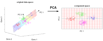
In PCA, the first axis (or “principal component”, PC) is chosen such that it maximizes this variance. The next PC is chosen such that it is orthogonal to the first and captures the greatest remaining amount of variation, and so on.
By definition, the top PCs capture the dominant factors of heterogeneity in the data set. In the context of scRNA-seq, our assumption is that biological processes affect multiple genes in a coordinated manner. This means that the earlier PCs are likely to represent biological structure as more variation can be captured by considering the correlated behavior of many genes. By comparison, random technical or biological noise is expected to affect each gene independently. There is unlikely to be an axis that can capture random variation across many genes, meaning that noise should mostly be concentrated in the later PCs. This motivates the use of the earlier PCs in our downstream analyses, which concentrates the biological signal to simultaneously reduce computational work and remove noise.
We can perform PCA on the log-normalized expression values using the `fixedPCA()` function from scran. By default, `fixedPCA()` will compute the first 50 PCs and store them in the `reducedDims()` of the output `SingleCellExperiment` object, as shown below.
Here, we use only the top 2000 genes with the largest biological components to reduce both computational work and high-dimensional random noise. In particular, while PCA is robust to random noise, an excess of it may cause the earlier PCs to capture noise instead of biological structure (Johnstone and Lu 2009).
```{r, getHVGs_zeisel}
library("scran")
## Top 2000 HVGs
top.zeisel <- getTopHVGs(dec.zeisel, n = 2000)
## Principal component analysis using top 2000 HVGs, 50 PCs
set.seed(100)
sce.zeisel <- fixedPCA(sce.zeisel, subset.row = top.zeisel)
reducedDimNames(sce.zeisel)
```
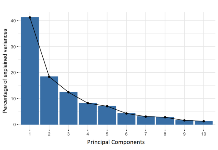
### Choosing the number of PCs
How many of the top PCs should we retain for downstream analyses? The choice of the number of PCs is an analogous decision to the choice of the number of HVGs to use. Using more PCs will retain more biological signal at the cost of including more noise that might mask said signal. On the other hand, using fewer PCs will introduce competition between different factors of variation, where weaker (but still interesting) factors may be pushed down into lower PCs and inadvertently discarded from downstream analyses.
It is hard to determine whether an “optimal” choice exists for the number of PCs. Certainly, we could attempt to remove the technical variation that is almost always uninteresting. However, even if we were only left with biological variation, there is no straightforward way to automatically determine which aspects of this variation are relevant.
Most practitioners will simply set to a “reasonable” but arbitrary value, typically ranging from 10 to 50. This is satisfactory depending of the amount of variance explained by that certain number of PCs.
```{r, VarExplained_PCs}
## Variance explained by PCs
percent.var <- attr(reducedDim(sce.zeisel), "percentVar")
plot(percent.var, log = "y", xlab = "PC", ylab = "Variance explained (%)")
```
### Visualizing the PCs
Algorithms are more than happy to operate on 10-50 PCs, but these are still too many dimensions for human comprehension. To visualize the data, the most common and easy way is to use the top 2 PCs for plotting.
```{r, PCs_zeisel}
library("scater")
## Plot PCA (Top 2 PCs for 2 dimentional visualization)
plotReducedDim(sce.zeisel, dimred = "PCA", colour_by = "level1class")
```
The problem is that PCA is a linear technique, i.e., only variation along a line in high-dimensional space is captured by each PC. As such, it cannot efficiently pack differences in *d* dimensions into the first 2 PCs.
One workaround is to plot several of the top PCs against each other in pairwise plots. However, it is difficult to interpret multiple plots simultaneously, and even this approach is not sufficient to separate some of the annotated subpopulations.
```{r, Plot_multiplePCA_PCs}
## plot top 4 PCs against each other in pairwise plots
plotReducedDim(sce.zeisel, dimred = "PCA", ncomponents = 4, colour_by = "level1class")
```
### Non-linear methods for visualization
#### t-stochastic neighbor embedding
The de facto standard for visualization of scRNA-seq data is the t-stochastic neighbor embedding (TSNE) method (Van der Maaten and Hinton 2008). This attempts to find a low-dimensional representation of the data that preserves the distances between each point and its neighbors in the high-dimensional space. Unlike PCA, it is not restricted to linear transformations, nor is it obliged to accurately represent distances between distant populations. This means that it has much more freedom in how it arranges cells in low-dimensional space, enabling it to separate many distinct clusters in a complex population
```{r, runTSNE_zeisel}
## TSNE using runTSNE() stores the t-SNE coordinates in the reducedDims
set.seed(100)
sce.zeisel <- runTSNE(sce.zeisel, dimred = "PCA")
## Plot TSNE
plotReducedDim(sce.zeisel, dimred = "TSNE", colour_by = "level1class")
```
The “perplexity” is another important parameter that determines the granularity of the visualization. Low perplexities will favor resolution of finer structure, possibly to the point that the visualization is compromised by random noise. Thus, it is advisable to test different perplexity values to ensure that the choice of perplexity does not drive the interpretation of the plot.
```{r, TSNE_perplexity_plots}
## run TSNE using diferent perplexity numbers and plot
## TSNE using perplexity = 5
set.seed(100)
sce.zeisel <- runTSNE(sce.zeisel, dimred = "PCA", perplexity = 5)
out5 <- plotReducedDim(sce.zeisel,
dimred = "TSNE",
colour_by = "level1class"
) + ggtitle("perplexity = 5")
## TSNE using perplexity = 20
set.seed(100)
sce.zeisel <- runTSNE(sce.zeisel, dimred = "PCA", perplexity = 20)
out20 <- plotReducedDim(sce.zeisel,
dimred = "TSNE",
colour_by = "level1class"
) + ggtitle("perplexity = 20")
## TSNE using perplexity = 80
set.seed(100)
sce.zeisel <- runTSNE(sce.zeisel, dimred = "PCA", perplexity = 80)
out80 <- plotReducedDim(sce.zeisel,
dimred = "TSNE",
colour_by = "level1class"
) + ggtitle("perplexity = 80")
## Combine plots
gridExtra::grid.arrange(out5, out20, out80, ncol = 3)
```
#### Uniform manifold approximation and projection
The uniform manifold approximation and projection (UMAP) method (McInnes, Healy, and Melville 2018) is an alternative to TSNE for non-linear dimensionality reduction. It is roughly similar to tSNE in that it also tries to find a low-dimensional representation that preserves relationships between neighbors in high-dimensional space. However, the two methods are based on different theory, represented by differences in the various graph weighting equations. This manifests as a different visualization.
```{r, Umap_zeisel}
## UMAP using runUMAP() stores the coordinates in the reducedDims
set.seed(100)
sce.zeisel <- runUMAP(sce.zeisel, dimred = "PCA")
## Plot UMAP
plotReducedDim(sce.zeisel, dimred = "UMAP", colour_by = "level1class")
```
Compared to tSNE, the UMAP visualization tends to have more compact visual clusters with more empty space between them. It also attempts to preserve more of the global structure than tSNE. From a practical perspective, UMAP is much faster than tSNE, which may be an important consideration for large datasets. UMAP also involves a series of randomization steps so setting the seed is critical.
It is arguable whether the UMAP or tSNE visualizations are more useful or aesthetically pleasing. UMAP aims to preserve more global structure but this necessarily reduces resolution within each visual cluster. However, UMAP is unarguably much faster, and for that reason alone, it is increasingly displacing TSNE as the method of choice for visualizing large scRNA-seq data sets.
## Clustering
Clustering is an unsupervised learning procedure that is used to empirically define groups of cells with similar expression profiles. Its primary purpose is to summarize complex scRNA-seq data into a digestible format for human interpretation. This allows us to describe population heterogeneity in terms of discrete labels that are easily understood, rather than attempting to comprehend the high-dimensional manifold on which the cells truly reside. After annotation based on marker genes, the clusters can be treated as proxies for more abstract biological concepts such as cell types or cell states.
At this point, it is helpful to realize that clustering, like a microscope, is simply a tool to explore the data. We can zoom in and out by changing the resolution of the clustering parameters, and we can experiment with different clustering algorithms to obtain alternative perspectives of the data. This iterative approach is entirely permissible given that data exploration constitutes the majority of the scRNA-seq data analysis workflow. As such, questions about the “correctness” of the clusters or the “true” number of clusters are usually meaningless. We can define as many clusters as we like, with whatever algorithm we like. Each clustering will represent its own partitioning of the high-dimensional expression space, and is as “real” as any other clustering.
A more relevant question is “how well do the clusters approximate the cell types or states of interest?” Unfortunately, this is difficult to answer given the context-dependent interpretation of the underlying biology. Some analysts will be satisfied with resolution of the major cell types; other analysts may want resolution of subtypes; and others still may require resolution of different states (e.g., metabolic activity, stress) within those subtypes.
Regardless of the exact method used, clustering is a critical step for extracting biological insights from scRNA-seq data.
### Graph-based clustering
Graph-based clustering is a flexible and scalable technique for clustering large scRNA-seq datasets. We first build a graph where each node is a cell that is connected to its nearest neighbors in the high-dimensional space. Edges are weighted based on the similarity between the cells involved, with higher weight given to cells that are more closely related. We then apply algorithms to identify “communities” of cells that are more connected to cells in the same community than they are to cells of different communities. Each community represents a cluster that we can use for downstream interpretation.
The major advantage of graph-based clustering lies in its scalability. It only requires a k-nearest neighbor search that can be done in log-linear time on average, in contrast to hierachical clustering methods with runtimes that are quadratic with respect to the number of cells. Graph construction avoids making strong assumptions about the shape of the clusters or the distribution of cells within each cluster, compared to other methods like k-means (that favor spherical clusters) or Gaussian mixture models (that require normality).
The main drawback of graph-based methods is that, after graph construction, no information is retained about relationships beyond the neighboring cells.
To demonstrate, we use the `clusterCells()` function in scran on PBMC dataset. All calculations are performed using the top PCs to take advantage of data compression and denoising. This function returns a vector containing cluster assignments for each cell in our `SingleCellExperiment` object.
By default, `clusterCells()` uses the 10 nearest neighbors of each cell to construct a shared nearest neighbor graph. Two cells are connected by an edge if any of their nearest neighbors are shared, with the edge weight defined from the highest average rank of the shared neighbors (Xu and Su 2015). The Walktrap method from the `igraph` package is then used to identify communities.
```{r, Clustering_clusterCells}
library("scran")
## Cluster using "scran::clusterCells"
nn.clusters <- clusterCells(sce.zeisel, use.dimred = "PCA")
## Cluster assignments
table(nn.clusters)
```
We assign the cluster assignments back into our `SingleCellExperiment` object as a factor in the column metadata. This allows us to conveniently visualize the distribution of clusters in a tSNE plot:
```{r, plot_clusters_zeisel}
## Save the cluster assignments
colLabels(sce.zeisel) <- nn.clusters
## Plot TSNE coloured by cluster assignments
plotReducedDim(sce.zeisel, "TSNE", colour_by = "label")
```
If we want to explicitly specify all of these parameters, we would use the more verbose call below. This uses a `SNNGraphParam` object from the bluster package to instruct `clusterCells()` to detect communities from a shared nearest-neighbor graph with the specified parameters. The appeal of this interface is that it allows us to easily switch to a different clustering algorithm by simply changing the `BLUSPARAM` argument.
```{r, clustering_specify_K}
library(bluster)
## Clustering using k=10
nn.clusters2 <- clusterCells(sce.zeisel,
use.dimred = "PCA",
BLUSPARAM = SNNGraphParam(k = 10, type = "rank", cluster.fun = "walktrap")
)
table(nn.clusters2)
```
We could also obtain the graph itself by specifying full=TRUE in the `clusterCells()` call. Doing so will return all intermediate structures that are used during clustering, including a graph object from the `igraph` package.
```{r, ClusterCells_graph}
## Obtain the graph
nn.clust.info <- clusterCells(sce.zeisel, use.dimred = "PCA", full = TRUE)
head(nn.clust.info$objects$graph)
```
### Adjusting the parameters
A graph-based clustering method has several key parameters:
- How many neighbors are considered when constructing the graph.
- What scheme is used to weight the edges.
- Which community detection algorithm is used to define the clusters.
**K Neighbors**
One of the most important parameters is k, the number of nearest neighbors used to construct the graph. This controls the resolution of the clustering where higher k yields a more inter-connected graph and broader clusters. Users can exploit this by experimenting with different values of k to obtain a satisfactory resolution.
```{r, moreRes_clustering}
## More resolved clustering using a smaller k (k=5)
clust.5 <- clusterCells(sce.zeisel, use.dimred = "PCA", BLUSPARAM = NNGraphParam(k = 5))
table(clust.5)
```
```{r, lessRes_clustering}
## Less resolved clustering using a larger k (k=50)
clust.50 <- clusterCells(sce.zeisel, use.dimred = "PCA", BLUSPARAM = NNGraphParam(k = 50))
table(clust.50)
```
**Edge weighting scheme**
Further tweaking can be performed by changing the edge weighting scheme during graph construction. Setting `type = "number"` will weight edges based on the number of nearest neighbors that are shared between two cells. Similarly, `type = "jaccard"` will weight edges according to the Jaccard index of the two sets of neighbors. We can also disable weighting altogether by using a simple
k-nearest neighbor graph, which is occasionally useful for downstream graph operations that do not support weights.
```{r, weighting_scheme}
## Cluster using the number of shared nearest neighbors (type="number")
clust.num <- clusterCells(sce.zeisel,
use.dimred = "PCA",
BLUSPARAM = NNGraphParam(type = "number")
)
table(clust.num)
## Cluster using the Jaccard index (similarity between sample sets)
clust.jaccard <- clusterCells(sce.zeisel,
use.dimred = "PCA",
BLUSPARAM = NNGraphParam(type = "jaccard")
)
table(clust.jaccard)
## Cluster without specifying a graph type (default method-KNNGraphParam)
clust.none <- clusterCells(sce.zeisel,
use.dimred = "PCA",
BLUSPARAM = KNNGraphParam()
)
table(clust.none)
```
**Community detection**
The community detection can be performed by using any of the algorithms provided by `igraph`. The Walktrap approach is a common one, but many others are available to choose from:
```{r, community_detection, eval=FALSE}
clust.walktrap <- clusterCells(sce.zeisel,
use.dimred = "PCA",
BLUSPARAM = NNGraphParam(cluster.fun = "walktrap")
)
clust.louvain <- clusterCells(sce.zeisel,
use.dimred = "PCA",
BLUSPARAM = NNGraphParam(cluster.fun = "louvain")
)
clust.infomap <- clusterCells(sce.zeisel,
use.dimred = "PCA",
BLUSPARAM = NNGraphParam(cluster.fun = "infomap")
)
clust.fast <- clusterCells(sce.zeisel,
use.dimred = "PCA",
BLUSPARAM = NNGraphParam(cluster.fun = "fast_greedy")
)
clust.labprop <- clusterCells(sce.zeisel,
use.dimred = "PCA",
BLUSPARAM = NNGraphParam(cluster.fun = "label_prop")
)
clust.eigen <- clusterCells(sce.zeisel,
use.dimred = "PCA",
BLUSPARAM = NNGraphParam(cluster.fun = "leading_eigen")
)
```
### Hierarchical clustering
Hierarchical clustering is an old technique that arranges samples into a hierarchy based on their relative similarity to each other. Most implementations do so by joining the most similar samples into a new cluster, then joining similar clusters into larger clusters, and so on, until all samples belong to a single cluster. This process yields obtain a dendrogram that defines clusters with progressively increasing granularity. Variants of hierarchical clustering methods primarily differ in how they choose to perform the agglomerations. For example, complete linkage aims to merge clusters with the smallest maximum distance between their elements, while Ward’s method aims to minimize the increase in within-cluster variance.
In the context of scRNA-seq, the main advantage of hierarchical clustering lies in the production of the dendrogram. This is a rich summary that quantitatively captures the relationships between subpopulations at various resolutions.This can be helpful for interpretation.
In practice, hierarchical clustering is too slow to be used for anything but the smallest scRNA-seq datasets. Most implementations require a cell-cell distance matrix that is prohibitively expensive to compute for a large number of cells. Greedy agglomeration is also likely to result in a quantitatively suboptimal partitioning (as defined by the agglomeration measure) at higher levels of the dendrogram when the number of cells and merge steps is high
We use a HclustParam object to instruct `clusterCells()` to perform hierarchical clustering on the top PCs. Specifically, it computes a cell-cell distance matrix using the top PCs and then applies Ward’s minimum variance method to obtain a dendrogram.
For this case, we will use the sce.416b
```{r, Hierarchical_clust}
library("scran")
## Top 2000 HVGs
top.416b <- getTopHVGs(sce.416b, n = 2000)
## Principal component analysis using top 2000 HVGs, 50 PCs
set.seed(100)
sce.416b <- fixedPCA(sce.416b, subset.row = top.416b)
## TSNE
sce.416b <- runTSNE(sce.416b, dimred = "PCA")
```
```{r, plot_dendogram}
library("dendextend")
## Perform hierarchical clustering on the PCA-reduced data from sce.416b
## The BLUSPARAM argument specifies the clustering method (here "ward.D2").
## The full=TRUE argument ensures that additional objects related to clustering are returned.
hclust.416b <- clusterCells(sce.416b,
use.dimred = "PCA",
BLUSPARAM = HclustParam(method = "ward.D2"), full = TRUE
)
## Extract the hierarchical clustering tree from the clustering result
tree.416b <- hclust.416b$objects$hclust
## Customize the dendrogram for better visualization
tree.416b$labels <- seq_along(tree.416b$labels)
## Convert the hierarchical clustering tree to a dendrogram object
dend <- as.dendrogram(tree.416b, hang = 0.1)
combined.fac <- paste0(
sce.416b$block, ".",
sub(" .*", "", sce.416b$phenotype)
)
labels_colors(dend) <- c(
"20160113.wild" = "blue",
"20160113.induced" = "red",
"20160325.wild" = "dodgerblue",
"20160325.induced" = "salmon"
)[combined.fac][order.dendrogram(dend)]
## Plot the dendrogram
plot(dend)
```
To obtain explicit clusters, we “cut” the tree by removing internal branches such that every subtree represents a distinct cluster. This is most simply done by removing internal branches above a certain height of the tree, as performed by the `cutree()` function. A more sophisticated variant of this approach is implemented in the `dynamicTreeCut` package, which uses the shape of the branches to obtain a better partitioning for complex dendrograms. We enable this option by setting `cut.dynamic = TRUE`, with additional tweaking of the `deepSplit` parameter to control the resolution of the resulting clusters.
```{r, cut_dendogram}
library("dynamicTreeCut")
## Perform hierarchical clustering with dynamic tree cut on the PCA
## The BLUSPARAM argument specifies the clustering method (here "ward.D2"),
## and enables dynamic tree cut (cut.dynamic=TRUE) with specific parameters.
hclust.dyn <- clusterCells(sce.416b,
use.dimred = "PCA",
BLUSPARAM = HclustParam(
method = "ward.D2", cut.dynamic = TRUE,
cut.params = list(minClusterSize = 10, deepSplit = 1)
)
)
table(hclust.dyn)
## Plot dendogram
labels_colors(dend) <- as.integer(hclust.dyn)[order.dendrogram(dend)]
plot(dend)
## Obtain assignations and plot TSNE
colLabels(sce.416b) <- factor(hclust.dyn)
plotReducedDim(sce.416b, "TSNE", colour_by = "label")
```
### Subclustering
Another simple approach to improving resolution is to repeat the feature selection and clustering within a single cluster. This aims to select HVGs and PCs that are more relevant to internal structure, improving resolution by avoiding noise from unnecessary features. Subsetting also encourages clustering methods to separate cells according to more modest heterogeneity in the absence of distinct subpopulations.
## Marker gene detection
```{r, }
```
```{r, }
```
```{r, }
```
```{r, }
```
```{r, }
```
## Cell type annotation
```{r, }
```
```{r, }
```
```{r, }
```
```{r, }
```
```{r, }
```