Replies: 1 comment 1 reply
-
|
Thanks for reporting. I switched from the
|
Beta Was this translation helpful? Give feedback.
1 reply
-
|
Looks a lot better. |
Beta Was this translation helpful? Give feedback.
Sign up for free
to join this conversation on GitHub.
Already have an account?
Sign in to comment
Uh oh!
There was an error while loading. Please reload this page.
-
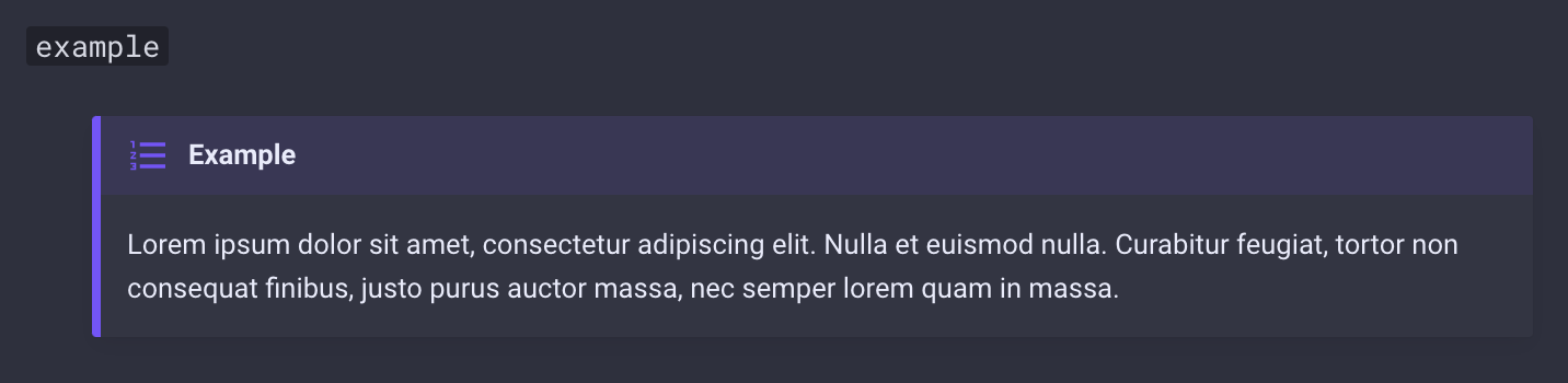
I personally think that the colour used for the example type of admonition should be tweaked a bit, especially for the slate scheme.
When you look at it does the icon not stick out that well compared to the other types.
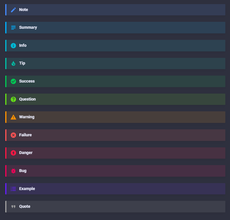
This works great on the white theme, but on slate, which I assume a fair amount of people is probably using, does it not show that great.
I can't give a suggestion about what colour should be used instead... Perhaps a brighter purple would already be enough.
Beta Was this translation helpful? Give feedback.
All reactions