Search filter and results for provisioning a Phone number #1171
-
|
Hey All! I'm working on the UI for the search filter and results for provisioning a Phone number and I want to go over with you on parts of this search:
|
Beta Was this translation helpful? Give feedback.
Replies: 2 comments 4 replies
-
|
Hey @lgalloherran - thanks for sharing this work, we'll be sure to take a look before your office hours time slots next week so we've got good context going into that meeting. We may drop some comments in your designs while we are reviewing, too. In the meantime, here are some thoughts:
|
Beta Was this translation helpful? Give feedback.
-
|
Thanks Katie! 2: This checkbox means that if 'any' is selected you get numbers with any of the capabilities, that's why the word 'any' works for this case. My question was more towards the use of checkboxes in the case 'select all/any'. 3B: This field filters the address requirements in a given country. Some people are searching for a number and they realize this numbers has a ‘local address requirement’ which they can’t provide, so that’s why the option are ‘Exclude’ instead of ‘Include’. I tested those options and customers definitively prefer the word ‘exclude’. 5: For the bullet # 5, yes, those are the empty states. Hoping to discuss the bullets # 3 and # 4 on OH. |
Beta Was this translation helpful? Give feedback.
-
|
Gotcha, this is all super helpful! A couple more thoughts/questions that will help give us some additional context going into OH next week: 2. Thanks for explaining how this works. The use of the Select All checkbox component doesn't feel quite right for this case, as the Select All checkbox will simply check all other boxes in the Checkbox Group. But, checking SMS, MMS, Voice, and Fax would show numbers that have all capabilities, not any capabilities (I believe). We can discuss options in OH, but in the meantime, you might explore removing the "Any" option entirely, and having no boxes checked by default. When no boxes are checked, phone numbers with any combination of capabilities are shown. Then, once the user checks one or multiple capabilities to filter by, phone numbers with those specified capabilities are shown. That is a more common pattern for filters like this. I would recommend trying this interaction pattern for the "Number type" filter as well. 3B. Gotcha, that makes sense. I might still not fully understand how the filter works, but it seems to me that these could actually be a Checkbox Group with two options: "Exclude numbers with local requirements", and "Exclude numbers with foreign requirements". Checking neither box would show numbers with any combination of address requirements, and checking both boxes would show numbers with no address requirements. This would allow you to get rid of the "Any" and "None" options. Do you think that might work? 5. Placement of the elements seems good, though I'd be curious to see some alternative layouts just to compare how they feel. Did you try a centered layout? Also, this is minor, but the icons should match the color of the link/button text (Sketch sometimes changes them back to gray so you may need to manually adjust it). |
Beta Was this translation helpful? Give feedback.
-
|
Thanks for feedback! |
Beta Was this translation helpful? Give feedback.
-
|
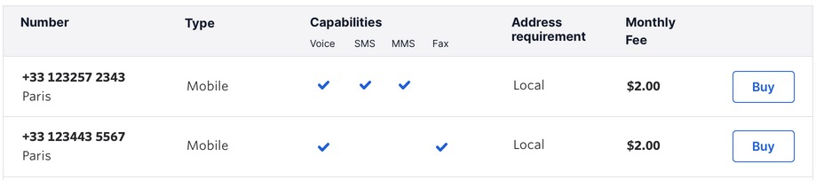
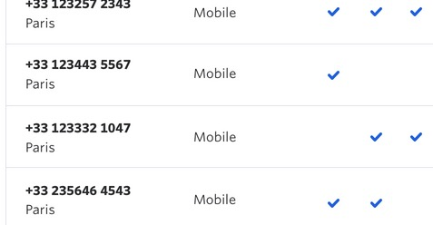
@SiTaggart @TheSisb @gloriliale - looping y'all in on this since you were all in this office hours today. We didn't get a chance to cover one of Luz's questions. She's got three different ways to show the capabilities in the Phone Numbers table. Luz and I both lean towards using the icons, so it's easier for a user to know which capability is which as they get further down the table. Do y'all have any thoughts? And, are there considerations Luz needs to make in terms of making this part of the table accessible for screen readers? |
Beta Was this translation helpful? Give feedback.
-
Accessibility of results table with regard to displaying capabilitiesFrom an accessibility perspective all three options are fine, but I suspect some have advantages over others. Overall what makes this an improvement for accessibility over the current version?Put simply, the addition of the individual column headers make this table much more accessible and easier to use.
The addition of the name of the capability as a column header, regardless of the treatment of the capability, means you are providing a clear and explicit meaning, rather than just having having a catch all "Capabilities" column header that covers all four types. Much better 👍 Treatment of capabilities in the tableI think all three versions are perfectly accessible, but some are better than others overall. Checkmarks
I agree that they maybe less clear as you scroll down the table. This might be especially true for folks who have low vision and need to zoom the interface, or have cognative disabilities that affect their short term memory or recall functions. The loss of context to the headers if it's a long or zoomed in experience makes it my least favorite. We also don't provider column borders which doesn't necessarily help when you are experiencing zoomed in content, you might loose context of which icons aligns to which column.
Icons
Icons are better for when you are out of context of the column headers or zoomed it. But the addition of the tooltips on those icons are even better and cover most, if not all, edge cases
SummaryIndividual columns headers, icons and tooltips would provide the best experience for all folks in my opinion. |


Beta Was this translation helpful? Give feedback.
Accessibility of results table with regard to displaying capabilities
From an accessibility perspective all three options are fine, but I suspect some have advantages over others.
Overall what makes this an improvement for accessibility over the current version?
Put simply, the addition of the individual column headers make this table much more accessible and easier to use.
The addition of the name of the capability as a column header, regardless of the treatment of the capability, means you are providing a clear and explicit meaning, rather than just having having a catch all "Capabilities" column header that covers all four types. Much better 👍
Treatment of capabilities in the table
I …