-
|
I'm implementing a UI with some comboboxes in it. In its design mocks, there is no label above the combobox; rather, the placeholder text indicates to the user what the field is. I've compensated for this by setting the "aria-label" field. My code looks like this. Right now, the blank "labelText" is necessary because it's not a nullable prop, but does this fundamentally need to be a required prop? |
Beta Was this translation helpful? Give feedback.
Replies: 3 comments 4 replies
-
|
Hi @sebm , in UI like combobox/input/etc the label above is suggested. If you'd like to see the reasoning for this/examples of what to do this section on accessibility is helpful. We'd also not suggest the label text be the placeholder. Is there a reason the design mocks don't have a label? |
Beta Was this translation helpful? Give feedback.
-
|
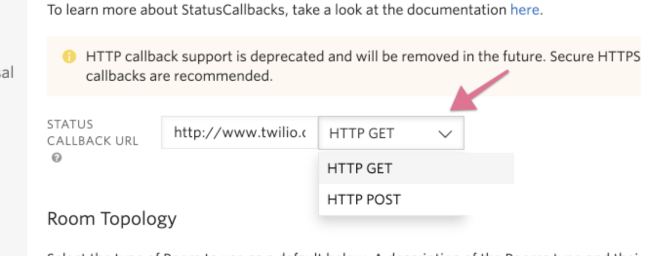
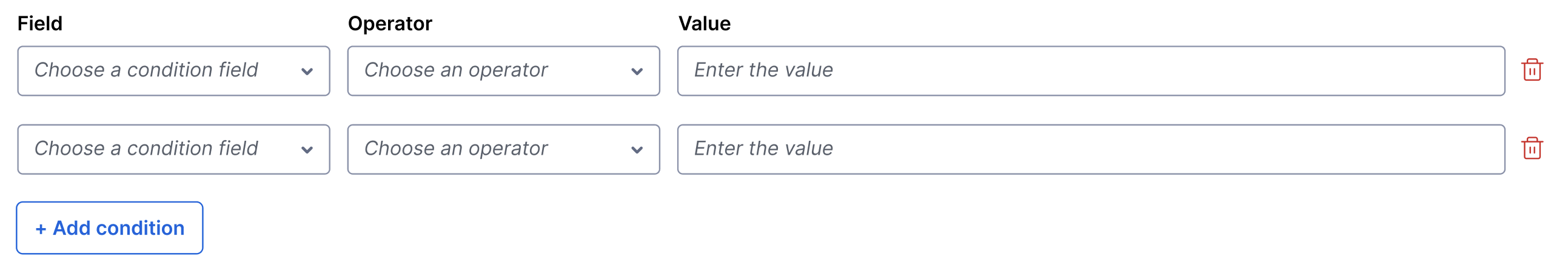
Hey @corinne-nagel! So this has come up a few times when migrating some PHP patterns to React, we've run into some places where selects are shown without a label alongside an input. One example is the following: But specifically for @sebm example, we are using a set of selects to define a query rule, and allowing the customer to add multiple sets of these. So having the label in for all the selects starts to get really busy and distracting. This is what we quickly came up with. But I would love you thoughts on how to utilize the label still without it getting busy.
For what it's worth, I took inspiration from the Messaging Insights dashboard filters which I know is still not fully migrated to React, but aligned the filters such as this:
Anyway, so if Labels are required to be included on Inputs, Selects, and Comboboxes, we might want to be explicit about this in the Paste docs for the components. Right now, it's not super clear. From the notes on Accessibility, It seems like although having the Label visually is preferred we still have the option of not visually including the Label but instead using |
Beta Was this translation helpful? Give feedback.
-
|
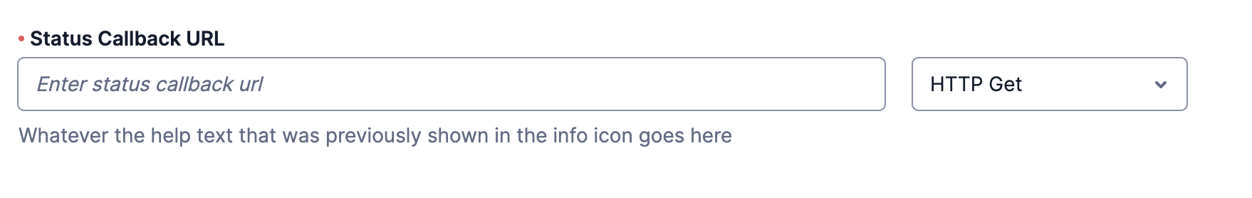
Ah I see, thanks for clarifying @kylegilbreath ! While it's generally our suggestion that labels be on each select, I agree, it would be really busy with all of those labels. I think for something like this it works to put the label above all of the selects if you're also using the Hope that helps! |
Beta Was this translation helpful? Give feedback.
-
|
Cool cool. Thanks for the input @corinne-nagel! I'll work with @sebm to update the designs to have the label shown above the first row of selects, similar to how Message Insights are doing it with filters. |
Beta Was this translation helpful? Give feedback.
-
|
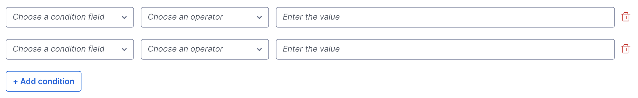
One last question @corinne-nagel or @SiTaggart. If I am only adding visual Labels to the first row of selects (see screenshot), should we label the selects that don't have visible labels directly using
cc: @sebm |
Beta Was this translation helpful? Give feedback.
-
|
Hi folks So minor updates on this. The reason we make Combobox labels required is that it more closely follows the Input guidelines and not the Select guidelines because it can take a placeholder, whereas Selects cannot. Because of that it's very tempting for folks to try and use a Placeholder as a label, which is against the more detailed Input guidelines. As for implementation, this has come up before in a different thread but the detail on labels got buried in thread so I don't blame you for not finding it. You can use a screen reader only component in the labelText prop. #993 (reply in thread) |
Beta Was this translation helpful? Give feedback.
-
|
Thanks for the help @SiTaggart ! |
Beta Was this translation helpful? Give feedback.
Hi folks
So minor updates on this. The reason we make Combobox labels required is that it more closely follows the Input guidelines and not the Select guidelines because it can take a placeholder, whereas Selects cannot.
Because of that it's very tempting for folks to try and use a Placeholder as a label, which is against the more detailed Input guidelines.
As for implementation, this has come up before in a different thread but the detail on labels got buried in thread so I don't blame you for not finding it. You can use a screen reader only component in the labelText prop. #993 (reply in thread)