-
|
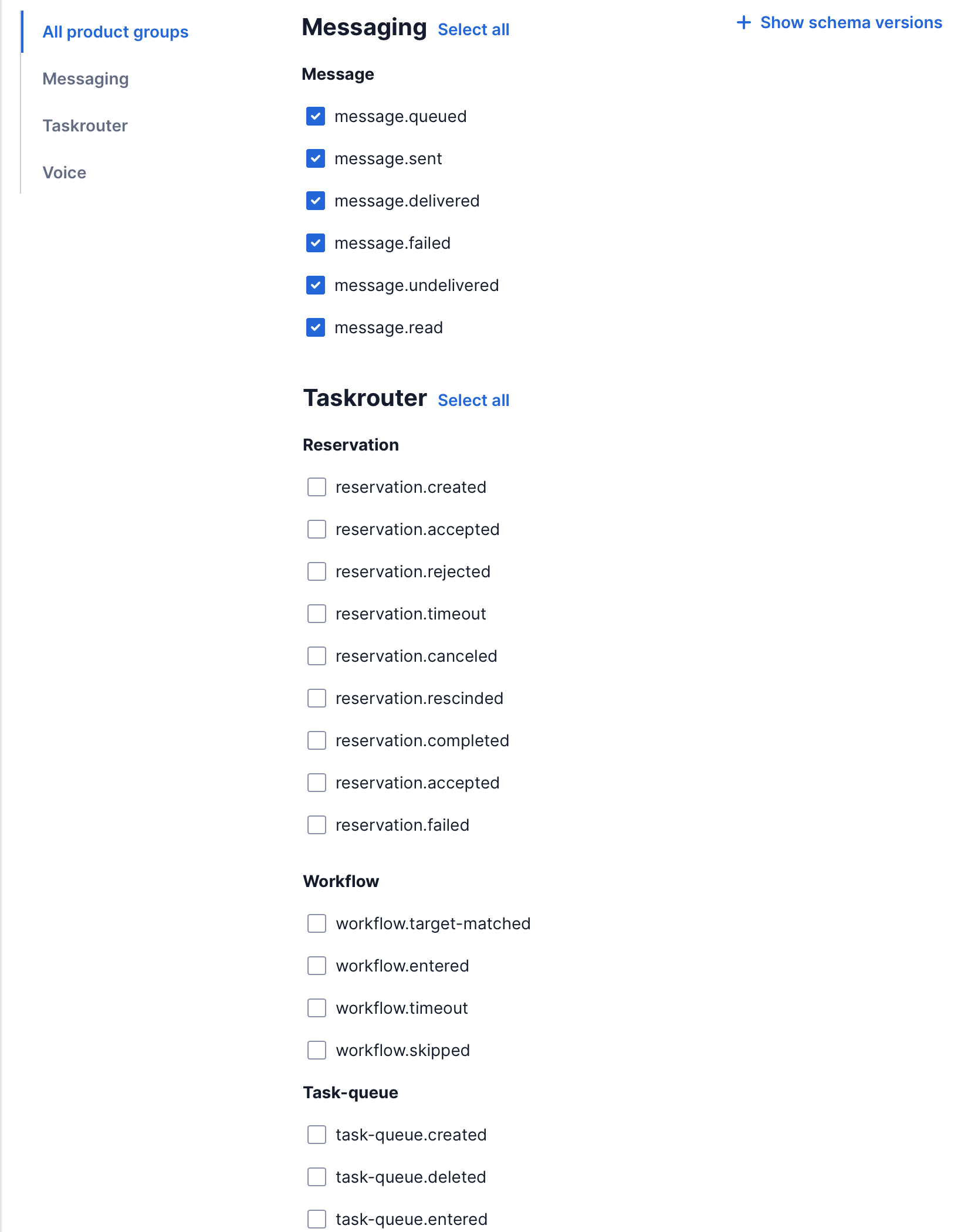
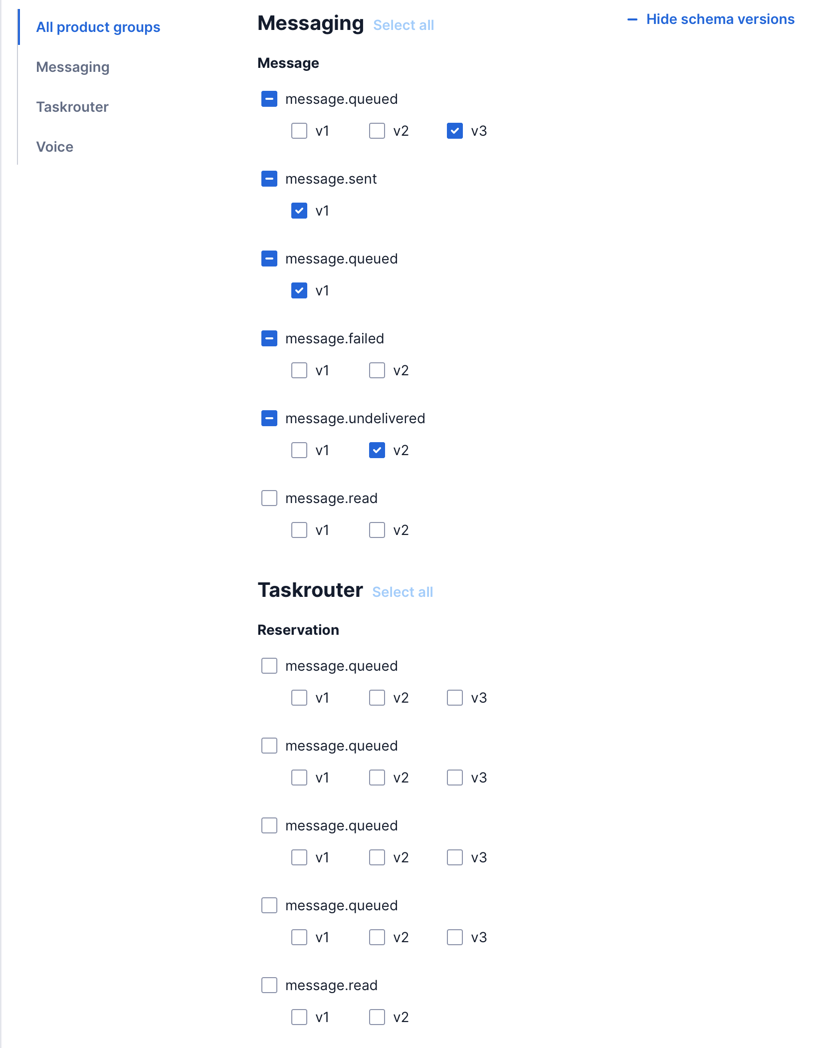
Hey DSYS! I got to user test Option 4 that y'all put together. Users loved this design and found it very easy to use. Thanks team :) Now, there is an additional sub-layer of options (schema versions) each checkbox (event type) can have. As a default, when a user is selecting an event, it will be defaulted to the latest schema version. Only when the user clicks "Show schema version" will they then see the sub-options. This is one concept I'm exploring right now. The biggest drawback is when you're looking at all the product groups (and we'll be release more soon) with all the schema versions shown, it's going to be a very very long scroll... Would like to see if DSYS have any recommendations on how to show and hide additional set of options, placement of it in relation to the checkboxes, and if there are any accessibility concerns with this approach. Another concept I'm considering is a modal to show the schema versions but have not designed it yet. Thanks!
-- Edit from @serifluous : Link to original thread in #1153 |
Beta Was this translation helpful? Give feedback.
Replies: 3 comments 3 replies
-
|
Love this pattern - very similar to Product Explorer page. It's a great way of filtering long pages of content into logical categories. |
Beta Was this translation helpful? Give feedback.
-
|
Hi @mindytom, sorry for the late reply, this slipped through somehow. Brought it up with the team and we will get back to you later today. |
Beta Was this translation helpful? Give feedback.
-
|
No worries. Here's the Invision prototype for y'all to click through the concept. |
Beta Was this translation helpful? Give feedback.
-
|
Hi again @mindytom,
The vertical tab looks like a reasonable way to show and hide certain blocks of options. For the sub-checkboxes (v0, v1, v2), it's not really clear what those are. They likely need labeling and optionally help text. This will help with accessibility. In terms of UI treatment, I just wanted to double check the checkbox usage, as it's unclear what it means for all v0 v1 and v2 to be selected, for example. Were there any concerns around this during design crit? The select all button looks enabled in one screenshot but disabled in the other. This may be confusing to users without an explanation as to why. |
Beta Was this translation helpful? Give feedback.
-
|
Hey @mindytom , just circling back here. Did you get the info you needed to move forward? |
Beta Was this translation helpful? Give feedback.
-
|
Yes, I brought it to office hours just now and got the answers I need to move forward. Thanks Corinne for circling back to this. |
Beta Was this translation helpful? Give feedback.
Hi again @mindytom,
The vertical tab looks like a reasonable way to show and hide certain blocks of options.
For the sub-checkboxes (v0, v1, v2), it's not really clear what those are. They likely need labeling and optionally help text. This will help with accessibility.
In terms of UI treatment, I just wanted to double check the checkbox usage, as it's unclear what it means for all v0 v1 and v2 to be selected, for example. Were there any concerns around this during design crit?
T…