Customized button style #1549
-
Get feedback on a customized button style used in a project for Marketing Campaign product.Customers Use cases Design View it here: Design prototype is here I would love some suggestions on the usage on the customized button style. Thanks |
Beta Was this translation helpful? Give feedback.
Replies: 4 comments
-
|
Hi @frankfzhao. Thanks for sharing. I'll share with the team, so we can provide feedback before the next office hours. |
Beta Was this translation helpful? Give feedback.
-
|
Adding some more here. I would also like to talk about the hover state for icons. Same screenshot above, I am wondering if we have something in DS that supports hovering state for the icons in the card. (Or probably I should use the icon only component[Not sure which style to use though]) |
Beta Was this translation helpful? Give feedback.
-
|
Hey @frankfzhao - Here's the video from office hours: https://www.loom.com/share/e25a286e90ab4584bd42bb9ae424d17c. The password is posted in the #help-design-system channel. Thanks again for coming to office hours! |
Beta Was this translation helpful? Give feedback.
-
|
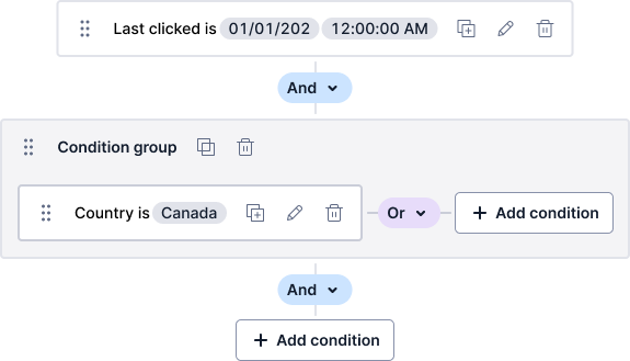
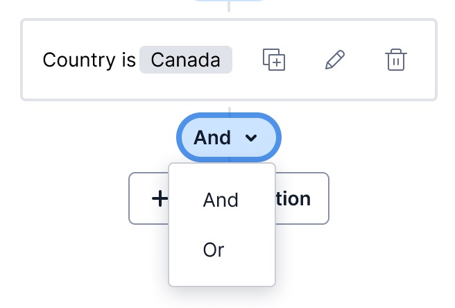
Some extra thoughts here after the team got together discussion the and/or logic gates. Component identityStarting with the control itself
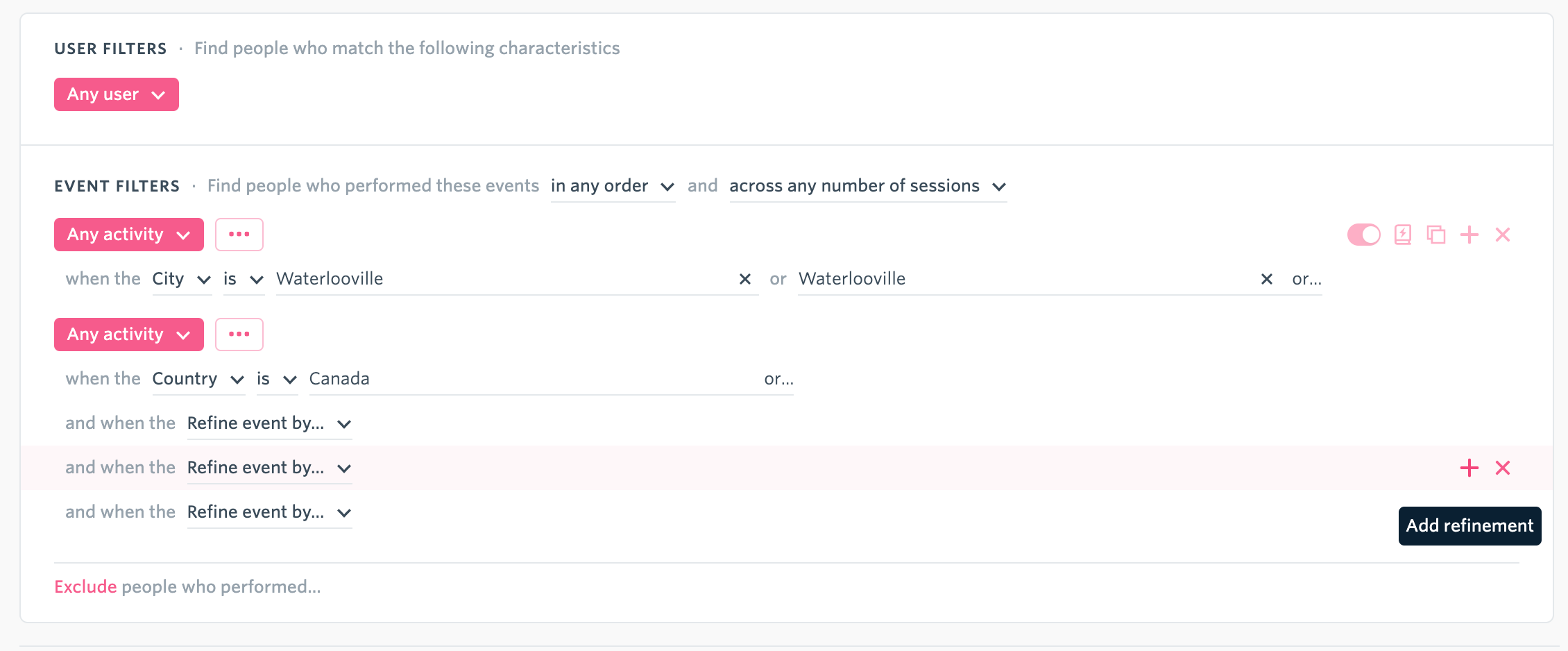
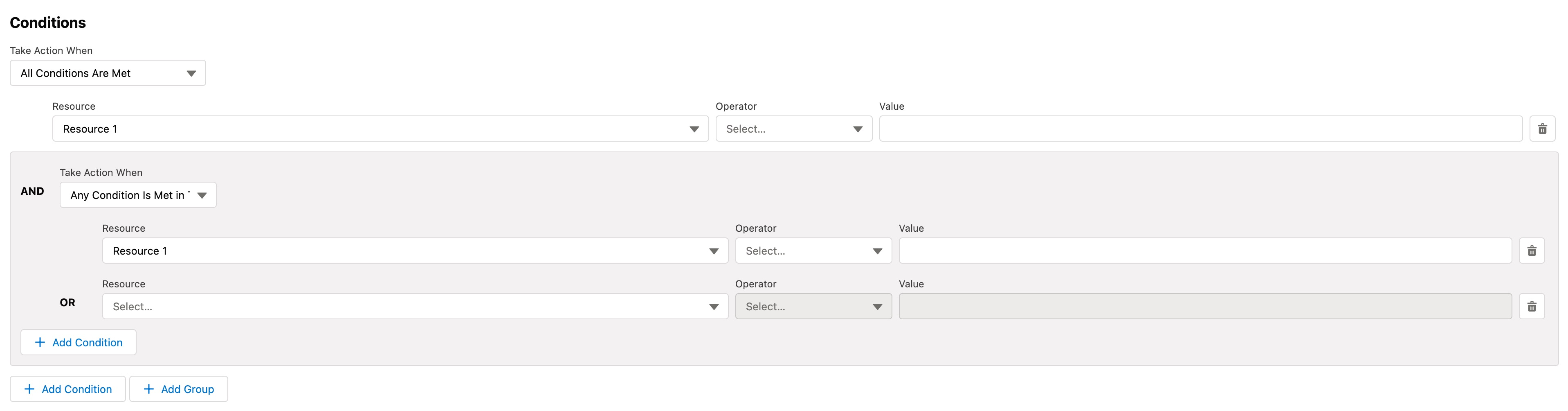
What did come up most is what this component actually is, especially when we are talking about "button styles". With that in mind we believe the intention is that the control is a menu button that shows a menu of selectable items. The potential wrench that I threw in was that menu buttons shouldn't change their text upon selection. Menus perform actions, they don't set a value or persist state. For that, you're looking at a Combobox. Alternatively if you've only got and or or, you might consider some sort of switch control, which we admittedly don't have yet. Grouping and associationThe next part comes as the current design is pretty heavily reliant on visual associate and visual meaning to communicate some pretty important relationships. The canvas nature of it might lend itself to being somewhat tricky to provide non-visual structure and relationships to users of assistive technology. With that we were wondering if you'd be interested in exploring something a little more structured and hierarchical, which would then lend itself better to supporting the use of a Combobox for the logic gate. As prior art we're thinking of this (which I can't remember the name of the product)
or this great example from Salesforce
https://www.lightningdesignsystem.com/components/expression/ Especially with the Salesforce example, the non-visual communication of state, relationships, hierarchy and meaning is really clear. We spent quite a lot of time on it. Other advantages might include its ability to scale pretty well to very complex expressions, with having to build some sort of zoom in and out functionality, and generally being easier to build for the engineering team, if that's a consideration. In summaryI don't think the addition of a new token would be wise right now, given that I don't think that control should be a button, and there might be better ways to communicate groupings, relationships and structure to non-sighted users. |
Beta Was this translation helpful? Give feedback.
Some extra thoughts here after the team got together discussion the and/or logic gates.
Component identity
Starting with the control itself
What did come up most is what this component actually is, especially when we are talking about "button styles". With that in mind we believe the intention is that the control is a menu button that shows a menu of selectable items. The potential wrench that I threw in was that menu buttons shouldn't change their text upon selection. Menus perform actions, they don't set a value or persist state.
For that, you're looking at a Combobox.
Alternatively if you've only got and or or, you might consider some sort of switch control, which we admittedly don't …