Data Visualizations - Colors #2496
-
|
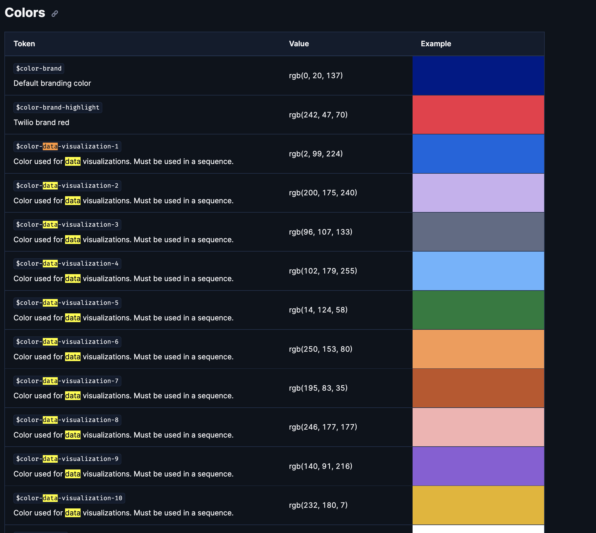
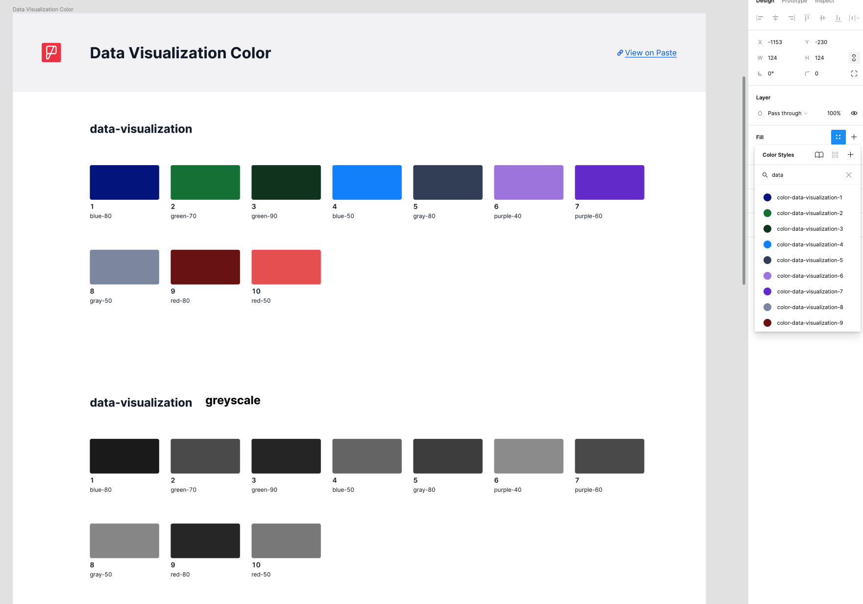
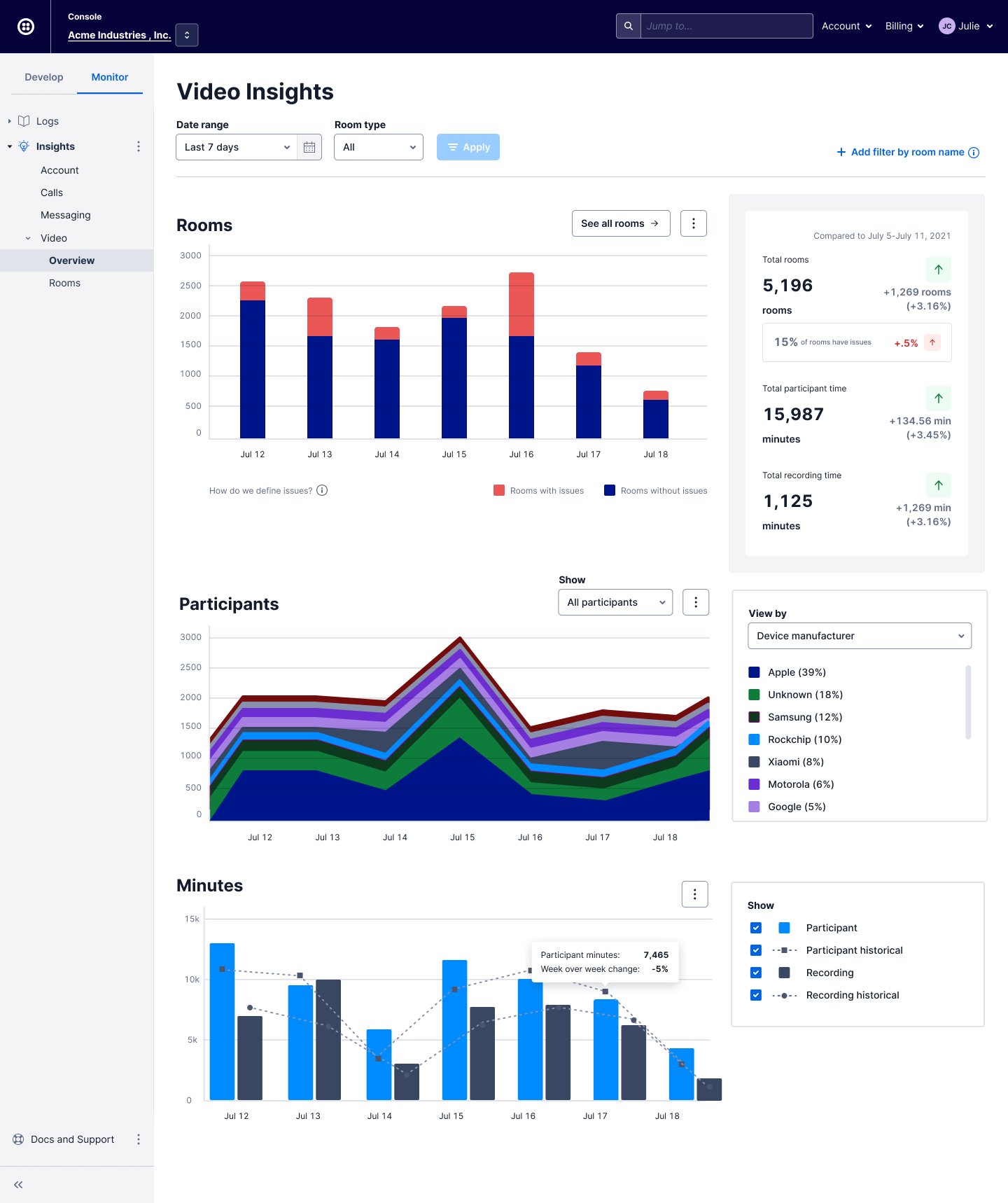
I am working on updating the data visualizations for Video Insights within the Console The current data viz Paste Color palette appears to only go from 40-90 for a value range making everything quite dark & heavy across the various screens. There is also some differences between the Paste Website colors and the Figma Library Colors. Any guidance would be much appreciated & I'll also be signing up for office hours. I will be moving away from the solid fills as a start to make things better, similar to either one of these Storybook examples: Current Paste Colors: Video Insights with Figma Library color palette example: |
Beta Was this translation helpful? Give feedback.
Replies: 2 comments
-
|
I think I spot two different questions, let me know if I missed something:
Unfortunately, none of our color aliases below 40 on the scale are accessible for graphical elements. When you say "one of the requests is to modify the colors for better accessibility", these colors will do the job!
So the reason they look different on the website is that the data visualization token colors change based on the theme. Your website appears to be in the Hope this helps! |
Beta Was this translation helpful? Give feedback.
-
|
Hi there! Wanted to leave the recording of Office Hours where we discussed this here for reference: Office Hours recording. The password is posted in the #help-design-system channel. Thanks again for coming to office hours! |
Beta Was this translation helpful? Give feedback.
Hi @benjamincoughlin,
I think I spot two different questions, let me know if I missed something:
Unfortunately, none of our color aliases below 40 on the scale are accessible for graphical elements. When you say "one of the requests is to modify the colors for better accessibility", these colors will do the job!
So the reason they look different on the website is that the data visualization token colors change based on the theme. Your websit…