Make Alert's dismiss button text configurable #2581
-
|
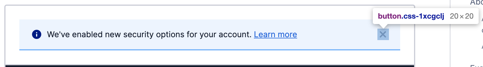
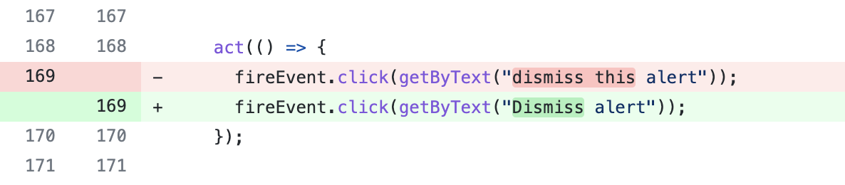
Hi team. I'd like to make a suggestion about an issue I had today. The console team decided to upgrade the version of the Paste library, and in my code two unit test broke. These unit tests required to select the dismiss icon in the Alert component in order to trigger a click on it.
However, the only way I found to hook to this element was via the help text, that in the current version of the library in the console was "dismiss this alert" while in the new version it was changed to "Dismiss alert". The fix looks like this:
My suggestion is to make this text configurable via props, maybe with a fallback text like the one already there. With this change, developers would be able to query the element with the text they set in the props. Additionally, the text will also be open to i18n, given that right now it is fixed to english. |
Beta Was this translation helpful? Give feedback.
Replies: 1 comment 1 reply
-
|
This change was indeed made to support our internationalization efforts. As a result, we exposed a number of additional props on a collection of components so that you, the consumer, can override text inside a component, that is not supplied as a child. Please check the prop tables of components on the docs site and find the new props, prefixed with For example, Alert now exposes Hope that helps |
Beta Was this translation helpful? Give feedback.
-
|
Oh, that's great! Didn't know about those i18n props. Thanks @SiTaggart |
Beta Was this translation helpful? Give feedback.
Hi @arodriguezcortes
This change was indeed made to support our internationalization efforts. As a result, we exposed a number of additional props on a collection of components so that you, the consumer, can override text inside a component, that is not supplied as a child.
Please check the prop tables of components on the docs site and find the new props, prefixed with
i18navailable for you to override text with for internationalization purposes.For example, Alert now exposes
i18nDismissLabelhttps://paste.twilio.design/components/alert#propsHope that helps