Alert Component #98
Description
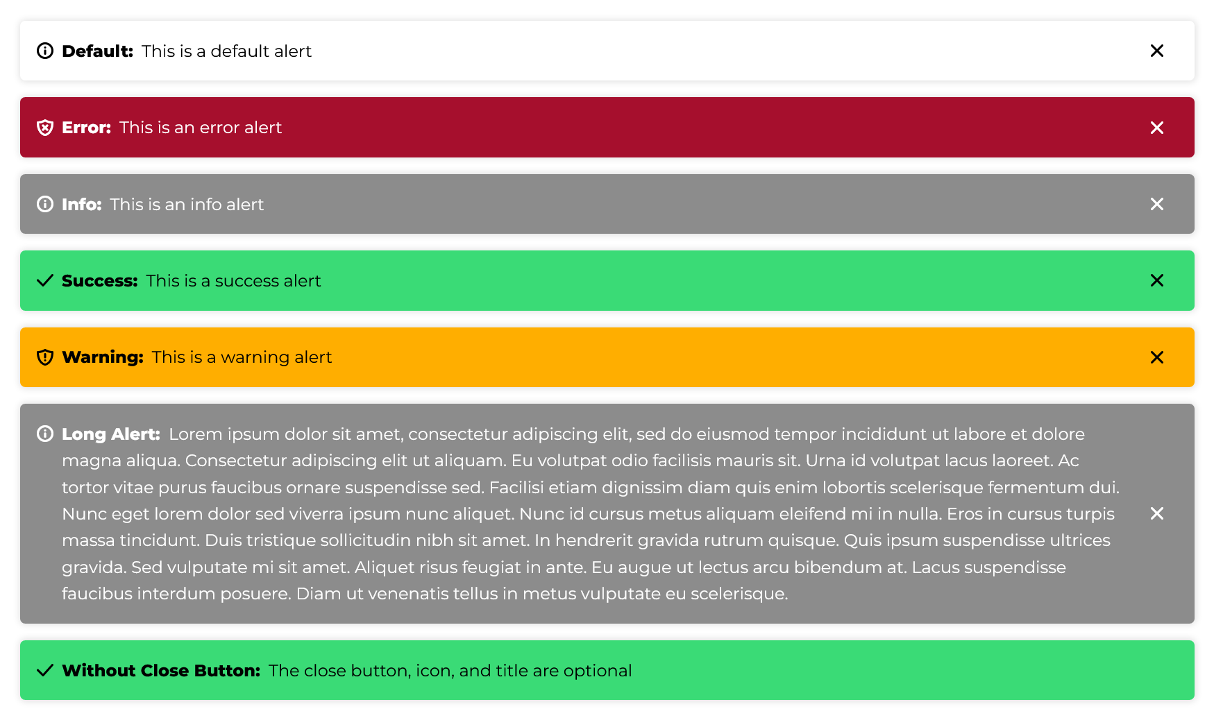
I needed alerts for an application I'm writing, so I created an alert based on the existing card component and figured I'd share it.
The WDS is missing the colors needed for success and warning alerts, so I used the colors from Foundation 6's buttons.
The styles (SCSS):
.wsu-c-alert {
    display:flex;
    padding: 1em;
    margin-bottom: 1em;

    // Copying card styles
    border-radius: 5px;
    box-shadow: 0px 0px 6px 1px rgba(0,0,0,0.125);
    transition: box-shadow 300ms cubic-bezier(0, 0, 0.03, 1);

    &:hover {
        box-shadow: 0px 0px 10px 1px rgba(0,0,0,0.3);
    }

    // Default is a white background

    // Colors from WDS
    &.wsu-c-alert--error {
        color: white;
        background-color: #A60F2D;
    }

    &.wsu-c-alert--info {
        color: white;
        background-color: rgb(140, 140, 140);
    }

    // Extra colors copied from Foundation 6
    &.wsu-c-alert--success {
        background-color: #3adb76;
    }

    &.wsu-c-alert--warning {
        background-color: #ffae00;
    }

    // Alert contents
    & > .wsu-icon:first-child {
        margin-right: 0.5em;

        // If you want the icon vertically centered
        // align-self: center;
    }

    & > .wsu-c-alert--body {
        flex-grow: 1;
    }

    .wsu-c-alert--title {
        font-weight: bold;
        margin-right: 0.25em;

        &:after {
            content: ':';
        }
    }

    & > .wsu-c-alert--close-button {
        margin: 0 0 0 1em;
        padding: 0;
        color: inherit;
        background-color: transparent;

        &:hover, &:focus {
            box-shadow: none;
            color: inherit;
            background-color: transparent;
        }
    }
}
To use it (the icon, title, and close button are optional):
<div class="wsu-c-alert wsu-c-alert--info" role="alert">
    <i class="wsu-icon wsu-i-info"></i>

    <div class="wsu-c-alert--body">
        <span class="wsu-c-alert--title">Title</span>
        Alert Text
    </div>

    <button type="button" class="wsu-c-alert--close-button" title="Close Alert">
        <i class="wsu-icon wsu-i-x-close"></i>
    </button>
</div>
And some JavaScript to wire up the close button:
function closeAlertButtonClicked(event) {
    event.target.closest('.wsu-c-alert').remove();
}

document.querySelectorAll('.wsu-c-alert .wsu-c-alert--close-button')
    .forEach(el => {
        el.addEventListener('click', closeAlertButtonClicked);
    });
And here's a working example.
Here's what the result looks like: