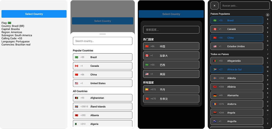
🌍 React Native country picker with flags, search, TypeScript, i18n, and offline support. Lightweight, customizable, and designed with a modern UI.


- 📱 Cross-Platform – Works seamlessly on iOS, Android and Web;
- 🧩 Flexible Integration – Supports both React Native CLI & Expo;
- 🎨 Modern UI - Custom component with sleek design;
- 👨💻 Component Versatility - Works with functional & class components;
- 🈶 internationalization - Supports 32 languages;
- 🧪 Test Ready – Smooth testing integration;
- ♿ Accessibility – Accessibility standards to screen readers.
To use this library, make sure you have react-native-country-select installed along with its required dependency react-native-safe-area-context:
npm install react-native-country-select react-native-safe-area-contextSince react-native-safe-area-context includes native code, you’ll need to install the iOS pods on macOS to complete the linking:
npx pod-install iosCreate a react-native.config.js file at the root of your react-native project with:
module.exports = {
  project: {
    ios: {},
    android: {},
  },
  assets: [
    './node_modules/react-native-country-select/lib/assets/fonts',
  ],
};
Then link the font to your native projects with:
npx react-native-asset- Install expo-fonts:
npx expo install expo-font; - Initialize the
expo-font:
  import { useFonts } from 'expo-font';

  ...

  useFonts({
    'TwemojiMozilla': require('./node_modules/react-native-country-select/lib/assets/fonts/TwemojiMozilla.woff2'),
  });

  ...
Observation: you need to recompile your project after adding new fonts.
- Class Component
import React, { Component } from 'react';
import { Text, TouchableOpacity, View } from 'react-native';
import CountrySelect from 'react-native-country-select';

export default class App extends Component {
  countryRef = null;

  constructor(props) {
    super(props);
    this.state = {
      showPicker: false,
      country: null,
    };
  }

  handleCountrySelect = (country) => {
    this.setState({ country });
  };

  render() {
    return (
      <View style={{ flex: 1 }}>
        <TouchableOpacity
          onPress={() => this.setState({ showPicker: true })}
        >
          <Text>Select Country</Text>
        </TouchableOpacity>
        <Text>
          Country:{' '}
          {`${this.state.selectedCountry?.name?.common} (${this.state.selectedCountry?.cca2})`}
        </Text>

        <CountrySelect
          visible={this.state.showPicker}
          onClose={() => this.setState({ showPicker: false })}
          onSelect={this.handleCountrySelect}
        />
      </View>
    );
  }
}- Function Component
import React, { useState } from 'react';
import { Text, TouchableOpacity, View } from 'react-native';

import CountrySelect from 'react-native-country-select';

export default function App() {
  const [showPicker, setShowPicker] = useState(false);
  const [selectedCountry, setSelectedCountry] = useState(null);

  const handleCountrySelect = (country) => {
    setSelectedCountry(country);
  };

  return (
    <View
      style={{
        flex: 1,
      }}
    >
      <TouchableOpacity onPress={() => setShowPicker(true)}>
        <Text>Select Country</Text>
      </TouchableOpacity>
      <Text>
        Country:{' '}
        {`${selectedCountry?.name?.common} (${selectedCountry?.cca2})`}
      </Text>

      <CountrySelect
        visible={showPicker}
        onClose={() => setShowPicker(false)}
        onSelect={handleCountrySelect}
      />
    </View>
  );
}- Typescript
import React, { useState } from 'react';
import { Text, TouchableOpacity, View } from 'react-native';

import CountrySelect, { ICountry } from 'react-native-country-select';

export default function App() {
  const [showPicker, setShowPicker] = useState<boolean>(false);
  const [selectedCountry, setSelectedCountry] =
    useState<ICountry | null>(null);

  const handleCountrySelect = (country: ICountry) => {
    setSelectedCountry(country);
  };

  return (
    <View
      style={{
        flex: 1,
      }}
    >
      <TouchableOpacity onPress={() => setShowPicker(true)}>
        <Text>Select Country</Text>
      </TouchableOpacity>
      <Text>
        Country:{' '}
        {`${selectedCountry?.name?.common} (${selectedCountry?.cca2})`}
      </Text>

      <CountrySelect
        visible={showPicker}
        onClose={() => setShowPicker(false)}
        onSelect={handleCountrySelect}
      />
    </View>
  );
}- Multi Select Country
import React, { useState } from 'react';
import { Text, TouchableOpacity, View } from 'react-native';

import CountrySelect, { ICountry } from 'react-native-country-select';

export default function App() {
  const [showPicker, setShowPicker] = useState<boolean>(false);
  const [selectedCountries, setSelectedCountries] = useState<
    ICountry[]
  >([]);

  const handleCountrySelect = (countries: ICountry[]) => {
    setSelectedCountries(countries);
  };

  return (
    <View
      style={{
        flex: 1,
      }}
    >
      <TouchableOpacity onPress={() => setShowPicker(true)}>
        <Text>Select Countries</Text>
      </TouchableOpacity>
      <Text>Countries: {selectedCountries.length}</Text>

      <CountrySelect
        visible={showPicker}
        isMultiSelect
        selectedCountries={selectedCountries}
        onSelect={handleCountrySelect}
        onClose={() => setShowPicker(false)}
      />
    </View>
  );
}
Modal Styles (modalStyles)
| Property | Type | Description |
|---|---|---|
backdrop |
ViewStyle | Modal background overlay |
container |
ViewStyle | Modal main container |
content |
ViewStyle | Modal content area |
dragHandleContainer |
ViewStyle | Drag Handle area |
dragHandleIndicator |
ViewStyle | Drag Handle Indicator |
searchContainer |
ViewStyle | Search input wrapper |
searchInput |
TextStyle | Search input field |
list |
ViewStyle | Countries list container |
countryItem |
ViewStyle | Individual country row |
flag |
TextStyle | Country flag in list |
countryInfo |
ViewStyle | Country details container |
callingCode |
TextStyle | Calling code in list |
countryName |
TextStyle | Country name in list |
sectionTitle |
TextStyle | Section headers |
closeButton |
ViewStyle | Close button container |
closeButtonText |
TextStyle | Close button text |
countryNotFoundContainer |
ViewStyle | No results container |
countryNotFoundMessage |
TextStyle | No results message |
alphabetContainer |
ViewStyle | Alphabet filter container |
alphabetLetter |
ViewStyle | Alphabet letter item |
alphabetLetterText |
TextStyle | Alphabet letter text |
alphabetLetterActive |
ViewStyle | Active letter state |
alphabetLetterDisabled |
ViewStyle | Disabled letter state |
alphabetLetterTextActive |
TextStyle | Active letter text |
alphabetLetterTextDisabled |
TextStyle | Disabled letter text |
CountrySelect Props (countrySelectProps)
| Prop | Type | Required | Default | Description |
|---|---|---|---|---|
| visible | boolean | Yes | false | Controls the visibility of the country picker modal |
| onClose | () => void | Yes | - | Callback function called when the modal is closed |
| onSelect | (country: ICountry) => void | Yes | - | Callback function called when a country is selected |
| modalType | 'bottomSheet' | 'popup' | No | 'bottomSheet' | Type of modal to display |
| countrySelectStyle | ICountrySelectStyle | No | - | Custom styles for the country picker |
| isMultiSelect | boolean | No | false | Whether the user can select multiple options |
| selectedCountries | ICountry[] | No | - | Array of countries to show in multi select mode |
| isFullScreen | boolean | No | false | Whether the modal should be full screen |
| popularCountries | string[] | No | [] | Array of country codes to show in popular section |
| visibleCountries | ICountryCca2[] | No | [] | Array of country codes to show (whitelist) |
| hiddenCountries | ICountryCca2[] | No | [] | Array of country codes to hide (blacklist) |
| theme | 'light' | 'dark' | No | 'light' | Theme for the country picker |
| language | ICountrySelectLanguages | No | 'eng' | Language for country names (see supported languages below) |
| showSearchInput | boolean | No | true | Whether to show the search input field |
| showAlphabetFilter | boolean | No | false | Whether to show the alphabetic filter on modal |
| searchPlaceholder | string | No | 'Search country...' | Placeholder text for search input |
| searchPlaceholderTextColor | string | No | '#00000080' | Placeholder text color for search input |
| searchSelectionColor | string | No | default | Highlight, selection handle and cursor color of the search input |
| minBottomsheetHeight | number | string | No | 30% | Minimum height for bottom sheet modal |
| maxBottomsheetHeight | number | string | No | 80% | Maximum height for bottom sheet modal |
| initialBottomsheetHeight | number | string | No | 50% | Initial height for bottom sheet modal |
| disabledBackdropPress | boolean | No | false | Whether to disable backdrop press to close |
| removedBackdrop | boolean | No | false | Whether to remove the backdrop completely |
| onBackdropPress | (closeModal: () => void) => void | No | - | Custom callback for backdrop press |
| dragHandleIndicatorComponent | () => ReactElement | - | - | Custom component for drag handle indicator on bottom sheet |
| countryItemComponent | (item: ICountry) => ReactElement | No | - | Custom component for country items |
| sectionTitleComponent | (item: ISectionTitle) => ReactElement | No | - | Custom component for section titles |
| closeButtonComponent | () => ReactElement | No | - | Custom component for closeButton |
| customFlag | (country: ICountry) => ReactElement | No | - | Custom render function for country flags. Returns rendered element in selected country |
| showCloseButton | boolean | No | false | Whether to show the close button |
| popularCountriesTitle | string | No | 'Popular Countries' | Popular Countries section title |
| allCountriesTitle | string | No | 'All Countries' | All Countries section title |
| showsVerticalScrollIndicator | boolean | No | false | Displays a horizontal scroll indicator |
| countryNotFoundMessage | string | No | "No countries found" | Country not found in search |
| allowFontScaling | boolean | No | true | Whether to allow font scaling for text elements |
The language prop supports the following values:
| Code | Language |
|---|---|
ara |
Arabic |
bel |
Belarusian |
bre |
Breton |
bul |
Bulgarian |
ces |
Czech |
deu |
German |
ell |
Greek |
eng |
English |
est |
Estonian |
fin |
Finnish |
fra |
French |
heb |
Hebrew |
hrv |
Croatian |
hun |
Hungarian |
ita |
Italian |
jpn |
Japanese |
kor |
Korean |
nld |
Dutch |
per |
Persian |
pol |
Polish |
por |
Portuguese |
ron |
Romanian |
rus |
Russian |
slk |
Slovak |
spa |
Spanish |
srp |
Serbian |
swe |
Swedish |
tur |
Turkish |
ukr |
Ukrainian |
urd |
Urdu |
zho |
Chinese |
zho-Hans |
Simplified Chinese |
zho-Hant |
Traditional Chinese |
When utilizing this package, you may need to target the CountrySelect component in your automated tests. To facilitate this, we provide a testID props for the CountrySelect component. The testID can be integrated with popular testing libraries such as @testing-library/react-native or Maestro. This enables you to efficiently locate and interact with CountrySelect elements within your tests, ensuring a robust and reliable testing experience.
const countrySelectModalContainer = getByTestId(
  'countrySelectContainer'
);
const countrySelectModalContent = getByTestId('countrySelectContent');
const countrySelectBackdrop = getByTestId('countrySelectBackdrop');
const countrySelectList = getByTestId('countrySelectList');
const countrySelectSearchInput = getByTestId(
  'countrySelectSearchInput'
);
const countrySelectItem = getByTestId('countrySelectItem');
const countrySelectCloseButton = getByTestId(
  'countrySelectCloseButton'
);Ensure your app is inclusive and usable by everyone by leveraging built-in React Native accessibility features. The accessibility props are covered and customizable by this package.
accessibilityLabelBackdrop: Accessibility label for the backdrop;accessibilityHintBackdrop: Accessibility hint for the backdrop;accessibilityLabelCloseButton: Accessibility label for the close button;accessibilityHintCloseButton: Accessibility hint for the close button;accessibilityLabelSearchInput: Accessibility label for the search input;accessibilityHintSearchInput: Accessibility hint for the search input;accessibilityLabelCountriesList: Accessibility label for the countries list;accessibilityHintCountriesList: Accessibility hint for the countries list;accessibilityLabelCountryItem: Accessibility label for individual country items;accessibilityHintCountryItem: Accessibility hint for individual country;accessibilityLabelAlphabetFilter: Accessibility label for alphabet filter list;accessibilityHintAlphabetFilter: Accessibility hint for alphabet filter list;accessibilityLabelAlphabetLetter: Accessibility label for individual alphabet filter letter;accessibilityHintAlphabetLetter: Accessibility hint for individual alphabet filter letter.
Thank you for considering contributing to react-native-country-select!
- Fork or clone this repository
$ git clone https://github.com/AstrOOnauta/react-native-country-select.git-
Repair, Update and Enjoy 🛠️🚧⚙️
-
Create a new PR to this repository
@mledoze for the countries data
Thanks for stopping by! 😁